Some years ago (maybe a couple, maybe more: I excel at losing track of time), Ricardo Gomes, from Lucky Stripes Cigar Box Guitars, needed a script lettering for his guitars.
For me, this was a really cool project: making scripts is always fun and challenging, I could do a fast project (since it’s lettering), lots of freedom and, man, guitars. Guitars are super-cool. Specially Ricardo’s.
But the most important thing that happened was that some time passed and we could see how the lettering behaved in many different settings and applications, thus showing us what worked well and what wasn’t working.
This article is about this: what was wrong and how we fixed it.
1. Lucky Stripes?
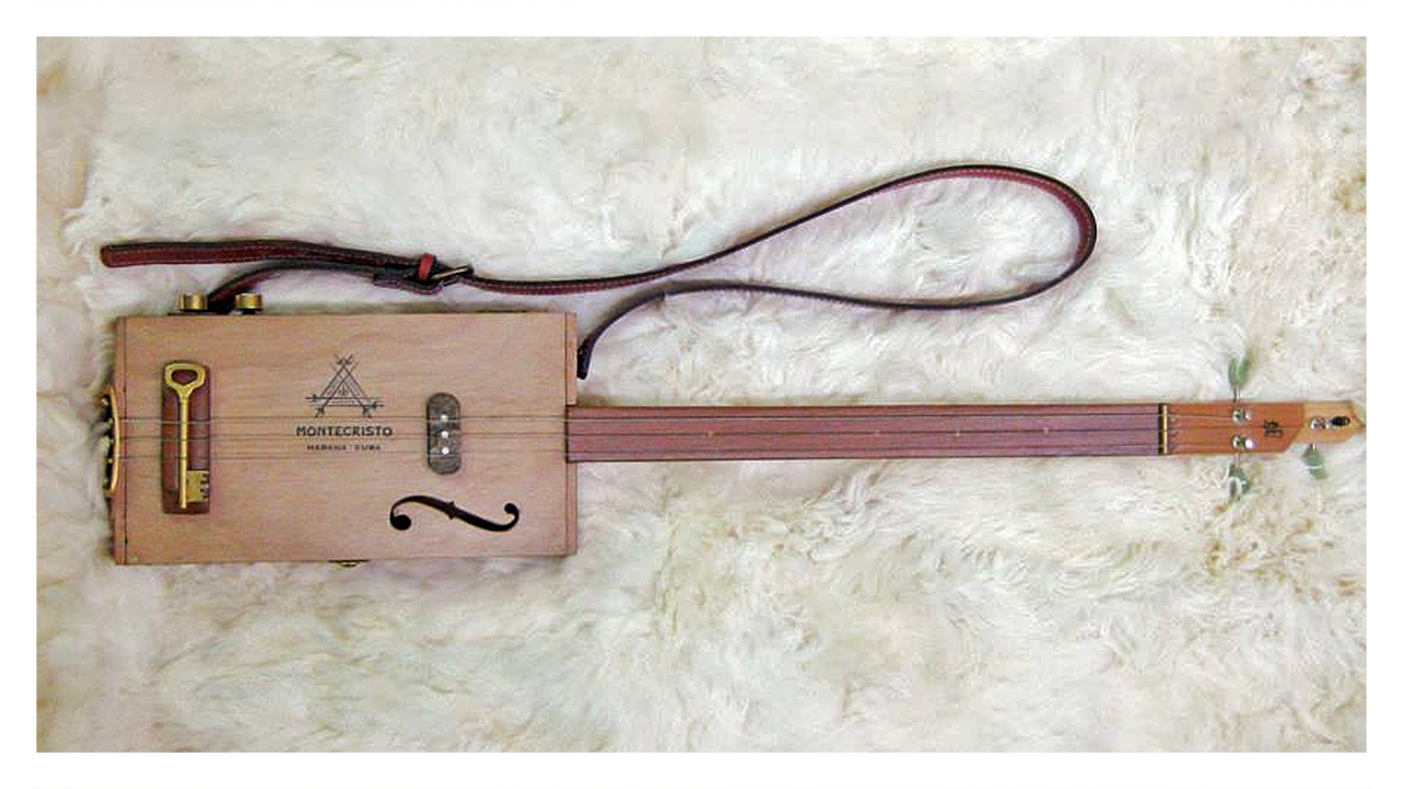
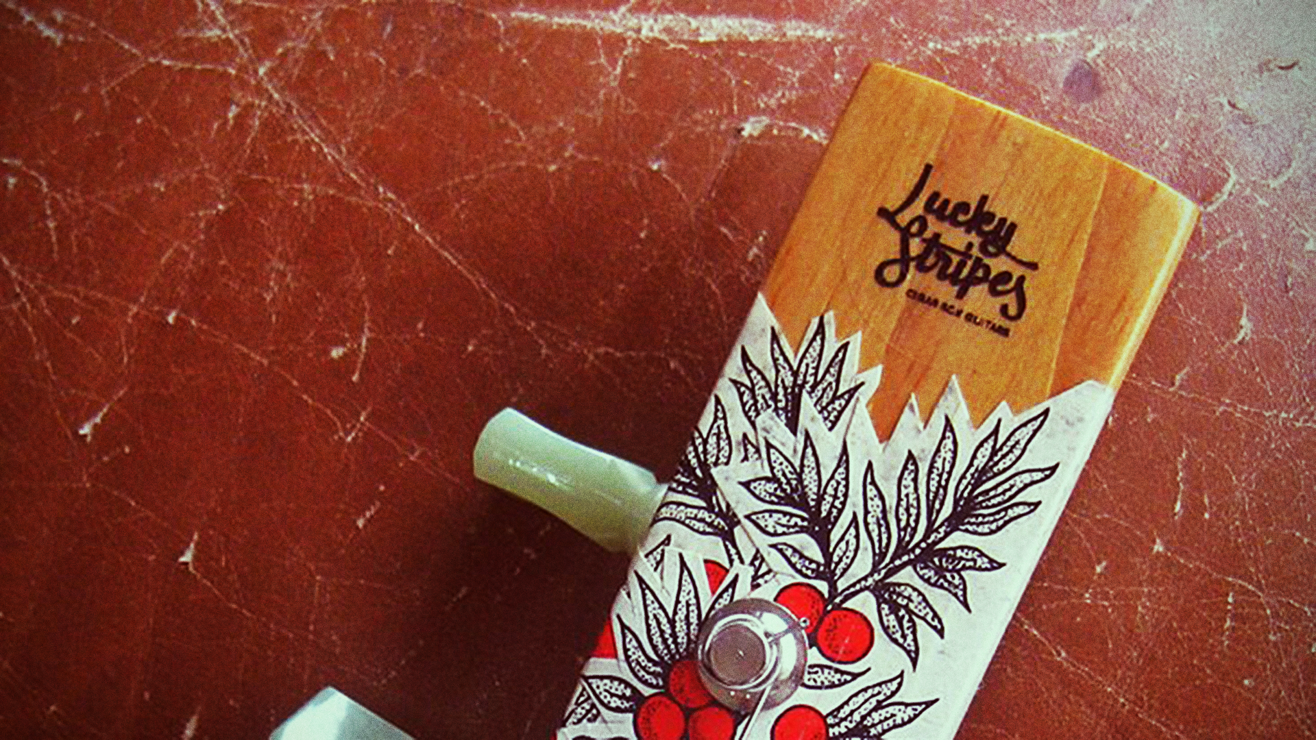
Before we go and talk about lettering, you should check Ricardo’s guitars. He a luthier that makes custom cigar box guitars (meaning: the resonance box of the guitar is actually a cigar box), where he recycles materials to actually build them.
Check this beauty out, for example:
He even made one for Seasick Steve! Here’s a video of Seasick Steve playing a Lucky Stripes guitar:
So, if you want to contact him, do it: he’s super nice!
2. The Past
So, as we were talking, I doodled something, just to retain some ideas of what we were talking about.
Here’s the sketch:
Although most would feel ashamed of posting this in the interwebs (let alone showing this as a sketch to a client), I’m doing it anyways, for the following reasons:
- This is a visual synthesis of the chat we had that in no way tries to be an usable solution;
- From this I went directly to the computer, since I’m not a big fan of solving stuff on paper;
- There’s nothing wrong with ugly sketches, simply because they’re sketches;
- I don’t want to feel constrained to a very precise sketch while I’m working in vector, since it blocks my mind from trying something new;
- And I don’t want to give the impression that a sketch is super-polished artwork. The amount of time that takes to produce an impeccable hand-made drawing is the same (or more) than a digital one, so it’s unrealistic to show something very close to final.
After I took a picture of the sketch with my cellphone, I did a quick center-line vector digitization of the sketch in Illustrator, sent the bitmap to oblivion and started tweaking it, until I got something like this:
Next step? Width Tool!
Although incredibly buggy (we’ll talk about that in a minute), the Width Tool is awesome to work with stroke modulation. Here, I maxed the stroke out, trying to find how thick the weight could go, and then started to add the thin strokes, in a pointed nib sort of logic: thicker down strokes, thinner upstrokes.
After getting close to what I wanted, I expanded the stroke, getting a Bézier hell like this:
And with modulation artifacts like this:
So, unless you want a destroy look in your piece, using the width tool as final art is a no-go, since it produces, as we just saw, an incredible amount of points (read here, here and here), not-so-smooth curves and a lot of strange artifacts.
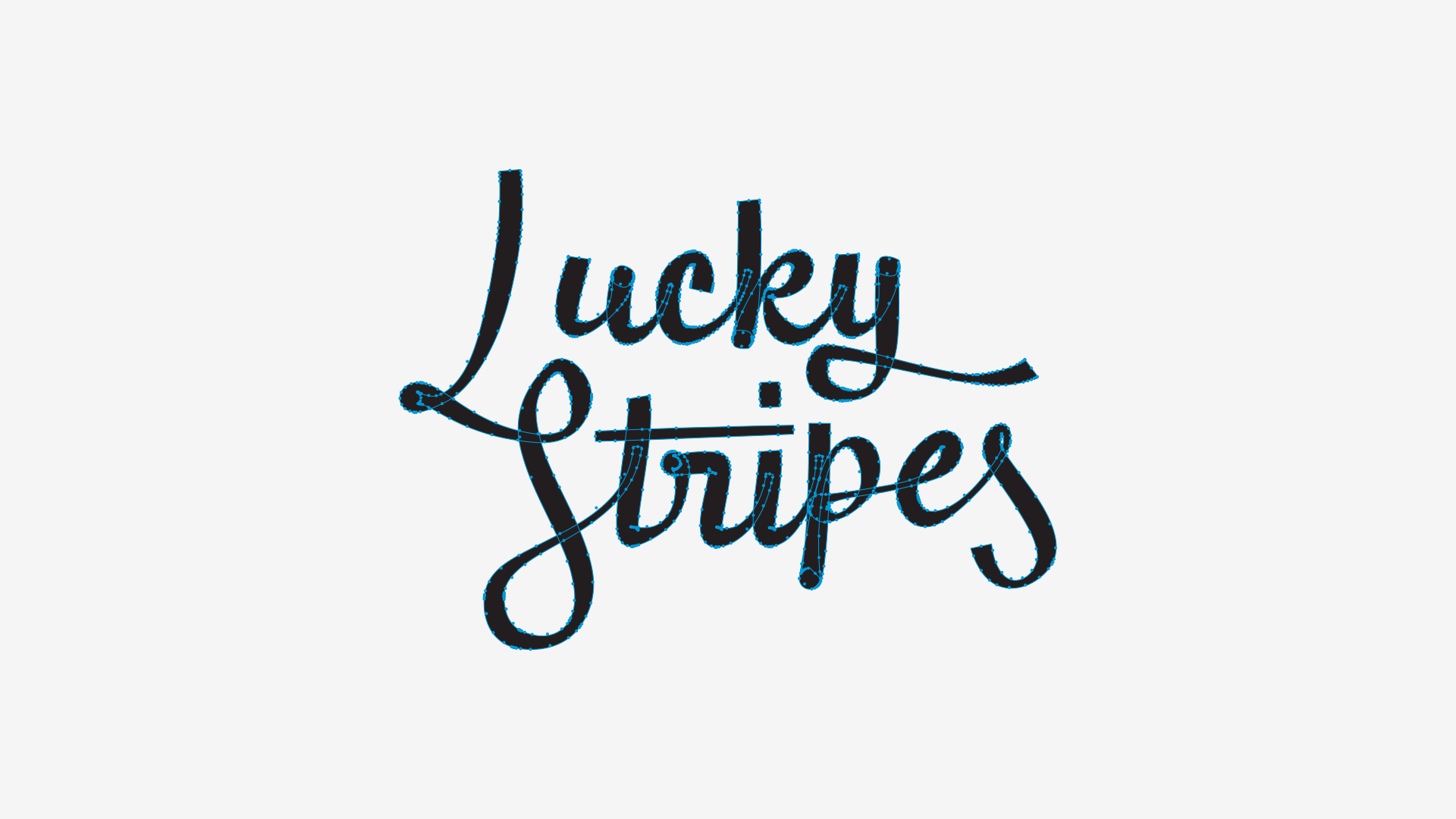
So, as always, I redrew the whole thing on top of this, with proper Bézier point placement and with some minor tweaks. Here’s the result (with the previous drawing in red):
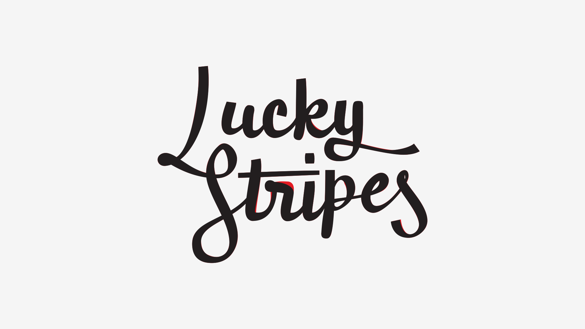
And BAM!, work done! Well, sort of.
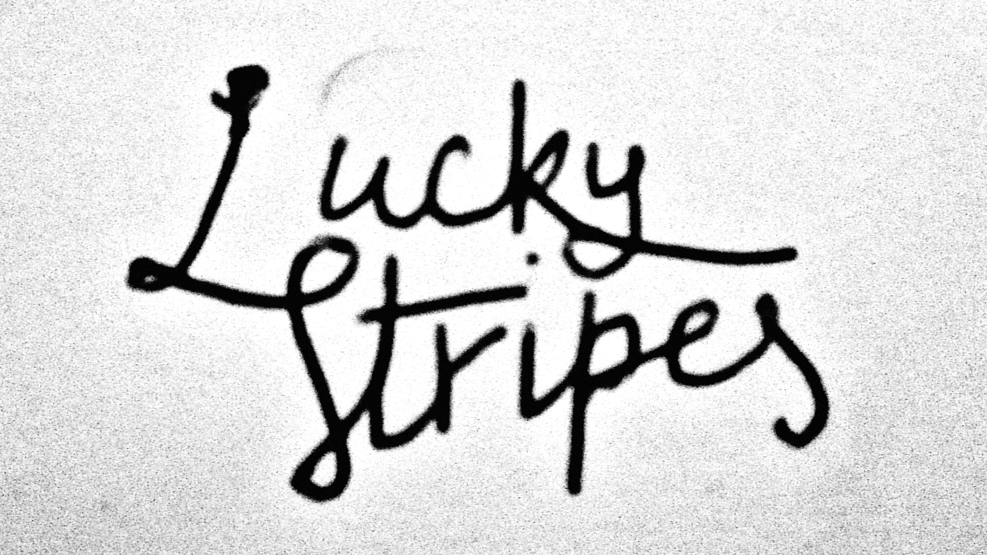
3. The Problems
We were happy, for a while. I guess that, in my case, I overlooked some of the composition issues because I didn’t had some distance to see it more analytically, and, to be honest, since then I’ve learned some more things to look out for.
So, having the chance to tweak it again, after some time, I was thrilled! I had a long time to look at it and think “I’d change this” or “That doesn’t look right”, and now it was time to solve it!
Anyway, let’s talk about some of the problems.
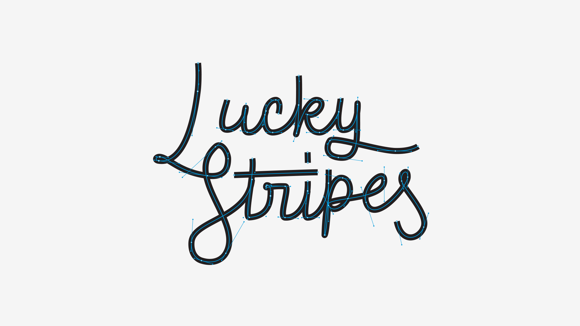
3.1 White Space
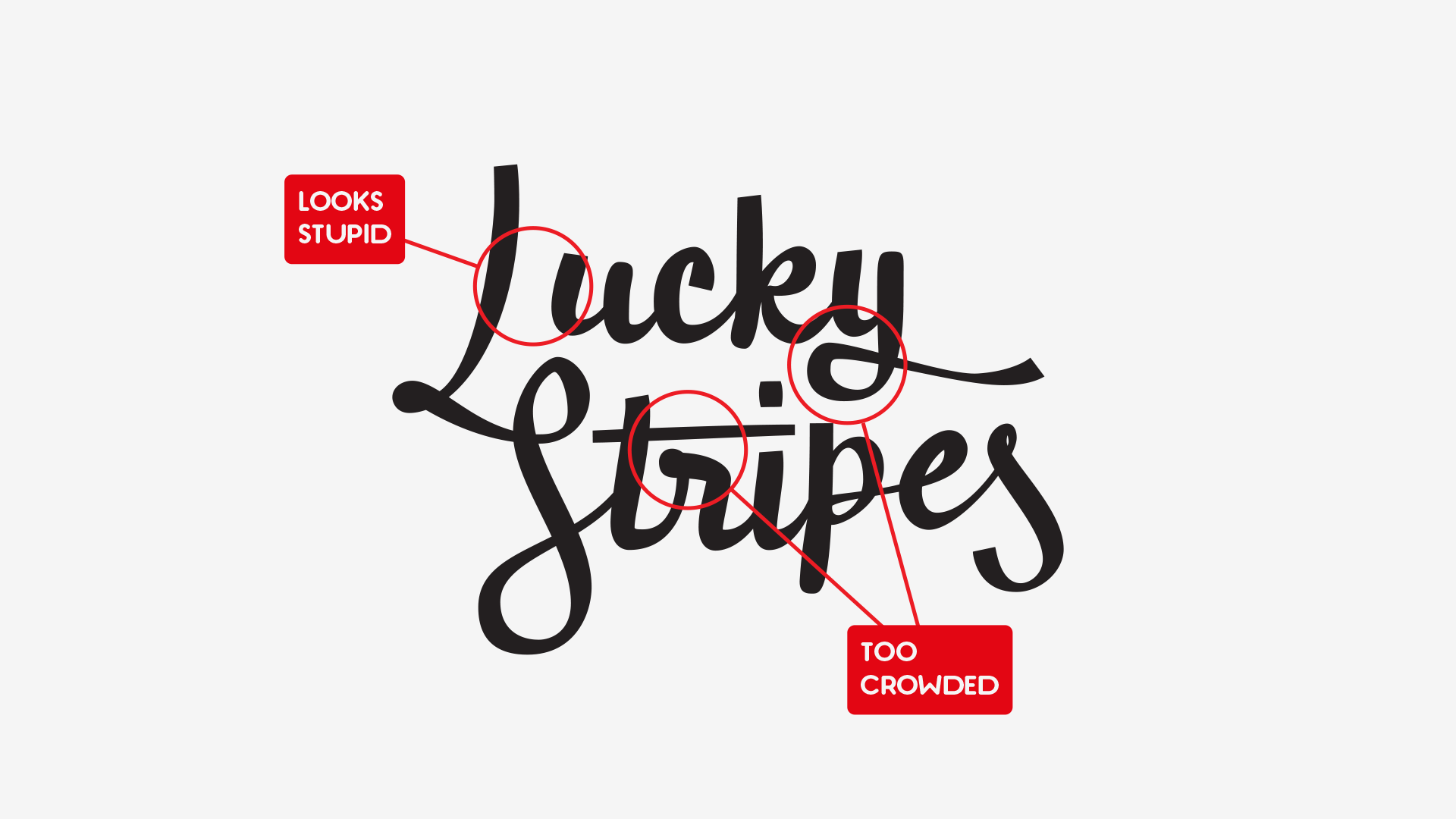
The overall interplay of positive and negative space here is pretty much inconsistent and with two major mistakes:
- The amount of white space between the L and the u is huge, sometimes appearing as part of two different words;
- The r is a disaster: too blobby, too close to the t‘s bar (overcrowding that area) and the loop is not readable at all.
3.2 Flow
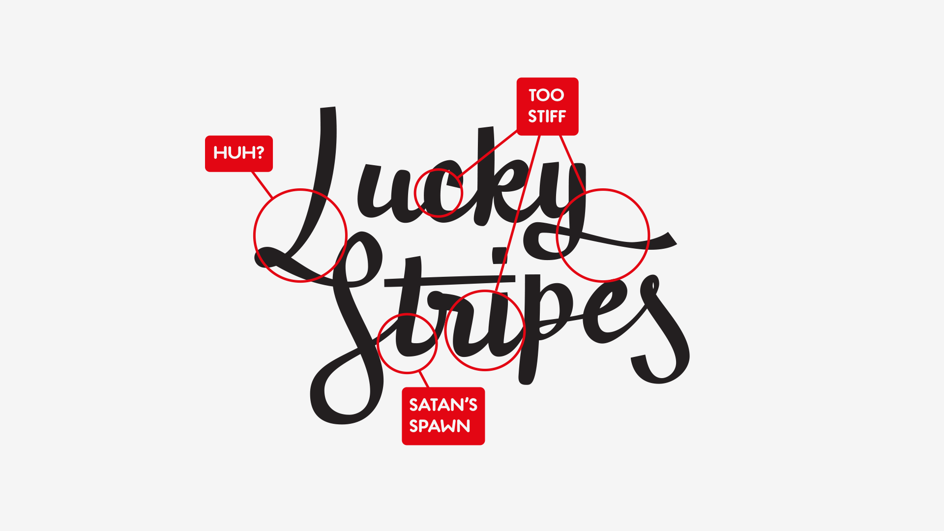
In general, the design had too many (apparent) corners, resulting in a somewhat breaky flow, with too many places for the eye to decelerate and make a sharp turn. Since we were looking for a smooth result, this wasn’t desired.
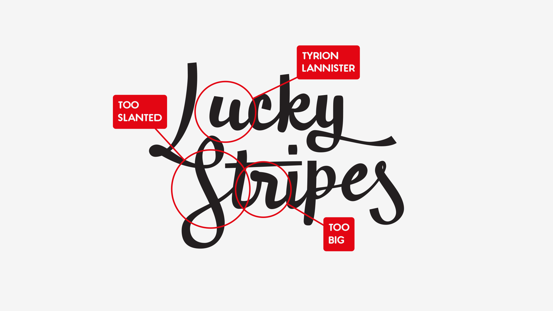
At the same time, although some irregularity in letter size and slope was intended, in some cases the letters were too small (like the u), too big (like the r) and too slanted (S and t).
3.3 Line Consistency
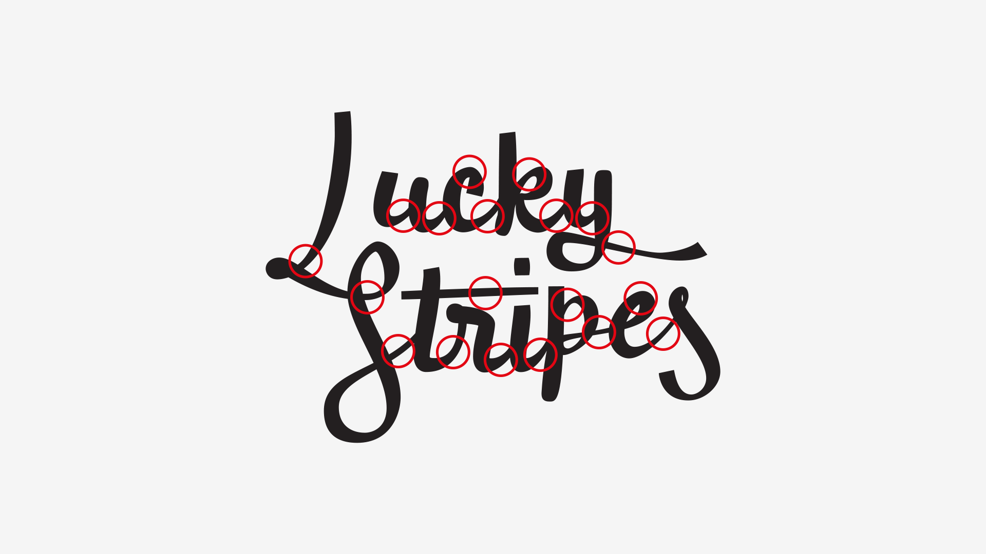
If you ever worked with a pointed nib or a pointed/conical brush, you’ve probably have guessed that the modulation is very weird.
Let’s think of the thin lines as the thinnest that the tool we’re trying to emulate is capable of doing. With this said, there’s some space for variation in the thickest parts of the strokes, but not so much for the thinnest (although possible).
I happened to do it the other way around: the thicker strokes are pretty consistent, while the thinner… well, they’re a mess.
3.2 Size issues
The main reason for calibrating this logo was that it didn’t work properly at small sizes, for two reasons:
- Due to poor design;
- Due to bad printing conditions and ink spread.
The following image show us what happens with loss of resolution and with ink spread. If you want to test your stuff, this was done playing with incremental Gaussian Blur and then applying a Threshold filter.
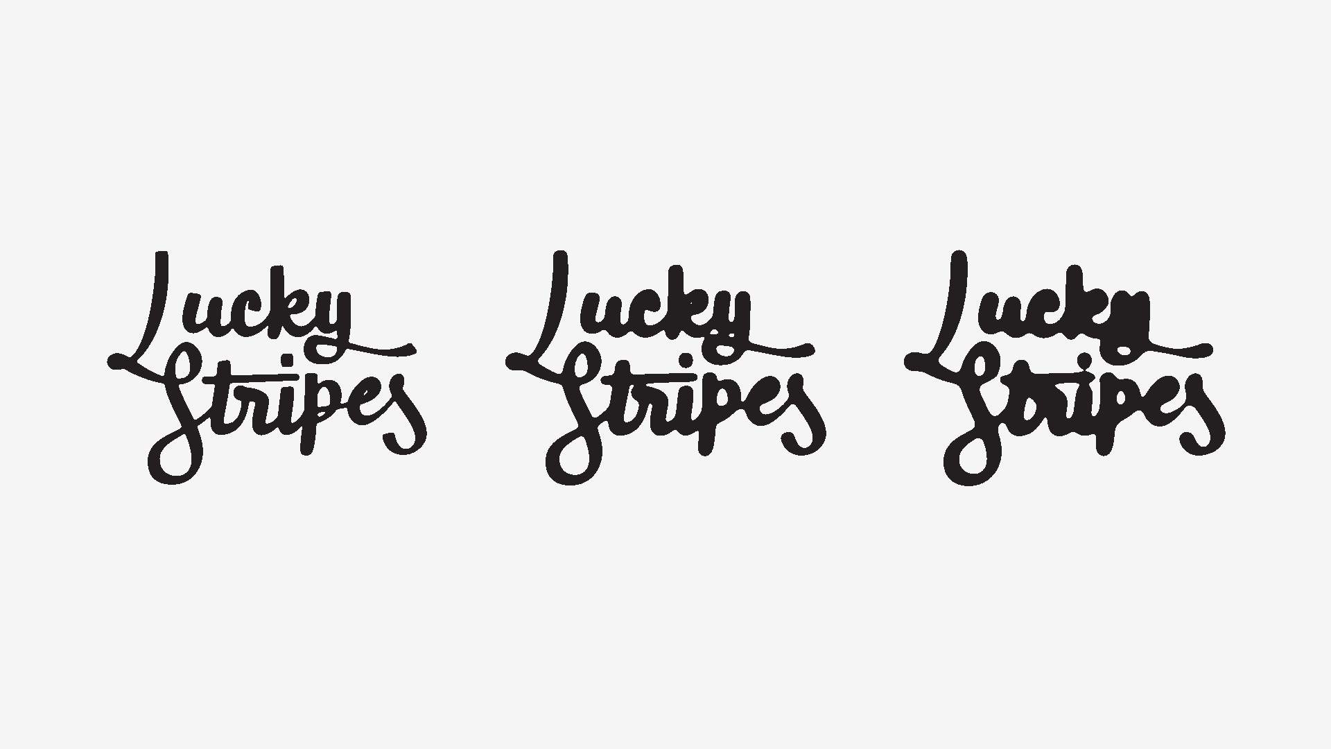
So the most immediate things that happen and severely compromise legibility and form recognition are:
- The counters and inner forms that are too small immediately disappear. In this case, the c and the e;
- The overcrowded areas (like the t‘s bar and the r, or the upper and lower part of the y) become unreadable black blobs.
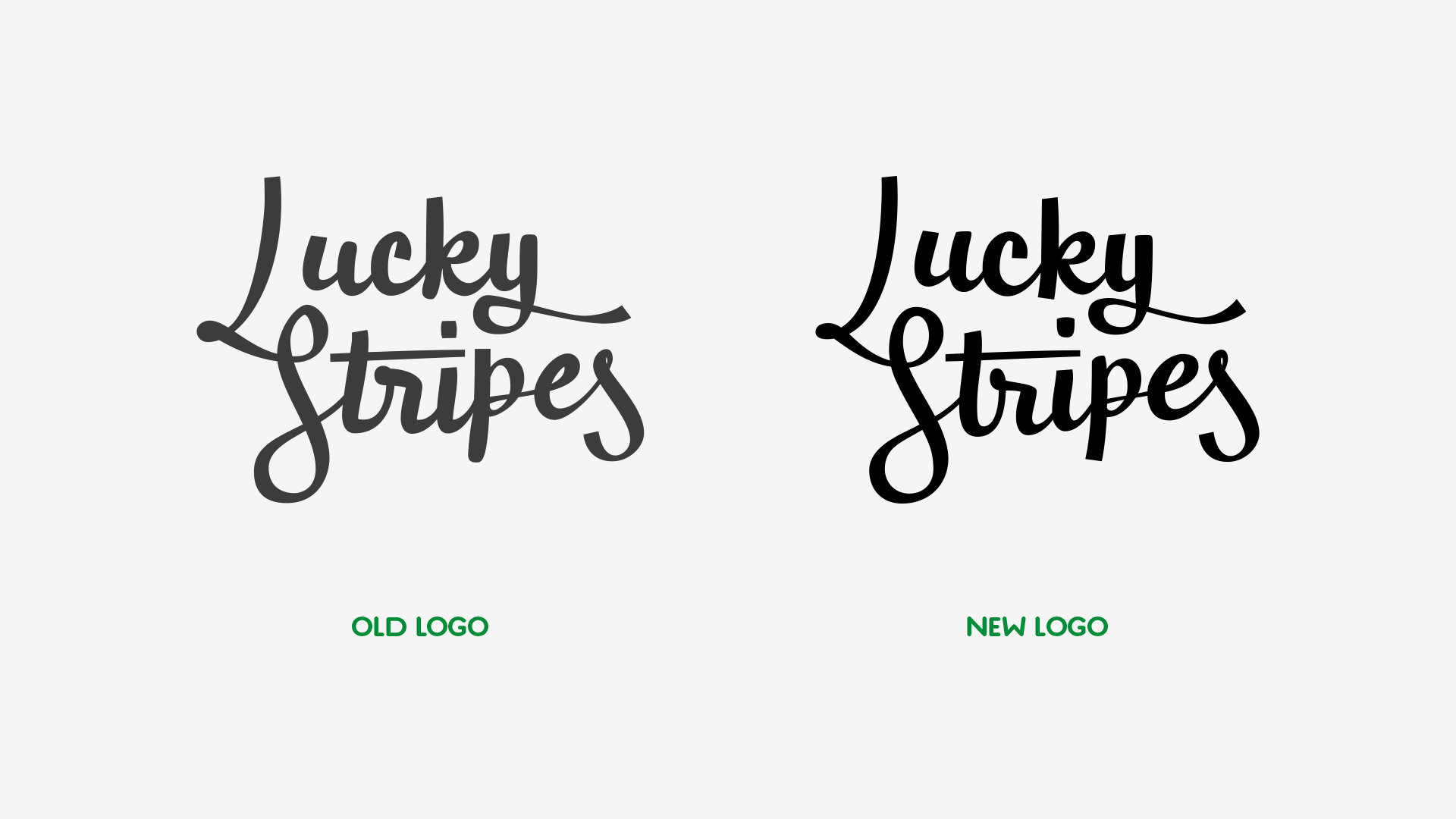
4. The Solutions
The goal was to correct the previous problems without changing the form too much, since Ricardo has developed a respectable fan base in the time period.
Here’s a list of some of the most important changes:
- Opened the counters, to avoid the ink spread so that they wouldn’t disappear;
- Corrected the line inconsistencies;
- Corrected the sharp turns, in order to become smoother;
- Corrected the i‘s dot to balance it’s weight and the white space around it;
- Corrected the r, paying attention to the loop and the horizontal stroke;
- Harmonized the u and the space between it and the L;
- Added some ink-traps in problematic areas;
- Simplified the p‘s and k‘s vertical stem (there was no need to retain the calligraphic quality of it, since it made the bottom blobby);
- Altered the swash in order to become more organic and smoother.
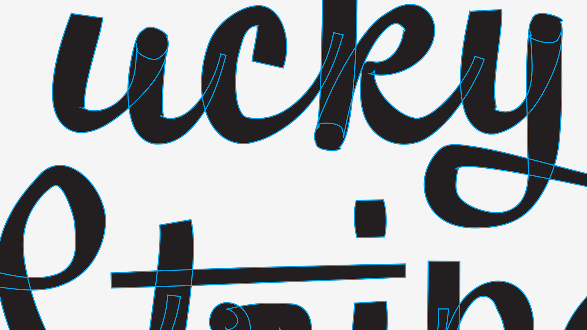
And here’s a side-by-side comparison of the old lettering with the new:
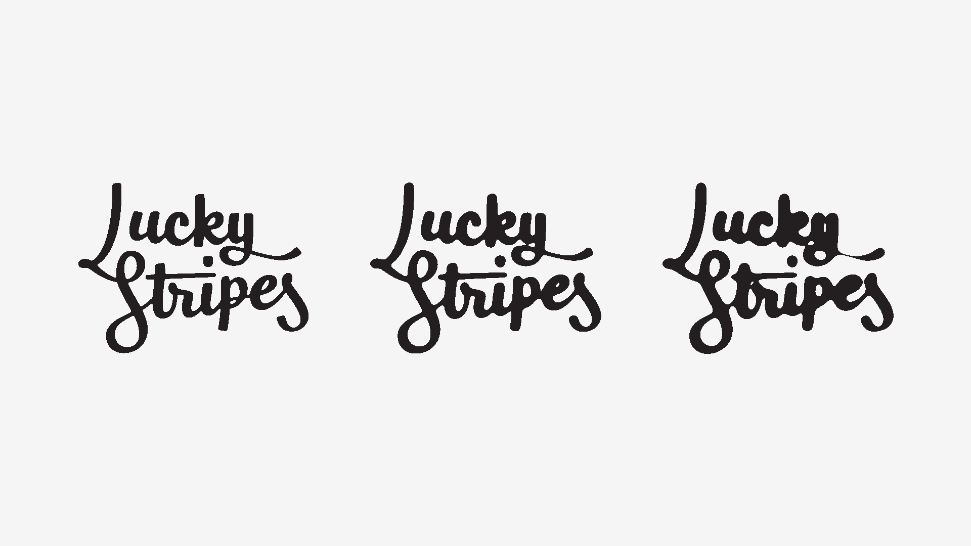
And here’s the blur + threshold result:
5. Wrapping Up
I hope you enjoyed this article! If you did, don’t forget to share it with your friends (you can use the buttons below)!
And if you want to be updated for new articles, fonts and random interesting stuff, you can subscribe to our newsletter below and follow me on Facebook and Twitter!
To support these articles, go and shop for some fonts!
Cheers!