When I am asked to calibrate a typeface or logo, or when someone asks me for help with their typefaces, one of the most common problems I find is bad Bézier curve design.
And every single time this happens, it’s not people’s fault: they just don’t know better.
And there’s that heart-stabbing situation when someone pings and says “Hey, I just finished this font, can you have a look and see if something’s missing?” and I feel obliged to say, with grief, “You have to redesign it all over: it’s poorly designed, bézier-wise”.
So, in order to save some people from this hassle, in advance, read along.
1. Problems
First of all, we should understand that each desktop publishing software is going to compile the font files in it’s own way. More so, each one of them is going to convert the curves through their unique algorithm, sometimes unleashing hell.
Flash IDE, for example, is notorious for wrecking curves. It does so, based on the size of your vector artwork, in order to keep the smallest file possible. If fonts are not embedded, the same happens.
Some programs, like 3D applications, simply break the curve into several facets. So even if you are doing something in Illustrator to use in 3DS Max, for example, read on, it might save you some trouble.
2. Reasons
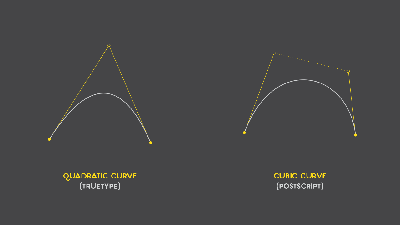
Usually, all of this revolves around how PostScript and TrueType deal with outlines: TrueType uses quadratic Bézier curves, and PostScript uses cubic Bézier curves.
I know, I know, geek stuff. Here’s the simple explanation:
- A quadratic Bézier curve (read TrueType) has 3 points: an insertion one, a control one and a end one.
- A cubic Bézier curve (read PostScript) has four: insertion, end and two handles.
And for the visual type of guy, here’s an image:
So, if we were to draw a circle in both curve equations, they would be drawn the following way:
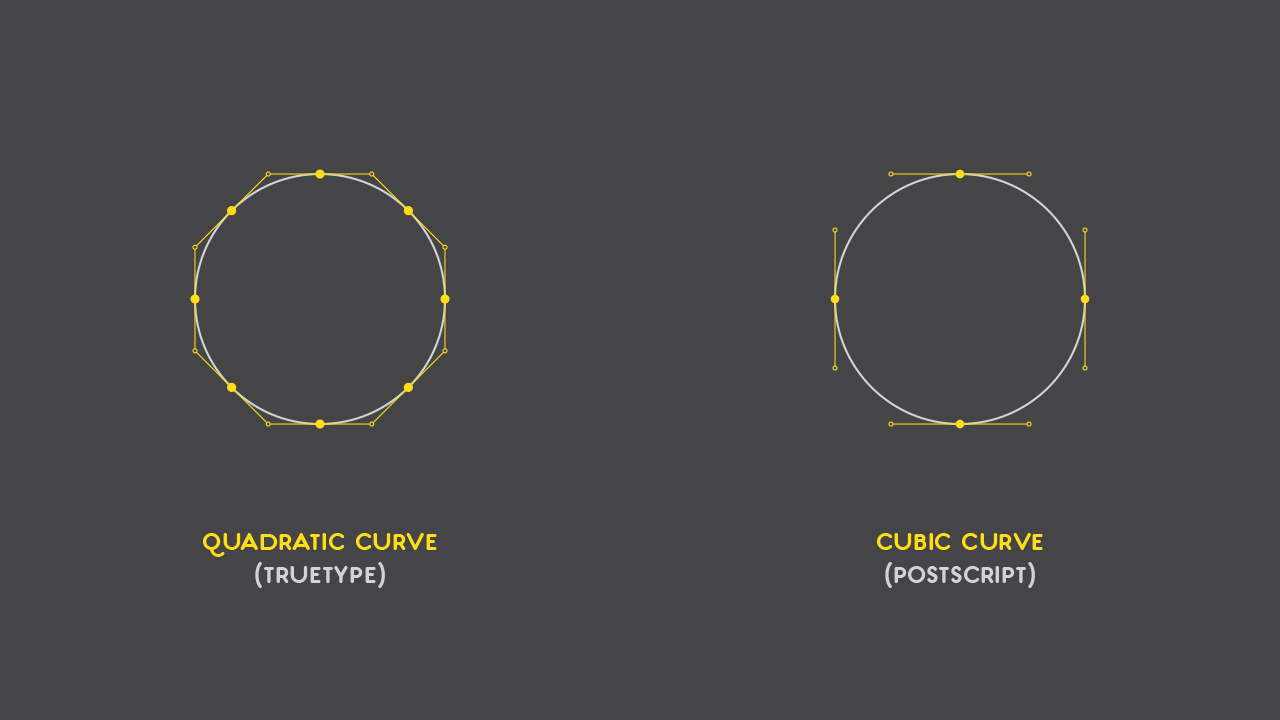
Let’s count the number of points needed for each circle:
- Quadratic: 8 anchor points + 8 control points = 16 points;
- Cubic: 4 anchor points + 8 control points = 12 points.
Counting points might seem unpractical and silly, but it can tell you a couple of things right away:
- The most obvious one is about file size: less points, less point coordinates, which means a smaller file size. Cubic curves win in this matter;
- Two control points per node allows more freedom while drawing, since it gives more control on the curve itself. Quadratic curves force the user to add more anchor nodes (since the addition of every angle per curve can’t be bigger than 180º), adding difficulty to the process of drawing a clean curve.
If this is so, it seems that cubic curves win over quadratic ones; so why aren’t quadratic curves obsolete?
3. Digging deeper
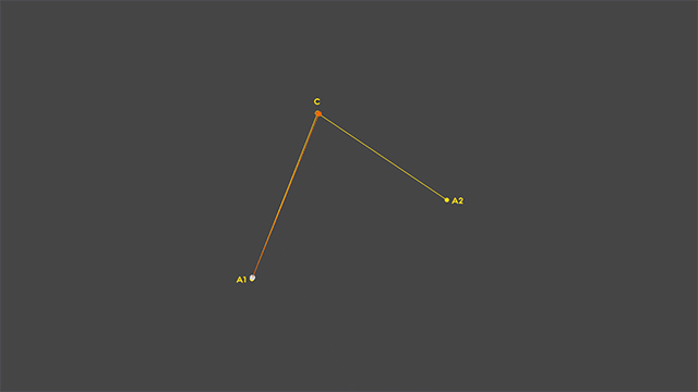
So how are Bézier curves calculated? Let’s start with quadratic curves.
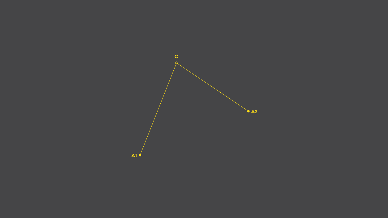
3.1 Quadratic Curve rasterization
So, we have our 3 points: 2 anchor (in and out) and 1 control point. Let’s say that the anchors are called A1 and A2, and that the control point is called C. Let’s connect A1 to C and C to A2 with straight lines, as shown below:
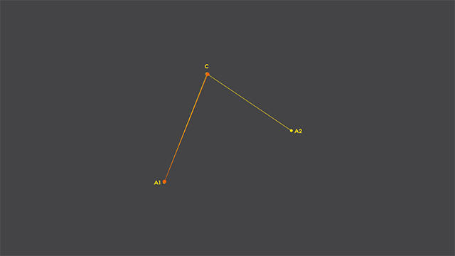
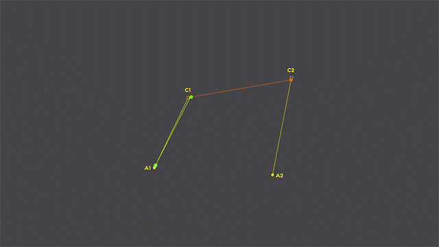
Now, we’ll add two points: one that travels from A1 to C and another that travels from C to A2, and they’ll take exactly the same time to make their trip. And for the sake of this exercise, we’ll also add a straight line that connect the two traveling points (shown in orange, below):
Now, let’s add a new point, one that travels between the two orange points, taking the same time to travel from one point to another (shown below in light gray). If we track it’s path while traveling, voilá, we have our quadratic curve rasterized:
OK, so now you know how a computer renders a bézier curve:
- It’s not actually a curve, but several iterations of straight line segments, smaller than pixels, that create the illusion of a curve. It’s what a 3D application does while smoothing a mesh – it breaks it exponentially, until the mesh seems smooth, when, in truth, are a bunch of tiny, tiny planes.
- The same applies when you zoom in or out, or when your printer controller prepares a document to print: it rasters the curve to the intended resolution.
- This is why older vector drawing applications would break fonts’ curves in bigger or smaller iterations, depending on the size that one would convert them to outlines – the raster algorithm would iterate depending on the size needed, because processing power and file size were issues;
- Still, applications have their own rasterization algorithm, and this is still needed. InDesign, for example, deals with huge amounts of text (meaning lots and lots of points and curves), so it provides different levels of rasterization resolution, so it doesn’t get sluggish. Sub-pixel rendering, in other hand, might do 3 or 4 different rasterizations and combine them, or nudge 1 in different ways. Simply put, ClearType would kill you 386 machine.
3.2 Cubic Curve rasterization
So, what about cubic curves? Is the rasterization done the same way?
Well, yes, sort of. It just adds another level of our “traveling points”. Have a look:
See what they did there? Right, a moving quadratic curve inside a cubic one! Here’s some deductions on cubic curve rasterization:
- We’ve noted that Cubic curves reduce the file size by 1/8, but the demands on processing power triples.
- If with quadratic curves, only 180º were possible, with cubic curves we can go up to 360º.
3.4 Going back and forth
The addition of multi order intermediate points can go down to infinity, and it’s possible to break cubic curves into quadratic with minimal loss in quality. The other way around, well… it get’s tricky.
Quadratic curves are always cone sections, while Bézier curves that have more than one level are a result of curve funkiness, meaning, a collage of cone sections’ sections.
So if we were to write an algorithm to convert cubic curves to quadratic, we would have no problem: we would just check for cone sections that would fit on that curve.
But if we were to write one to convert quadratic to cubic, the best the program could do is an approximation of the original outline, usually keeping the anchor points it already had, but adding one more control point per anchor. So, file size wise, not a good idea; processing power wise, even worst idea.
Edit: As it was stated over at Hacker News by simias and jacobolus, and kindly explained by nanofortnight, the above statements are wrong -in fact, the truth is it’s very oposite.
If we were to convert a quadratic curve to cubic, it would be the exact same curve, as nanofortnight demonstrated. But, as jacobolus pointed out, due to the integer nature of font compiling, this conversion might not be exact.
And when we go to convert cubic curves to quadratic, it’s not the easy-peasy I stated. For further reading on this, check this out.
Is this a problem, then? Well, these conversion issues are the reason why DTP software and printers always favoured PostScript, i.e., cubic Bézier curves. If the drawing was provided in quadratic curves, the software could easily convert them to cubic; if it was already in cubic, it would simply keep it that way.
So, while designing type, you opt for TrueType or PostScript. And, while this makes me favour PostScript, if you start with one, stick with it.
But why do type design applications offer cubic curves only or have them as default, as a drawing method? Well, as it was debated, conversion from TrueType to PostScript is optimal and the other way around is not. And the third reason comes next.
4. File Size
We already know that you can draw the same thing with less points with cubic curves, but there’s also some other things that we can have in consideration, regarding file size.
4.1 Always work with integers
FontLab, for example, doesn’t even let you use decimal data in x/y coordinates data, and no sane developer will do a vector drawing application that would allow point data to infinity. Since we still need a worldwide network of computers just to find some more pi digits, no perfect circles to anyone.
But then again, if your eye can’t tell the difference and, in fact, you still have to cheat the circle to make it look like a circle (when you adjust forms optically), using decimal numbers on type design is just some sort of geek stubbornness.
And there’s the workflow issue: ask any professional type designers if they use Illustrator or other vector drawing application that uses decimal numbers by default and you’ll find very few that say yes, and even fewer that say “yes and with no corrections”.
It’s way easier to nudge with the keyboard arrows than using a text box to input integer values. On the other hand, a lot algorithms used for font handling in DTP software simply round the points to integers, so they can handle them with less storage and processing resources.
Edit: And, as Pomax kindly pointed out, the OpenType specs only allows for integer point coordinates.
But the big issue here is file size: if you have a file with integers and 4 points, it will be smaller than a file with two decimal figures and 2 points. Make some thousands of points and the difference in file size is dramatic, as well as for processing power.
5. Always work with cubic curves
Cubic curves win, for all the reasons mentioned above: easier drawing, better conversion to quadratic than the other way around, smaller file size. You know the drill.
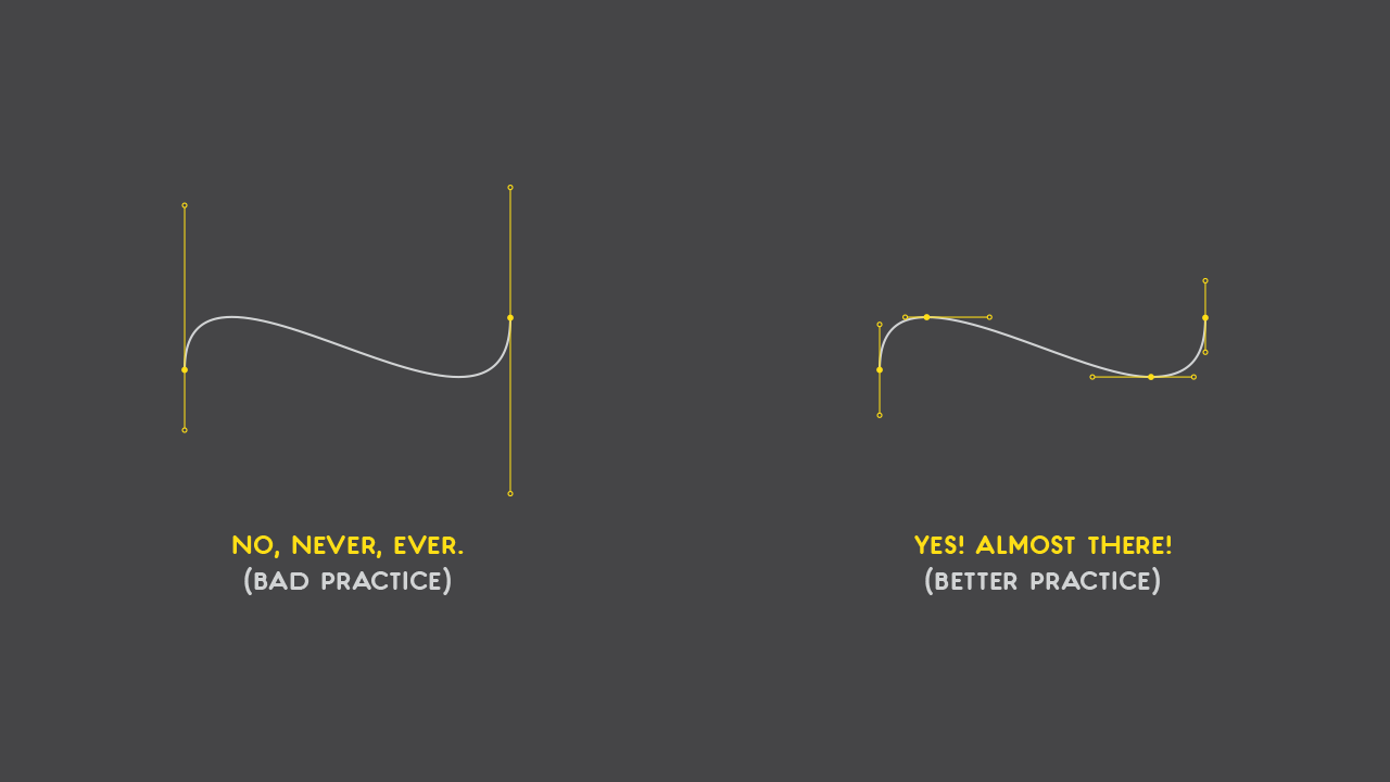
6. Keep anchor points at extrema – and handles straight
This is a big one. Most of the time, the most common problem I see (in situations as described in the introduction) is that the anchor points are spread all over the place. This results in jagged lines, poor rasterization, bigger file size (because you’ll need more points), increased difficulty in drawing, and the list goes on.
If you want to draw a smooth curve, having the anchor points at the horizontal and vertical extrema and keeping the handles vertical or horizontal is enough. It gives you a better control over the curve path and less stuff to adjust.
Edit: And, although implied above, is good to mention: do not invert the path direction with you handles (thanks to Pedro Amado for pointing that out). Here’s what I mean:
Edit: 7. Explicit Inflection Points
Hrant Papazian made me notice, over Twitter, that I’ve missed a point here (pun intended!). The example above, on the right, lacks an explicit inflection point.
“What the hell is that?”, you may ask. Well, in an ideal scenario, all points should alternate between vertical and horizontal handle position. Why? Because we want to keep each curve segment without inflection points, in order to have an optimal conversion from cubic to quadratic.
“OK, lovely, but you haven’t explained what a inflection point is”. True. Here you go: the inflection point is where the curve changes direction. So, if your walking from left to right and start leaning to the left, the place where you start doing so is your path’s inflection point. Simple.
So, in the example in §6, the curve changes paths between the two horizontal handlers, creating an inflection point. How to avoid it? Well, make it explicit; i.e., make it an anchor point. In this way, the curve is split to one-direction-only segments:
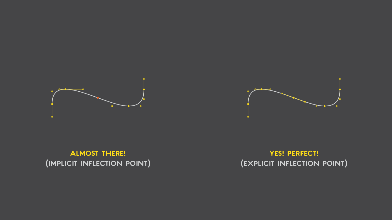
For more information on inflection points, have a read here.
8. Final considerations
I know this was lengthy and somewhat technical, but I believe it’s important to know why instead of just how. Computers have limitations – and will always have – so it’s important to make the best of it; and for that, knowledge is key.
I hope you had as much fun reading this as I had making this article. Thanks for your time!
References: