0. Introduction
If you’ve been visiting this blog, you might be wondering why I’m writing another article about this subject.
You’ve probably read Bézier Curves And Type Design: A Tutorial and Bézier Curve Quick Tips: Two Methods For Smooth Curves, along with AGSC’s article So What’s the Big Deal with Horizontal & Vertical Bezier Handles Anyway?, and you might think that, for graphic designers and related métiers, things are pretty much covered.
Well, they’re not. The suggestions to keep nodes at extrema, handles vertical or horizontal, use explicit inflection points, balance the handles and so on aren’t just workflow optimizations: they’re methods to overcome technical problems.
So, today, I want to give you the reasons why these point-placement methods should be used extensively, in a more in-depth way than in the previous two articles (and again, here and here, because I strongly suggest you to read them before reading this one).
Ready? Go!
1. It Reduces Point Placement
This one is a no-brainer. As discussed before, in cubic Bézier curves, the most simple way to describe a curve is with two nodes and two handles, and if we keep angles smaller than 90º, we can easily draw any curve. So, working with extra points doesn’t seem much of an advantage, since it ends up with you having more stuff to deal with.
1.1 And Thus, It Reduces File Size
Less points, less coordinates. Less coordinates, smaller file size. Done.
2. Rasterizers Are Dumb
This section and §3 are this article’s gem: the stuff that you don’t usually see being talked about.
In Bézier Curves And Type Design we barely scratched the surface on this. Remember how a cubic Bézier curve is constructed? The animations there show how a Bézier curve rasterizer builds a curve through a method called linear interpolation. Let’s start there.
2.1 Linear Interpolation
Linear interpolation is a method of curve fitting that uses linear polynomials (read line segments joined together to fit a curve), and this is how computers draw Bézier curves, because De Casteljau’s algorithm (the one used in Bézier curves) was made to do precisely this.
So, as we know the Bézier Curves And Type Design‘s animations, the curve is broke into several linear steps. Have a look:
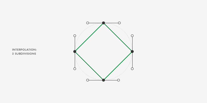
Fibonacci FTW!
Be aware that the subdivisions are per segment: from anchor point to anchor point.
So, with this said, how would the previous animation look with odd point placement? Here you go:
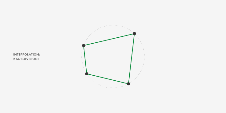
As you might have guessed, the perceptual smoothing of each segment through the various iterations differ quite a bit:
- The shorter the segment, the quicker it appears to be smooth;
- Since the segments differ in size, the smoothing appears to be uneven.
Ever worked with splines in 3D software? If you have, you know the pain it is (or used to be, rasterizers did get better) to convert it to a mesh, with steps unequally distributed along the spline. Or Flash, that converts the curves to line segments for processing and file size’s sake. Now you know why.
How to solve this? Same recomendations:
- Keep smooth nodes at the extrema;
- Keep smooth nodes’ handles straight vertically or horizontally;
- Balance the handles;
- Use explicit inflection points.
2.2 And Rasterizers Should Be Dumb; You’re The One Who Should Be Smart
Why? Because linear interpolation isn’t the only thing to worry about, when it comes to rasterizers.
We want our vector drawings to be cross-compatible between formats, rasterizers, hinters, printers, parsers, and the list goes on. So it’s our job to know a little bit more and try to minize conversion errors. Just because something looks good in Illustrator, it doesn’t mean that it will look good in an old printer.
And if you convert your drawing from cubic to quadratic and back to cubic and then interpolate it, welcome to hell.
3. Hinting
Though this part is somewhat related to §2, it deserves a different section.
Let’s get this straight: hinting is not exclusive to type design; in truth, every printer, for example, only prints bitmaps, i.e., it hints the vector artwork first. And printers may have their own rasterizers and hinters, and the way you draw can make a difference.
The reason why it’s an obvious type concern is that we (type designers) deal with a finer degree of detail in way smaller sizes.
But, in spite of rasterizers becoming better and better, it doesn’t mean that graphic designers shouldn’t be concerned about it too.
And with this I don’t mean that we should rasterize vector work and start editing pixels: you should, however, try to draw vector art as fool-proof as you can.
Can the way you draw influence hinting? Yes, very slightly, but yes. And the smaller you get, the more crucial it becomes.
4. Conclusion
I hope you’ve enjoyed reading this! Happy drawing!
Cheers!