I hope you guys had a great Easter (if you’re culturally inclined for such practice – if not, I hope you had a great week).
So, here we are, back on track. In the previous post, we talked about some preparatory steps regarding the conceptualization of the font in hand. Today, we’re going to start analysing an initial prototype, so we can make some early choice of the development to come.
But before we dive into it, I want to thank you guys for such an overwhelming response to the first post. I was really shy to promote it, since I thought it was a very initial approach to this subject, and I thought it was best to leave a more intense promotion to later on, when there was more reading material.
I’m humbled that you guys found a preparatory post interesting enough to share it so much, so my deepest thank you for your attention! I owe my motivation to you and your kindness, so I have nothing to do but my best! Thank you all!
So, to avoid more sappiness from my behalf, let’s get to the point.
1. How many styles?
At this point, this is the most crucial decision to make. As we are going to see in §4, this factor determines how lengthy this process will be.
The only reason why I should be concerned with the time this will take to make is that I want to keep you interested. Since most of you guys are casual visitors (meaning not subscribers [but you can subscribe at the bottom of this page]), this attention can easily go into the void.
To avoid that, I have to consider time. Or you can simply scroll down and subscribe to the newsletter.
Let’s say that we don’t have to worry about time. In this scenario, if we consider the “repetition” model (read about it in the previous post, §3 and §5), a linear incrementation would be the best one, right? Well, sort of.
Yes, it would give you more manual control, but the point here is about random substitution. And the glyph width variation should be extreme enough, since this is not about subtlety, but boldness.
Still, a natural or organic progression, although extreme, is welcome. So, here’s the solution: the Fibonacci sequence. The sequence goes like this:
1, 1, 2, 3, 5, 8, 13, 21, 34, …
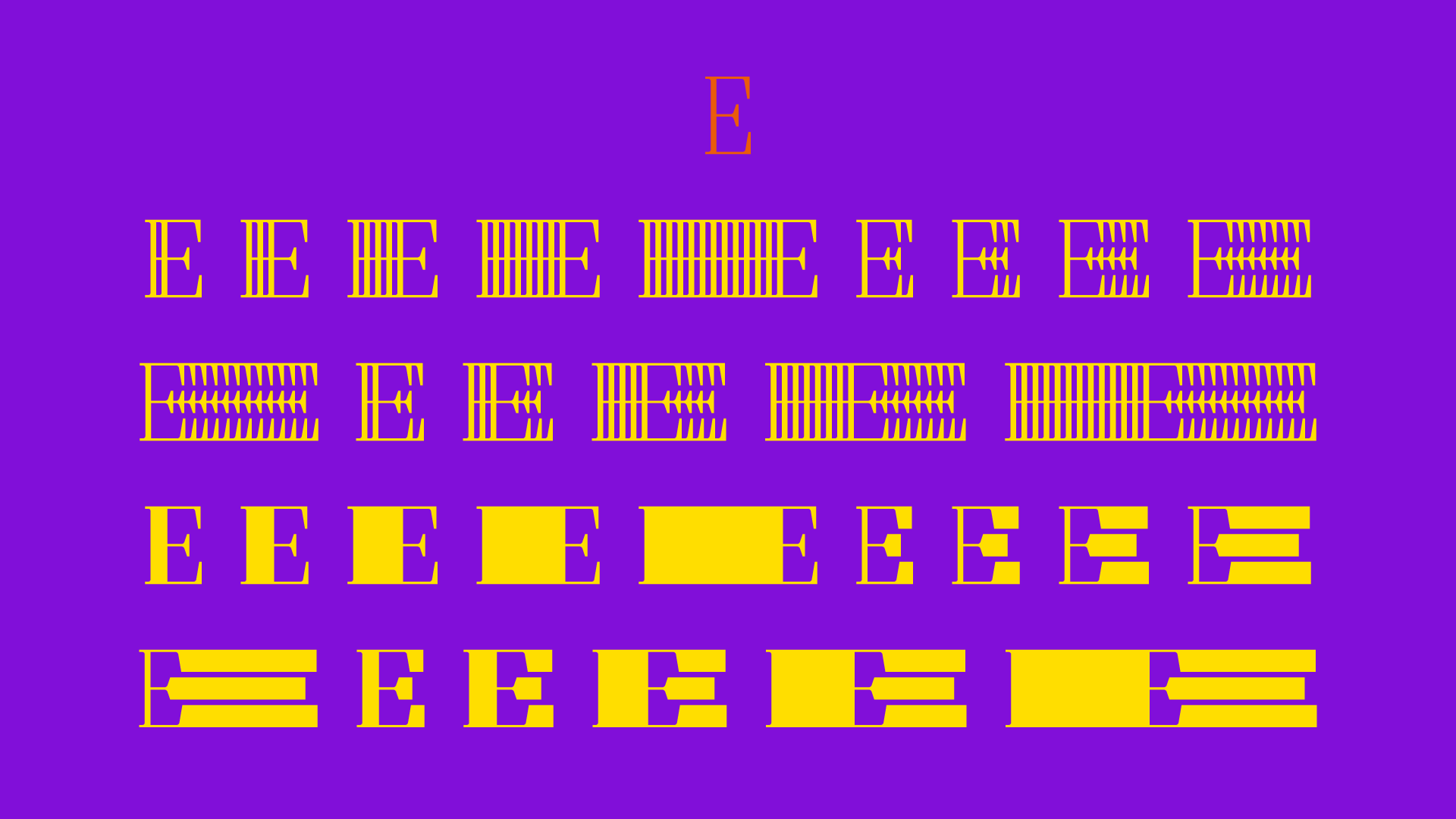
The logic here is that any number is the addition of the previous two. In our case, we can skip the 1’s, since that’s our base glyph. And since we want 5 variations of expansion/repetition to each side (and both), we’ll use the numbers from 2 to 13.
So, we have 1 (our base glyph), 2, 3, 5, 8 and 13. The variations look something like this:
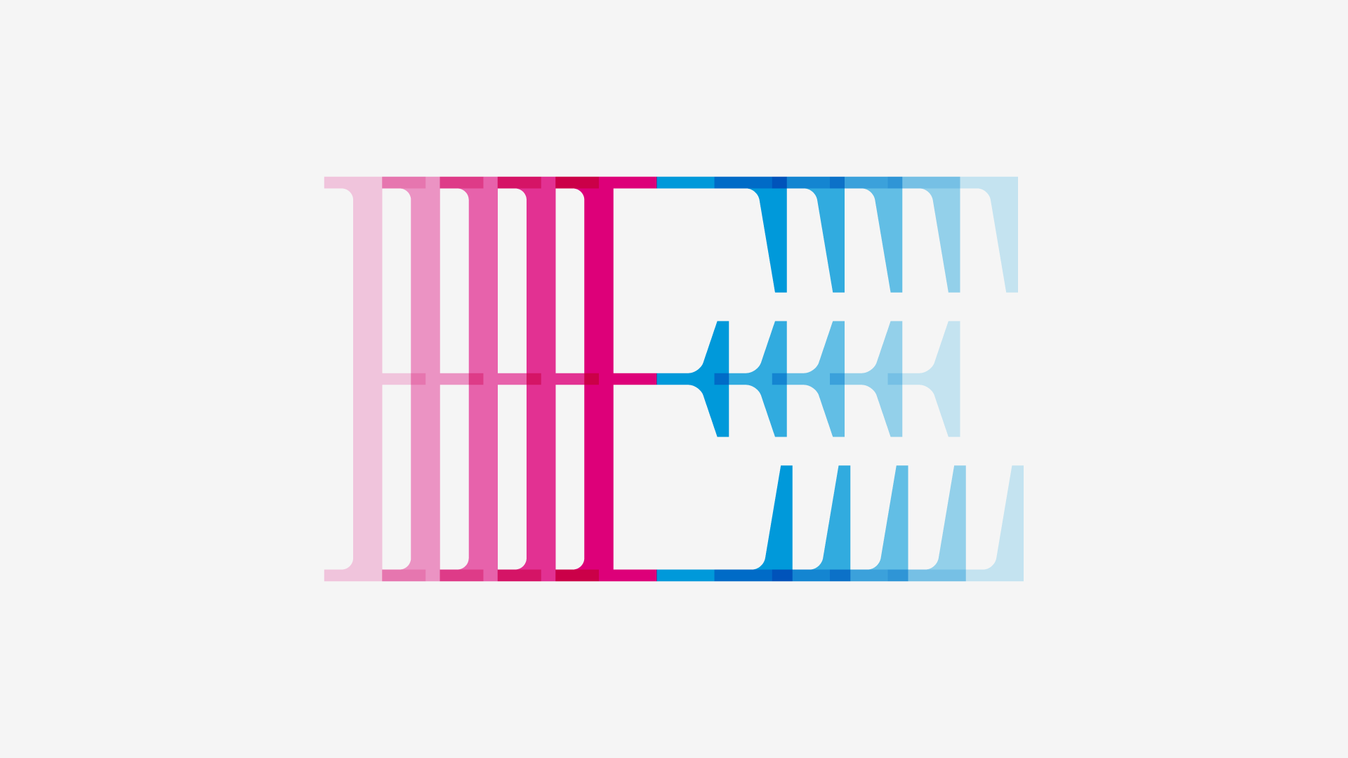
Then, as you saw in the image that opens this section, the same happens to the other side of the glyph and then to both sides. And then we make the “expanded” variations, using the repetition as the base. We’ll talk about that in a tick, in §3.
So, with 5 variations to each side, as well as 5 for both, in two sets (“expanded” and “repetition”) we have 30 stylistic sets, apart from the default glyph. That means 31 variation per letter. *heavy breathing*
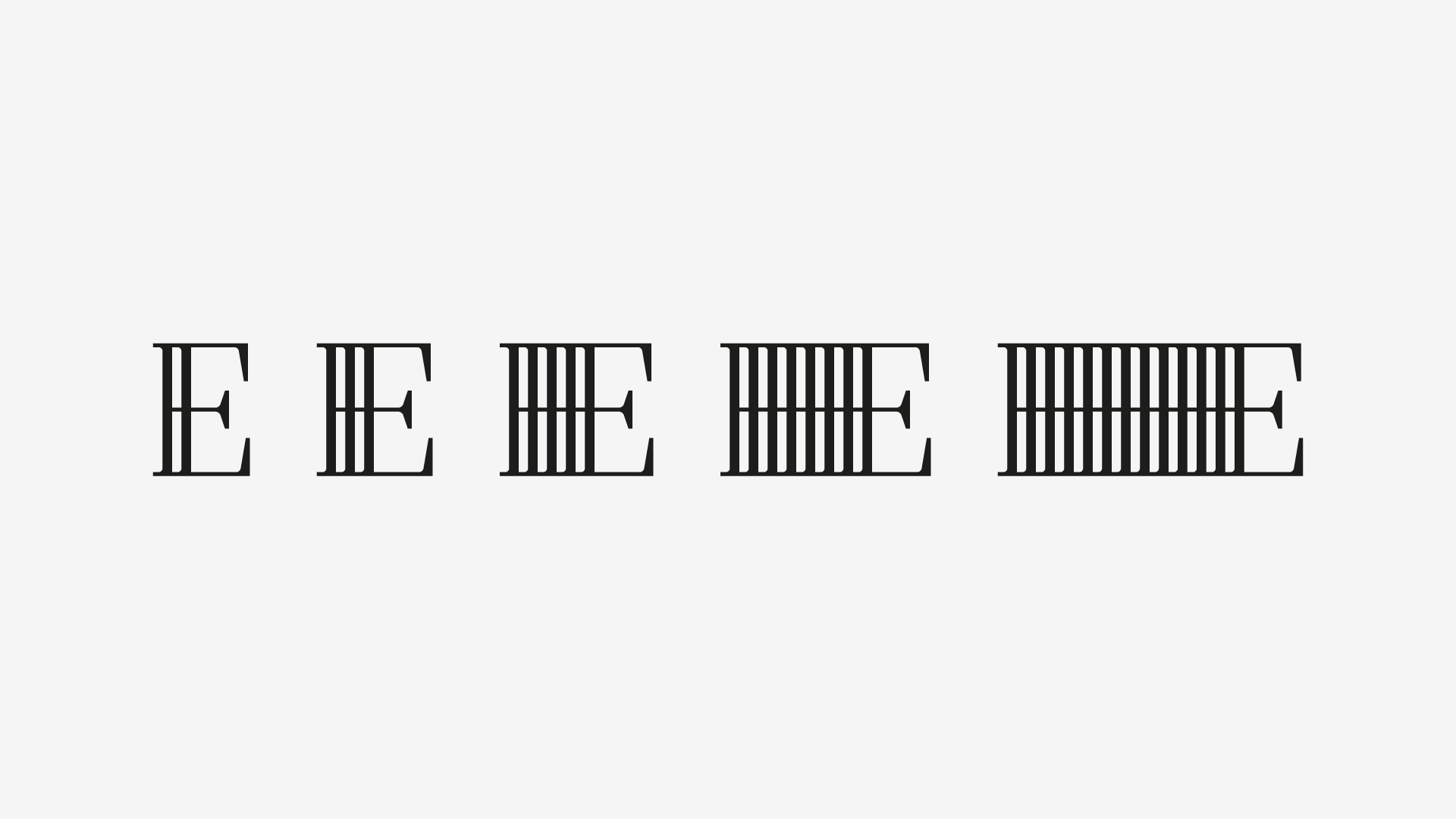
2. The Base Glyphs
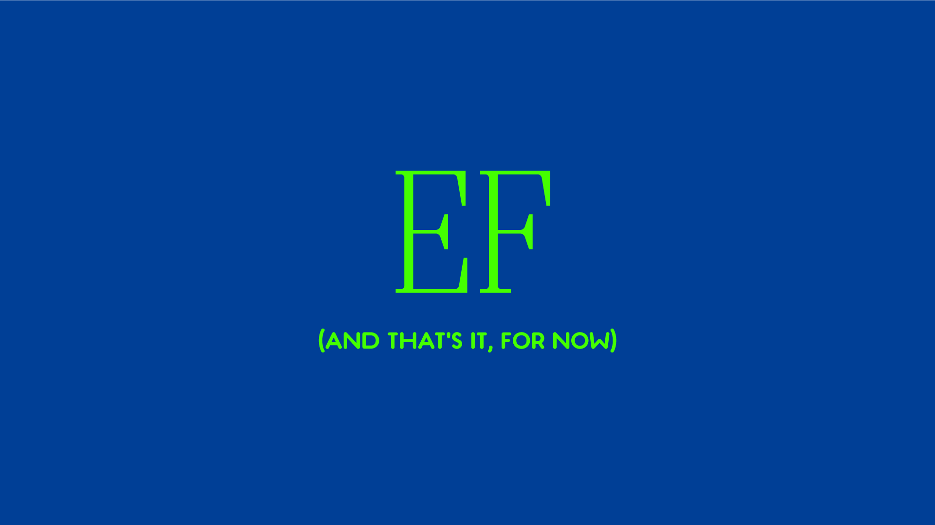
I have only two characters drawn, at this stage: E and F. And their 30 variations.
Now I’m more concerned with prototyping it, or better, to get the tech stuff sorted out before the drawing process; that’s why you’re seeing the same letters over and over again.
As this series go through, expect the tech geekness to decrease (although the next post or two will be about OpenType programming and maybe some Python macro stuff) and the drawing aspects to be mentioned more and more.
But as formal characteristics, the E can tell a lot, in our case. It can tell us quite nicely how the serifs will work, as well as how these elements work with the expansion/repetition. Of course, I’m still in the dark about the curved and diagonal shapes (although they’re playing cheerfully in my head, but that doesn’t mean it will play out properly once drawn).
I’m hoping to draw some very classic, rational and somewhat bland capitals. I want the magic to occur with the variations, not with the base forms.
3. Expanding Processes
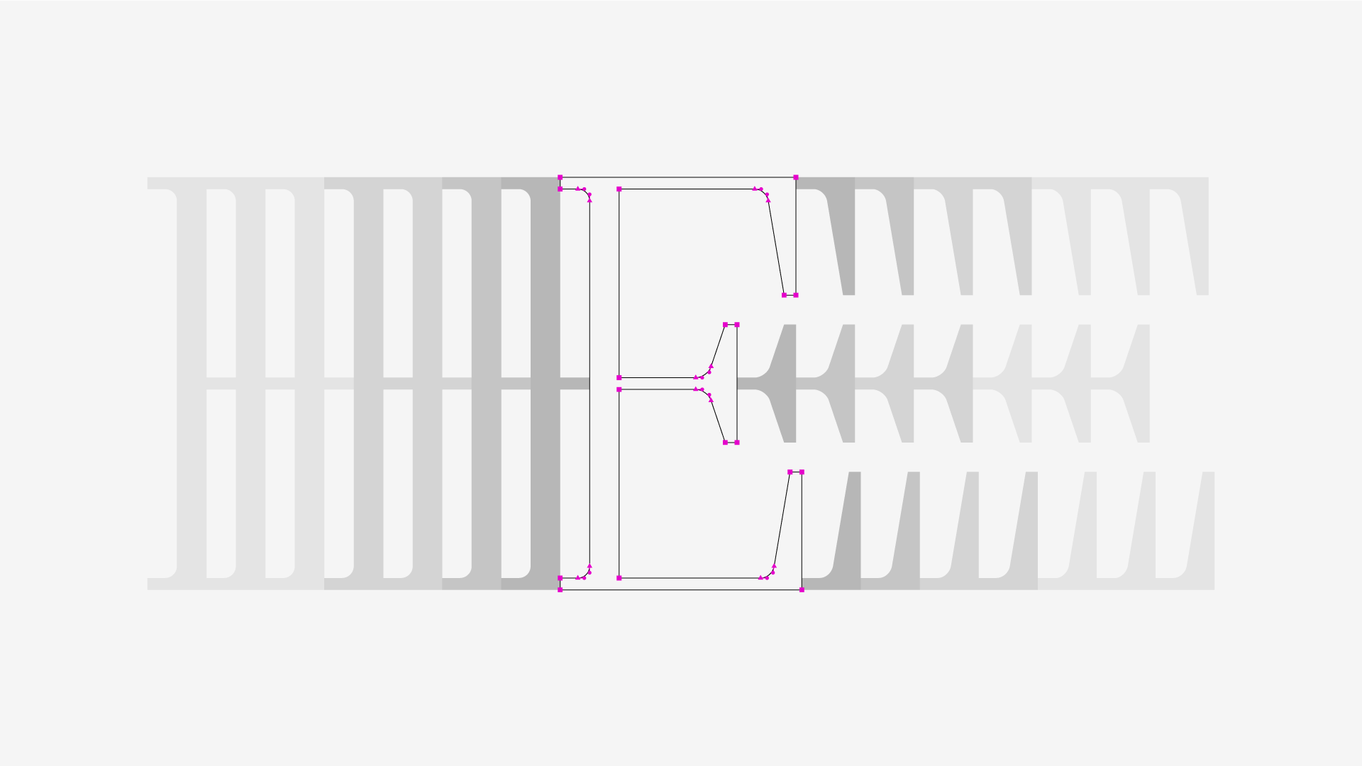
After we have the base glyph, the expansion is pretty simple.
Each glyph is divided in two components: one for the left repetition, another one for the right one. Have a look:
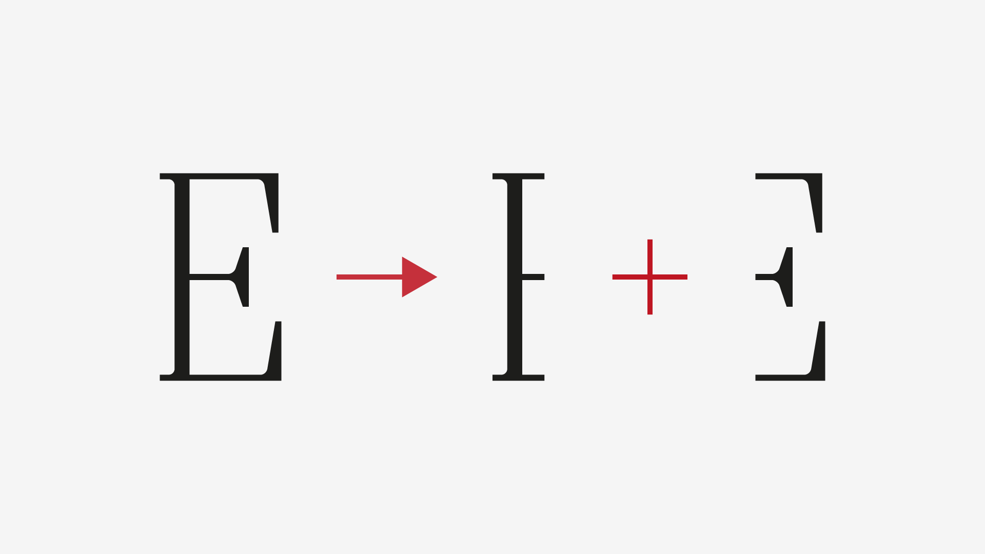
I’m sure you can tell where this is going now: the components are propagated, on top of the base shape, to left, right or both sides, and so we get the “repetition” styles:
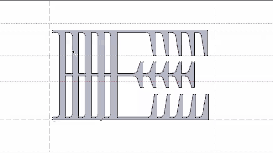
For the “expanded” set, we take the corresponded “repetition” glyph and simply delete what’s not needed. Here’s an animation of the process:
Et voilá!
4. The Math Of Going Overboard
As I’ve mentioned in the previous article, this font will be Latin-only. So, how many glyphs will it have?
I could go for a basic Type 1 Western/Roman character map (256 glyphs), but that would leave some languages aside. So, after the usual checking of language support tables, I’ve decided to go for the OpenType Latin Pro encoding (433 glyphs). If you think, as I do, that this is an OK character table, let’s make some further calculations.
Let’s consider a basic character map (Type 1 Western/Roman): 256 glyphs. As we saw on §2, we have something like 30 stylistic sets. Added with the default glyph, we have 31 variations of the same letter. How many glyphs are necessary for this? Here you go:
256 × 31 = 7.936
7936 glyphs. Ouch. And what about the OpenType Latin Pro?
433 × 31 = 13.423
Holy s***. Well, this might take a while.
But giving it a second thought, this font is all-caps, and that means that half of the alphabet is a duplicate. So, instead of 433 glyphs to draw, we have 310:
310 × 31 = 9.610
OK, this looks more manageable. *sighs*
5. Wrapping Up
This is all for today! I hope you’ve enjoyed the article!
If you’re a newcomer, be sure to read the previous post of this series an, while we’re at it, check the rest of the blog for some more juice! Oh, and don’t forget to subscribe at the bottom of this page, as well as to share it, if you think it’s valuable!
Thanks for your attention! Cheers!