0. Introduction
So, yeah, I’m a type designer. And there are numerous situations where I end up stating that “I make fonts”, so that people can have an idea about what I do for a living.
But drawing letters and packing them into working fonts is just a slice of it: I very often find myself fixing other peoples designs. And while it might seem obvious that I would be fixing other people’s typefaces (it has happened on ocasion, though, but when other type designers ask me to help them it gets closer to a mentorship than me doing the designing work), I end up doing logotype calibrations.
1. Logotype Calibration?
Isn’t it just redesign?
“Just”. As if redesigning isn’t a lot of work. But then again, what is logotype calibration, anyway?
Imagine this situation: you’re working in a branding project and, as such, you end up with a logotype. But something’s off — the form is wonky, it doesn’t work with the typefaces you use, it doesn’t survive small sizes and so on — this is where I usually come in.
If you want to check out the process, here’s a video where I go through most of the process of calibrating a logotype (size-specific calibrations were discarded here):
Note: Thanks to Both Bou for agreeing on letting me use his work for the video!
2. When Do I Need My Logotype Calibrated?
Always.
— Yeah, alright, Fábio, nice self-promotion move. [sarcasm]
— Thanks. [sarcasm]
But seriously, always. Or better, there’s only one situation when you don’t need your logotype calibrated: when you don’t have one.
And this doesn’t mean you need to hire someone to do that gig for you: with practise, knowledge and time, anyone can make an impeccable job.
Still, let’s suppose that you’re hiring someone to do that for you. When should you call them on board? There are two optimal situations that makes this smooth sailing:
- Your logo is done, but could be better and you don’t know how nor why;
- You need to fine-tune it to several applications (sizes, media and such).
3. Not My Logo
I’m a strong believer that, in this type of gig, I have to respect the designer/studio’s work and take it as not being my own. Any alteration has to be done within reason and not by whim:
- I’m looking at the visually applied results of a brand strategy, not at the brand strategy itself;
- The designer/studio has it own pipeline and process and I shouldn’t interfere with that (a small detail change can hijack and stall the whole branding project);
- It’s a calibration job, not a logotype design job.
Although I take some liberties, the need to respect what was given to me is always in the back of my mind. I don’t want to be creative about it, someone already has done that.
The thing is that someone is trusting me their months-long work to make it better. Someone has put a lot of care into this, probably has time and budget constraints and this is, most likely, a tiny (but very central) fragment of a much larger project.
4. Fine-tunning Form
Form is the singlemost important element in Design.
We need to adapt forms to whatever use and perceptual situation we decide to. So, though it seems like I’m stating the obvious, the whole process of calibration is form correction and/or optimization.
Since examples work great, here’s a mini case study: the Swedish studio Identity Works! hired me to correct a logotype for Hotel At Six, in Stockholm — which led to a custom typeface, but that’s a story for some other time —, where the first step was to correct the form and composition in general, fixing curve smoothness, intersections, spacing, stroke width and some other minor details. Have a look:
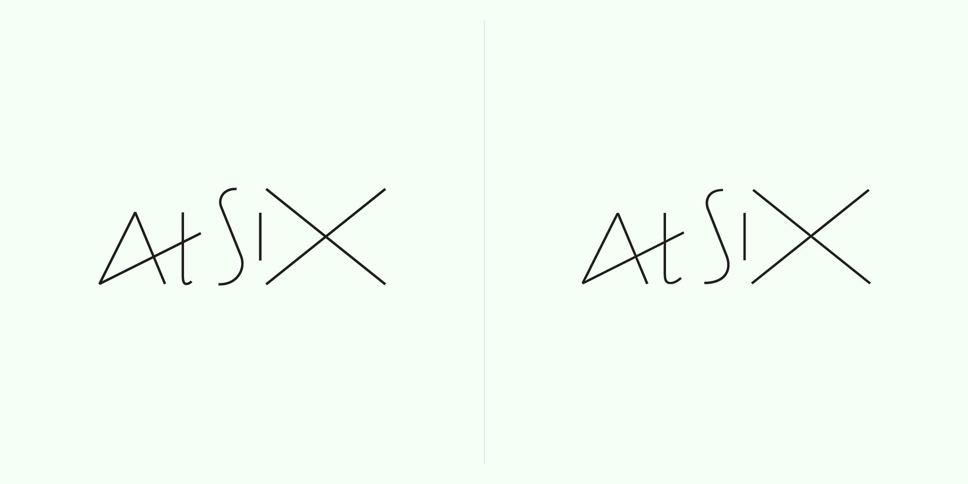
As you can see from the image above, they sent me a pretty well developed logotype that pretty close to what it should be.
Still, there was a back-and-forth discussion with the project’s Art Director (props to Nuno Coelho, he was always so nice and dilligent), testing versions of small details, a lot of time spent looking through a magnifying lens and a completely non-eco-friendly waste of paper.
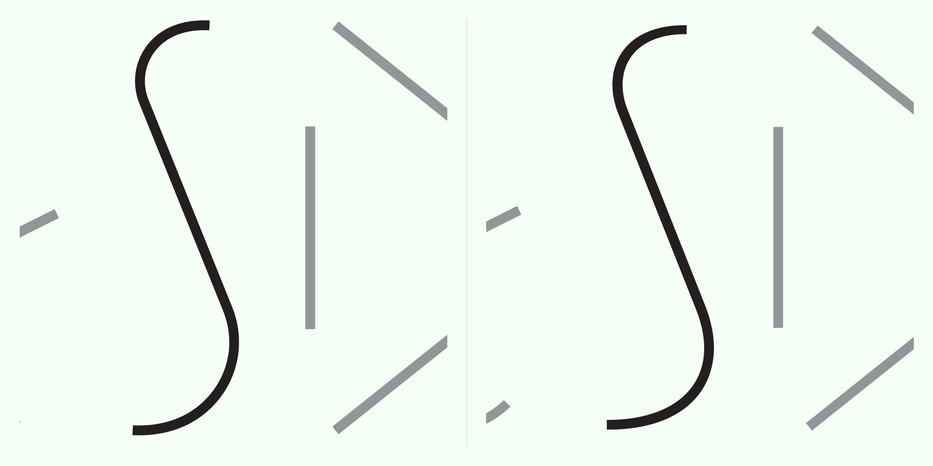
So, the first step was to strive for a harmonious shape, with the concern of making it to visually flow smoothly. The most obvious detail is the t‘s bottom-most part, that was too shy in the original. But, for example, the S was too lumpy, out of being too geometric:
The greater amount of time in the development of this project was to get the inktraps just right. Gladly, this was a size-specific design and I could test the final media with satisfactory accuracy, so the stroke widths, intersections and curves were tweaked until I couldn’t make it better. The result was this assymetrical beauty:
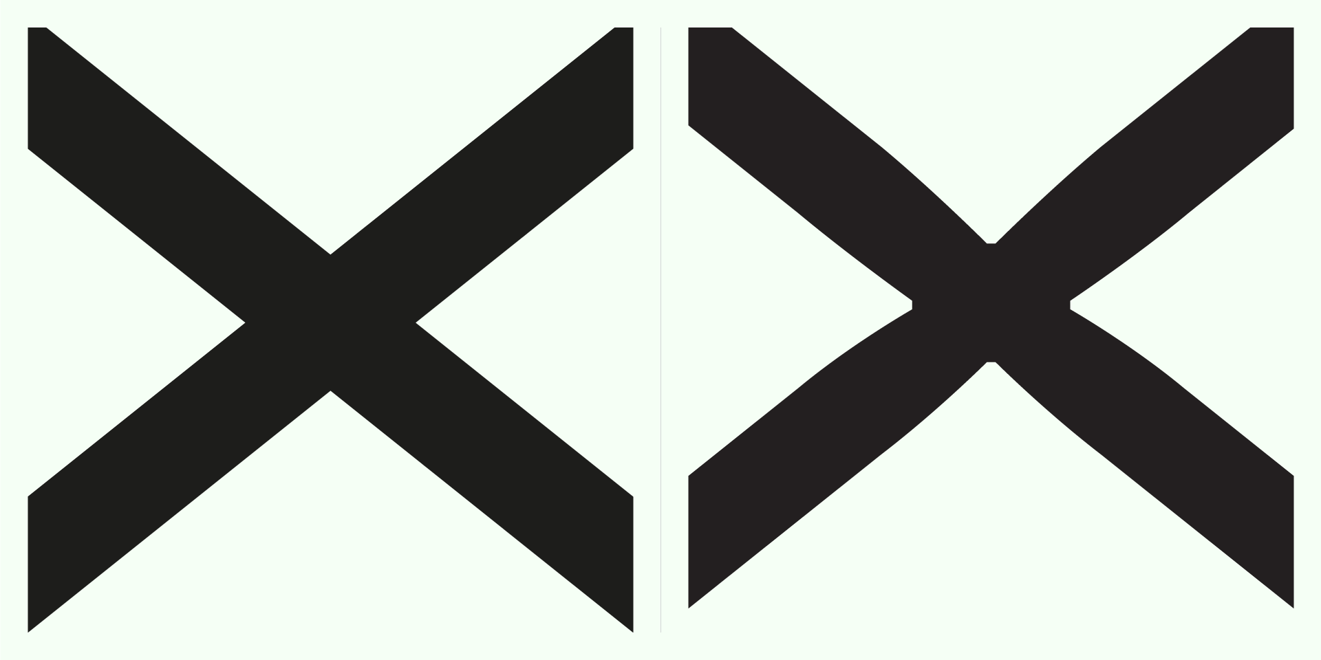
Working with such thin lines, on the threshold of being ignored by the rasterizer, is a challenge. It’s, in fact, a crash-course on microtweaking, where 1/1000 nudges make a difference. Stroke modulation (yes, it has modulation) has to be perfect, since any difference in tension surfaces immediatly. Visual mass is so little that is unforgiving — which means this project was really fun for me.
5. Applications
In a branding strategy, a logotype can appear in a wide array of media and sizes, through a wide array of processes. Digital and print are vague terms that encapsulate formats, rasterizers, printing methods, papers, software, screens and so on. The list is endless.
To predeterminate as much of these as possible and to deliver context-specific solutions is key to making logotype calibrations. And there will always be variation, always.
Trying to achieve perfect consistency in applications is to aspire to make order out of chaos. Still, this is the goal.
And, in spite of all the technical constraints and real-world entropy — and with the notion that flawlessness is a myth —, any approximation is welcome.
A logotype is a set of graphic pieces, each one of them context-specific.
6. Conclusion
I hope you’ve enjoyed this article! If so, please share it with your folks!
You can also subscribe to the newsletter below, if you want to keep track with what is going on.
And if you’re wondering about talking to me about it, you can always say hi!
Until next time!