0. Introduction
Today, while I was waking up, I came up with an idea on how to do something that I’ve been wanting to do for a while. But before I tell you what the idea was, let me contextualize you.
I’ve been wanting to cover, log or to make a some sort of journal of the development of a typeface, to share with you guys. Instead of a “that’s how you make this”, I was wondering about a “that’s how I’m doing this”.
It sounds quite simple, right? Just writing small posts about what you’re doing as you go. Seems tangible, not very time consuming and interesting.
And when I say for a while, I mean for months. So why haven’t I’ve done it yet? Well, there’s a lot of factors to the mix, so bare with me:
- I’ve been working in huge projects. If I want to write about something that won’t bore you to death, super families is a no-go. And to talk to you about custom client work would be impossible until released, separating us (me and you) from interacting while something is being made.
- It has to be simple enough. For comprehension sake (and, again, to fight reader’s boredom), the project has to be simple enough. The main goal here is to let you learn something and let us happily discuss it, so I don’t want to push you away with hyper-complexity.
- It has to be complex enough. Am I paying attention to what I just wrote? The answer is yes. The web is flooded with articles on how to do typefaces, so I have to throw something worthwhile to the mix. Also, some tech-geekness can’t hurt.
- It has to be relatively fast to produce. Because type design deals with a monstrous amount of repetition, so I don’t want to ask you to dedicate yourself to pay attention to the same thing, over and over again. And those huge projects need my attention too. *wink*
So, points 1 and 2 have been the major setbacks, which leads us to:
1. So, When I Woke Up…

I love those moments when we’ve been thinking about something in a long time and then, suddenly, it all makes sense. And our subconscious is kind enough to provide pictures along with the solution.
So, I jumped out of bed and doodled in a piece of paper, before I did anything else (and yes, even before I went to the bathroom). Oh, and with my glasses off.
I wanted to get the idea down before I gave it a chance to fade away. And, while I was having breakfast, I decided to do today’s Typecooking image with this idea, so I could test it out. The result is what you can see above.
The result is far from perfect (and it’s not supposed to, as I explained in the previous article), but it did motivate me to get further with this.
2. Concept
There are three (at least that I can think of right now) main influences to this typeface:
- Ondrej Jób’s Woodkit. I love how this one comes together, as a type system: Jób was brilliant in how he used disparity and historical references to make this typeface work;
- DSType’s Diversa and LettError’s Beowolf. I’ve been wanting to do OpenType pseudo-random glyph substitution for a while, and these two are brilliant examples on how to achieve this.
Worthy of mentioning, I also had the pleasure to see some unreleased work from the super-talented calligrapher Hugo Moura (Facebook, Behance) that also played a part on getting to this idea. Since I can’t provide a hyperlink, check his work for some other stuff.
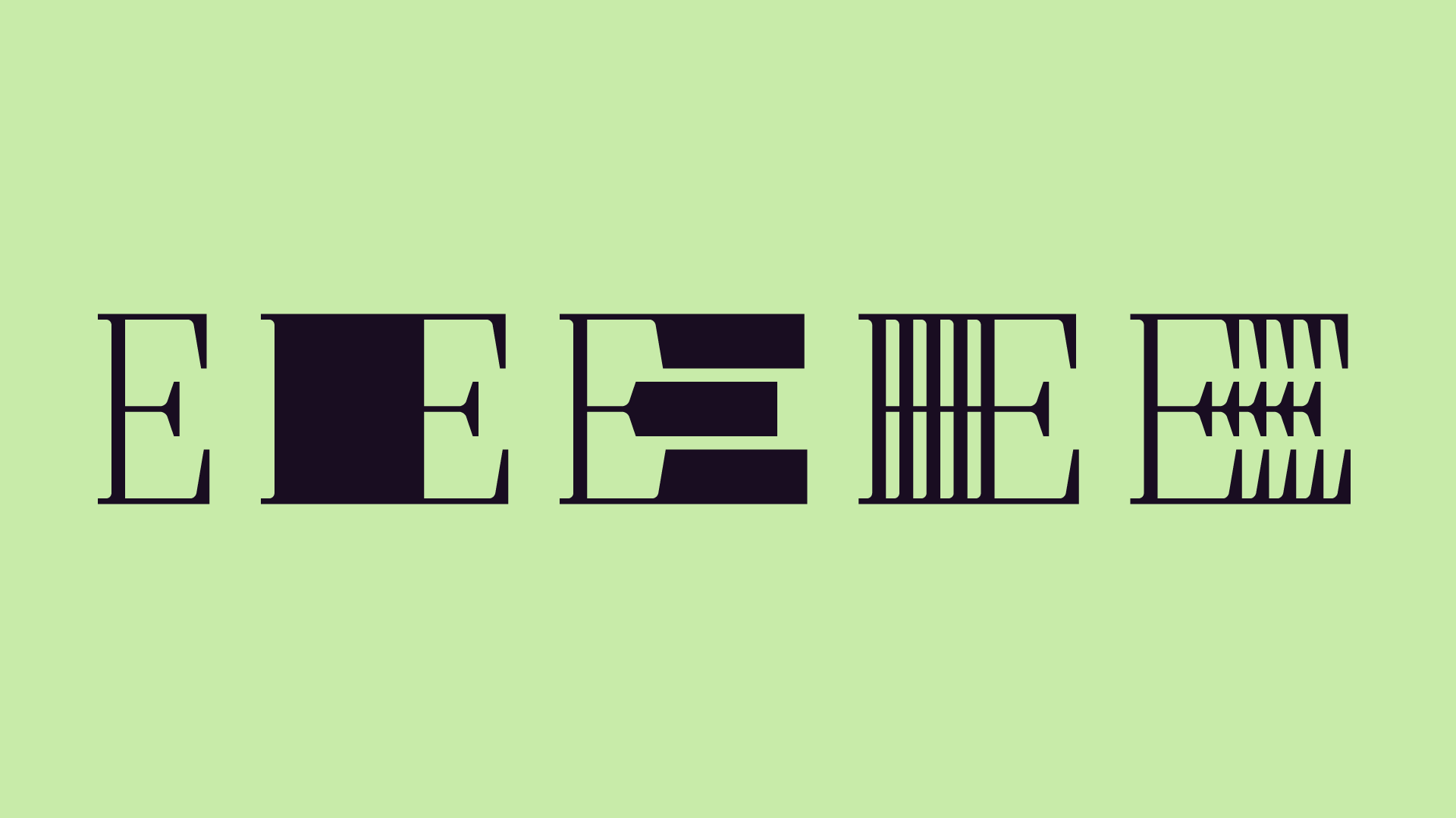
Back on track: the idea is to make a typeface where it’s glyphs grow unevenly in the cartesian x axis, either by stretching or by element repetition, as shown above. And, as the cherry-on-top, the glyphs will randomly change, as you type! Bam!
3. Developing A System

It’s easy to go crazy with this. Not that one shouldn’t, but we surely need a roadmap.
Although a lot can change during the production, I find that the clearer the notion of what we’re doing, the better, since we don’t want to bump into a I’ll have to redo this all over again crisis. I had my fare share of them (and I’m glad I did) and I also don’t want to keep you waiting for a long time.
So let’s enumerate decisions through a question and answer scheme:
- Intended usage? Display. Again, we want this to be fast. Also, this kind of trippy-ness is not very text friendly.
- Gauges/Optical Sizes? 1. For now, since there’s not much of a need for gauges in display sizes.
- Weights? Single. Besides, the distortion here already acts as weight.
- Construction? Capitals. Although slightly weird, I want it to be fairly legible/readable, and lowercase letters would suffer a whole lot more that capitals.
- Where to grow? Sides, for now. Although I haven’t ruled out a middle expansion yet. But I do have the feeling that it isn’t as easy (read fast) as it might seem, specially in vertically symmetric shapes. Again, for now, expansion of the side stems, one at a time.
- Style? Didot / Bodoni. Vertical stress (or 0º axis) seems perfect for this kind of distortion and the serifs add elements to keep things more interesting.
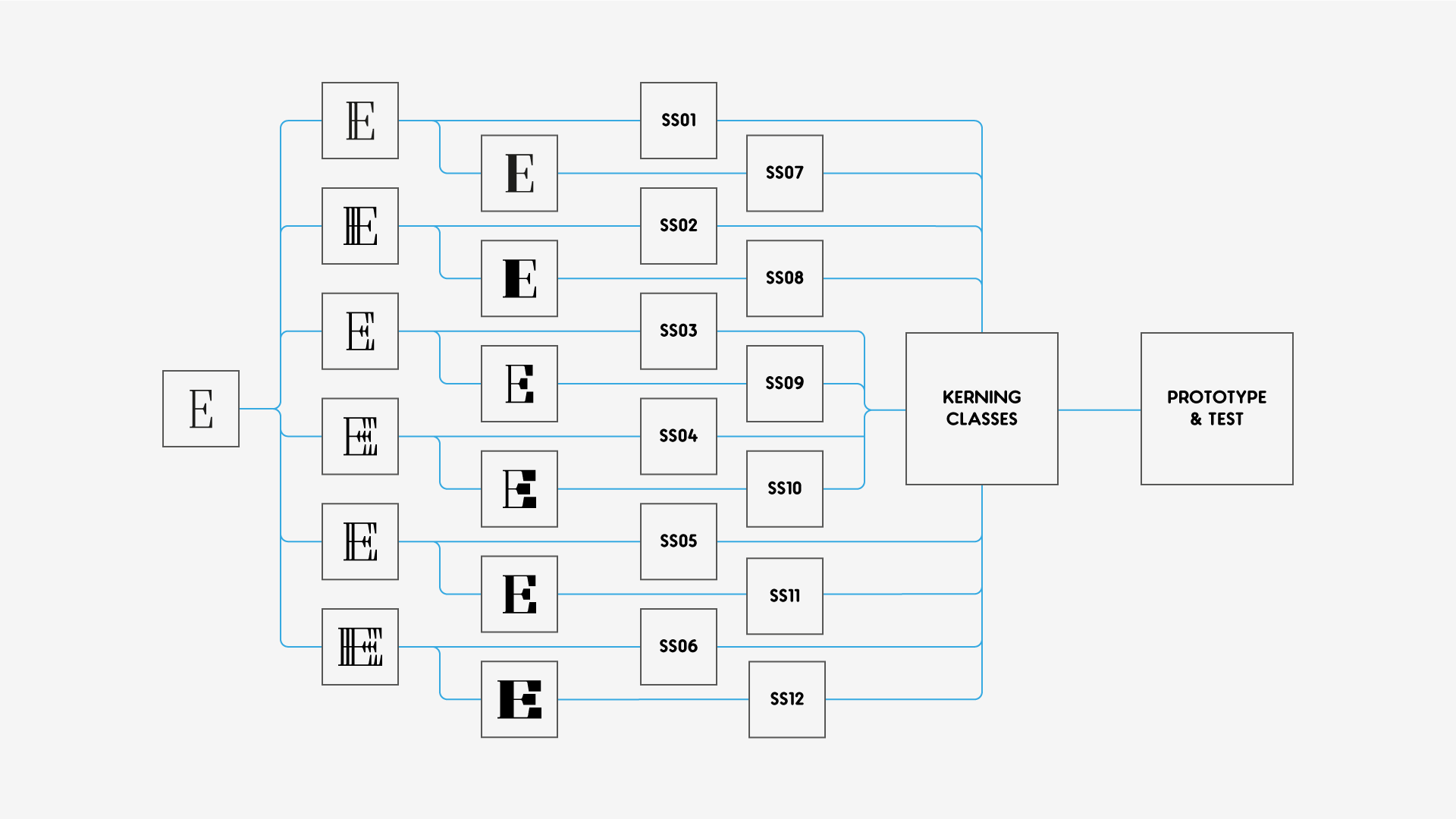
- Stylistic Sets? Indeed / I’ll have to test it out. This typeface will rely heavily on stylistic sets, at least the one with the glyph substitution. The question how many?, however, will only be solved in the prototyping stage.
- Language Support? Latin. Greek and Cyrillic capitals’ construction would welcome this sort of distortion but, for time constraints, let’s stick to Latin.
4. Imagining Processes And Tools
What strikes me as the most obvious way to do this is to start by drawing the unadultered shapes, i.e., the classic capital forms. Since the stylistic variations are distortions of these forms, we need them first to distort, otherwise there is only void. And yes, I’m stating the obvious, again; but bare with me, this will make sense.
After these initial forms, I’ll step to the “repetition” set. Although the “expanded” set is actually easier to produce (heck, I could even just draw two of them and interpolate the rest), the “repetition” set has more constraints when it comes to expansion.
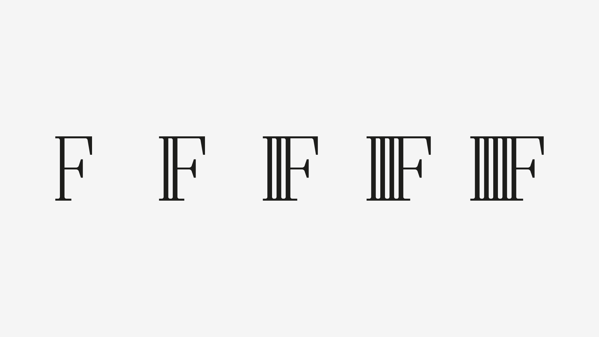
What I mean is that, in the “repetition” set, we can only iterate in specific steps: one bar, two bars, three bars and so on. Here’s an image to ilustrate the idea:
Once these are done, I’ll move on to the “expanded” set. And if I use the “repetition” set as a base, I can simply delete stuff or add stuff to get the effect I need. But the main reason is that I would maintain a width consistency between the two sets.
Although this coherence might seem like something odd in a typeface as crazy as this one, I still want all the sets to speak to each other in a similar language, so they should have common characteristics throughout.
Here’s a thing that I might have mislead you to a erroneous interpretation: when I say that I’ll go through these steps, I mean that I’ll go through them glyph by glyph, not character set per character set. Doing it the latter way would be very dumb of me, since I would be postponing testing and prototyping to later stages of development, what could lead to having to through a lot of work through the window.
So, I like to deal with problems early on. There, I said it.
4.1 Metrics & Kerning
This should be as complicated as if two one set, since the left and right sidebearings, as well as it’s outward shape, doesn’t change. Class kerning, on this one, is a way to go: and the number of stylistic variations of one letter is irrelevant, here.
4.2 Macros
Nothing fancy, here. In fact, right now, I think that I need only one that I already use: a rounding corner script that I modded from this one from Betatype. It’s not flawless, specially with curves, but it’s awesome: it can spare you from some 8 steps and you can tweak the curve tension programatically.
4.3 Encoding
This one will be a tough baby. The glyph map is going to grow lightning fast and it might be wise to keep things under control. Maybe this is the reason I need to update my Font Encoder tool (if any of you wants to help me out with this tool, please let me know!).
5. Wrapping Up
At this point, I believe that we have enough to get this started. And that’s material for our next article!
Thanks for your time and attention, and I hope this article has been insightful for you!
See you in the next article!