If you’re following me on Facebook, you probably know that I’ve recently asked for suggestions on what should I write about. Michał Jarociński suggested that I should do something about legibility, wayfinding and signage.
Curiously enough, not so long ago, I’ve started a thread on Typophile (and a discussion on Reddit’s Typography board) about the function/use of serifs, and, to my surprise, it escalated very quickly to a derby between serif and sans-serif type and which one was the most legible: but I’ll get back to you on this, in a bit.
But this led me to Kevin Larson, Microsoft’s researcher on reading, who was kind enough to exchange some e-mails with me, happily providing me some papers on the matter.
So, since you now know the path leading here, I hope provide you with some insightful knowledge about legibility — or what makes type more legible —, in order to help you improve your type designs (if you’re a type designer or letterer) or to help you refine your typeface selection process (if you’re a graphic designer).
And cabbages. Low in fat.
Without further ado, here’s the juice:
1. Letter, Word, Paragraph
First of all, it should be a no-brainer that, when we talk about rapid-letter recognition, there are multiple levels of the letters’ context (or, let’s say, relationship between other letters) that have an effect on how we recognize letter-forms.
So, as you might have wondered, a single letter should be recognized faster than one within a word. And its position in the word affects it’s recognition. And leading has an effect on this too.
Edit: Hrant Papazian has already provided some insights in my first article about Bézier Curves, and he did it again.
In spite of the previous statement, reading is a way more complex event than simple letter-by-letter construction. The bouma model suggests that we read through clusters of letters and only go through the letter-by-letter process in case of uncertainty.
I sympathize with this idea because it’s more economic, brain processing wise. To keep it simple, while reading, factors like grammar, word expectancy, word form and so on, are not to be excluded when we think about the reading experience.
*edit end*
Keep also in mind that, by definition, legibility is not the same as readability, although, in practical terms, they are particular focus lenses of the same thing. We’ll talk primarily about legibility (the formal properties of a glyph that improve their instant recognition), but it would be a major fault not to mention readability issues (such as spacing, texture and so on).
Edit: This kind of research is still on its infancy, so keep in mind that these suggestions are a mix of what has been researched, empirical experience and my own opinions on the matter.
At the same time, the parallel-letterwise model that you can find in the third reference is still disputed, and very brightly, by Papazian, in Typo13.
*edit end*
But how to improve this? Well, I’d like to talk about something else, first.
2. Familiarity
I have a memory of when I started tying my shoes, without an adult to help me out: I remember being the the kindergarten’s corridor, puzzled, trying to figure out how to do a neat bow and how the laces could make such form. It took me a while, I guess. I remember it as being a challenging task, since I was alone (yes, you could be alone in kindergarten, in the 80’s [well, at least here in Portugal]), and I was trying my best. I don’t even know if I’ve managed to do it properly, I just remember that I did something with it and that it filled me with proud.
Today, I don’t even remember when I tied my sneakers.
It’s part of our cognitive process to forget that we know how to do something: we end up just doing it without thinking. That’s why we can talk and write, for example, without a colossal effort to construct meaning, spelling, grammar and so on.
And the same applies to reading, i.e., recognizing letters. The more we are exposed to a certain typeface and the more we interact with it, the easier it is to rapidly recognize it.
I know this sounds like I’m stating the obvious, but consider the implications that this has on any study about legibility. Imagine gender differences on this matter. Cultural differences.
So, we should be very careful to engage extrapolations on legibility and readability, because this factor alone can sabotage our conclusions, so address this article (and others) with a critical mind.
Edit: Kevin Larson directed my attention to an issue regarding familiarity: even though we read best with typefaces we know best, we’ll do just fine at reading well-designed brand new typefaces. *edit end*
But before you go and use Helvetica on everything from now on, please read along. *wink*
3. Spacing & Kerning
As was implied in §1, the amount of white space around to a letter influences it’s legibility, thus having an impact on readability.
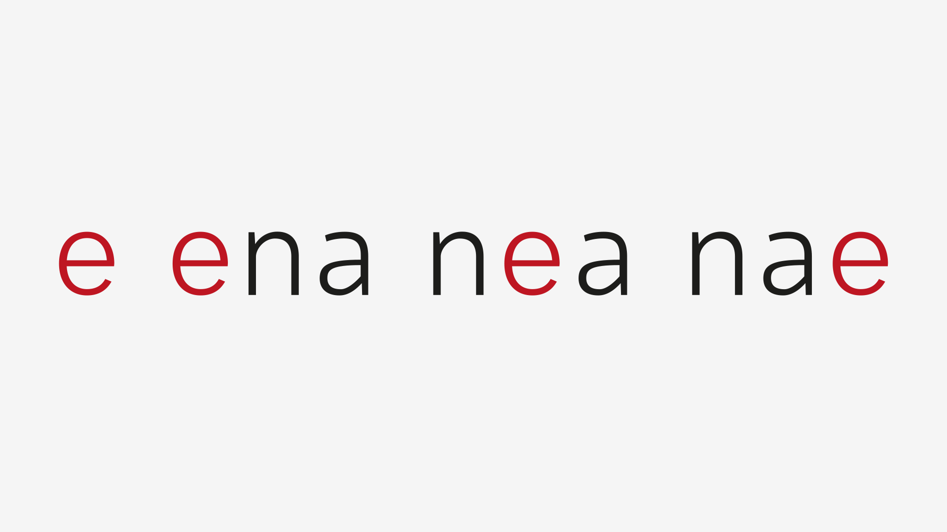
But what effect? Well, if the tracking is too tight, letters will clutter and we might mistaken two or more character for another one; if too loose, we might have a hard time figuring out if a character is in a word or not.
Here, have a look:
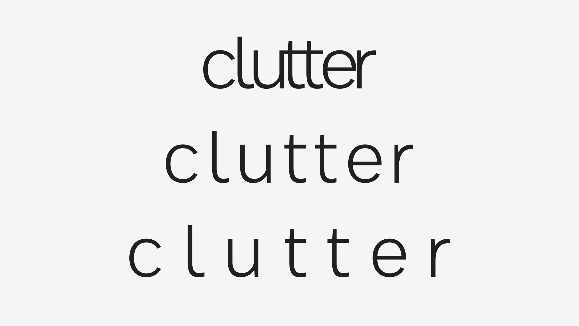
As you can see in this example, in the first row, it wouldn’t be odd to mistaken the c and the l as being a d. And even by knowing that it’s the same word, probably you slowed down while reading the last line.
Spacing should be set to produce an even rhythm throughout the texture; altering this rhythm produces a reading experience similar to a ride in a car that has a choked engine, prone to hiccups.
3.1 Size-specific Spacing
Loosening the tracking slightly is not always a bad thing to do. In fact, in order to improve legibility and readability, it’s a good practice to open the tracking as you go down or/and if you’re working with very small resolutions.
Here’s a quick test to see how legibility survives deterioration: Gaussian Blur + Threshold.
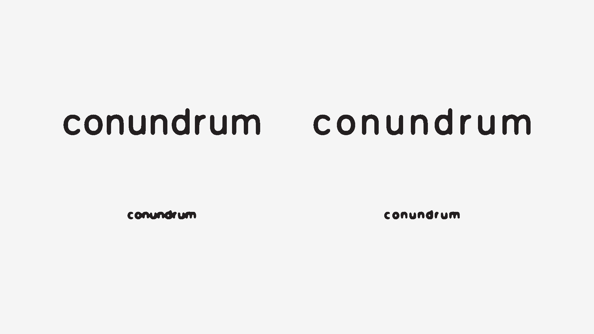
As you can see in the image, the top-right word is spaced to loosely for such a big size; but its reduction (bottom-right) keeps a better quality of letter-recognition.
As for tight tracking in big sizes (you were wondering about it, weren’t you?), it’s sort of a different case. Is not as damaging, of course, since there’s more room for outlining the letter with the eyes, but it’s not actually an improvement; just more tolerable.
Still, since big type takes more room, it’s tempting to reduce the tracking: it’s OK, but don’t go wild with it; you’ll know some more tricks to go around this as you read along. And cabbages.
4. x-height And Vertical Proportions
It’s a widespread idea that a big x-height improves legibility/readability, but I have to say that this idea is an over-simplification. Not wrong, but a distortion by simplification, nonetheless.
Imagine that you’re designing a newspaper. Or a typeface family for a newspaper, same story. While it’s desirable to have a large x-height in the text typeface, it’s kind of irrelevant to do the same for the headline cut, right?
Now imagine that a newspaper contacts you to tweak their typeface. They want to keep the same char count, the same number of lines, but they feel that their text typeface is too small. Increasing the x-height seems logical.
But here’s the drill: the ascenders and the descenders, in proportion, as well as the caps, will shorten, considering that you want to keep your line-gap free from clutter. And you should be careful with this because…
4.1 Ascender And Descender Retraction Takes A Toll
… on cabbages. Er… I mean, on legibility and readability.
Consider the following animation:
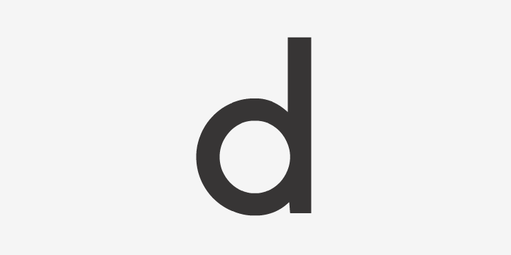
As the x-height increases, the Futura-like d slowly starts to resemble a single-story lowercase a, increasing the probability of mixing those two.
And be aware that, since we scan words from their top, we leave the bottom of the words to a more peripheral part of our focus; this means that the descenders should be slightly longer than the ascenders.
Or, as Kevin Larson, via e-mail, has told me:
“We found in our studies of Sitka that a large x-height came with a trade-off; While the large size helped the neutral height letters, it hurt the ascending and descending letters.”
Note: let me remind you that this is not an absolute truth – in §6 we’ll cover another aspect that can compensate this retraction: it’s always a compromise of multiple factors.
5. Counters

Open those counters!
This is actually one of the beefs I have with Helvetica, so you can imagine my surprise when Apple chose it as it’s UI font. But my jaw dropped when Apple stated the following:
In OS X Yosemite, fonts have been refined systemwide to be more legible and consistent across the Mac experience.
More legible? Seems like I missed a breakthrough research paper that contradicts centuries of type production. *long live sarcasm!*
But lets give the benefit of the doubt and round our quick Gaussian Blur + Threshold test, and pair Helvetica with another UI font: Microsoft’s Segoe UI (because it’s Apple’s main competitor and has a bigger counter aperture).
Here’s Helvetica:
And here’s Segoe UI:
If you’re still not convinced, step away from you computer and squint your eyes, shake your head, look away and back for a glimpse, decrease your monitor’s brightness, print it in a bad inkjet printer at a very small size and see which one performs better.
So, for low road mortality and low carbon-emission sake, keep Helvetica out of roadsigns. And cellphones – because no matter how stupid it is to text and drive, people will keep on doing it. Or get hit by a car while crossing a street without looking away from their cellphone, who knows.
Cabbages don’t cross the road staring at their cellphone.
6. Character Variation

This is one of the most important aspects of type design, regarding legibility.
While this is somewhat self-explanatory, here’s the rule of thumb:
The more distinct the glyphs are, the better.
It’s harder to tell twins apart, even though they have differences. So, as you can see in the images in §5, it’s easy to mistaken characters if they’re formally too similar.
Edit: Although obvious, this has an effect on the word level: glyph variation also increases variation in the word form, reducing ambiguity. *edit end*
But try not to build a Frankenfont: changing letterforms too radically, style-wise, creates confusion, slowing fast-recognition big time. And in the same idea, be sensitive about the amount of elements added to letterforms, since it might produce cluttering.
6.1 Serif versus Sans-serif

Remember, in the introduction, where I mentioned the discussions about serif’s functions on Typophile and Reddit that ended up in a derby between serif and sans-serif type? Well, now we have enough information to discuss this properly.
So, the answer to the question Which one is more readable, serif of sans-serif type?, the answer is No.
Following the motto there are no bad answers, only bad questions, this question is one of the bad ones. Serifs don’t automatically make type more legible (although they can help with character variation) and sans-serif simplicity is not always a plus.
It’s always a contextual matter and we have no empirical evidence that suggest the superiority of one of the styles.
So, why are sans-serifs almost universally used in signage and serifs in books? The answer is: available space and clichés.
Don’t get me wrong: clichés are a good thing, in this subject. If we’re aiming for legibility/readability, not clashing with people’s expectations is a good thing: we don’t want people crashing in the highway because a sign is set in Sabon, neither we want to read a romantic novel set in Comic Sans (although better than in Helvetica). *now I’m imagining the interwebs going rage on me!*
As for available space, serifs take more space than sans-serifs. Simple. And we want street signs to have big type on it, so we can read them from afar; in the same logic, in small type and longer lines of text, sans-serif create a kind of moiré effect in the texture, which is undesirable, since it requires effort.
Edit: And type size and word amount! I’m sorry for leaving this one out (props to Hrant Papazian, again)!
While we’re driving, it’s logical that a special focus on letter-by-letter recognition is paramount. Type is huge, and only one or two words are set per line, so it’s fast enough to decipher form and meaning.
But while reading a book, where there are a lot of words in a texture and type is set in a much shorter viewing arc, the bouma model fits best.
So serifs, in large chunks of text, have several advantages over sans: letters are “fused” together, the word shape has variety, white-space vs. rythym has diversity, and so on.
But I might be wrong.
*edit end*
7. Width
This is another size-specific subject, under the condition of legibility improvement; I mean, if we set aside aesthetic considerations, some width adjustments can help with legibility.
Lets say that every time that you need to move your head (while looking at large type) or move it forward (in the case of tiny type), glyph width can help. With this said, we can conclude that small type is more welcoming of wide glyphs, while big type is more welcoming to condensed ones; although the case where the latter most benefits is when really, really large type is used and at a very short viewing arc.
And this leads us to…
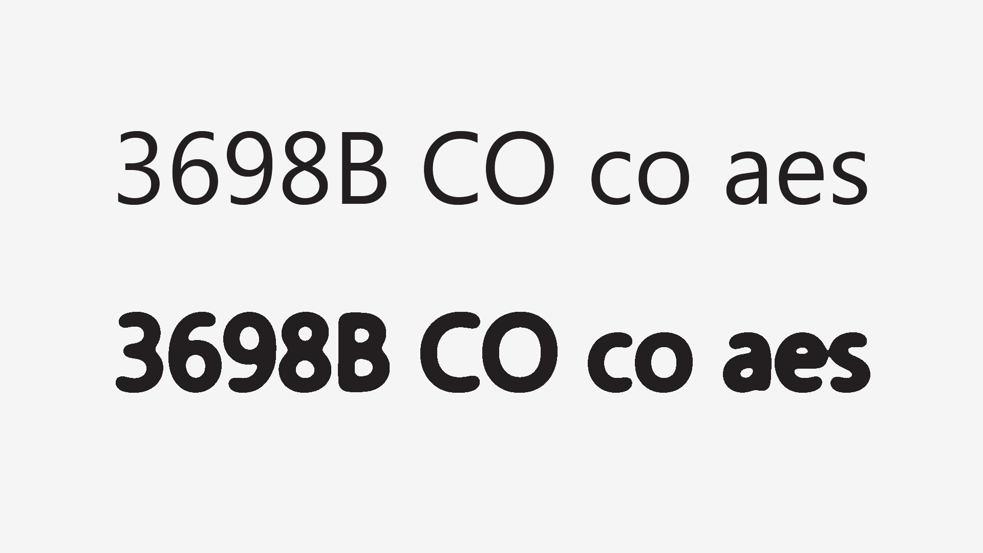
8. Weight & Contrast
As you might have guessed by now, finer details don’t survive deterioration.
And if you think that this is a technological problem, such as pixel density or printer resolution, think again.
Imagine the following scenario: you have three different size circles and you want them to have the same stroke width, like this:
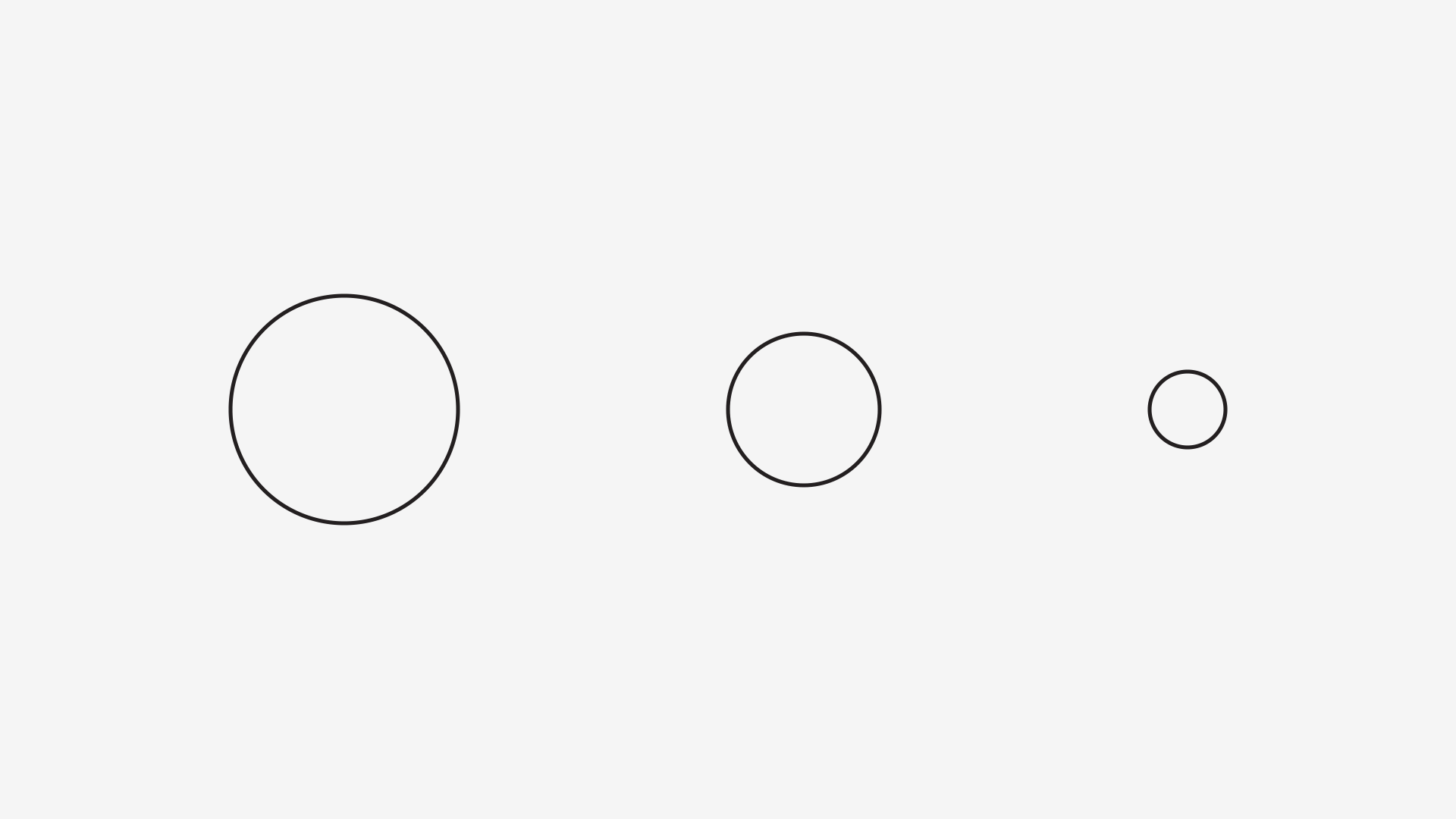
If I asked you to scale the circles to the same size, would they have the same stroke width? Of course not.
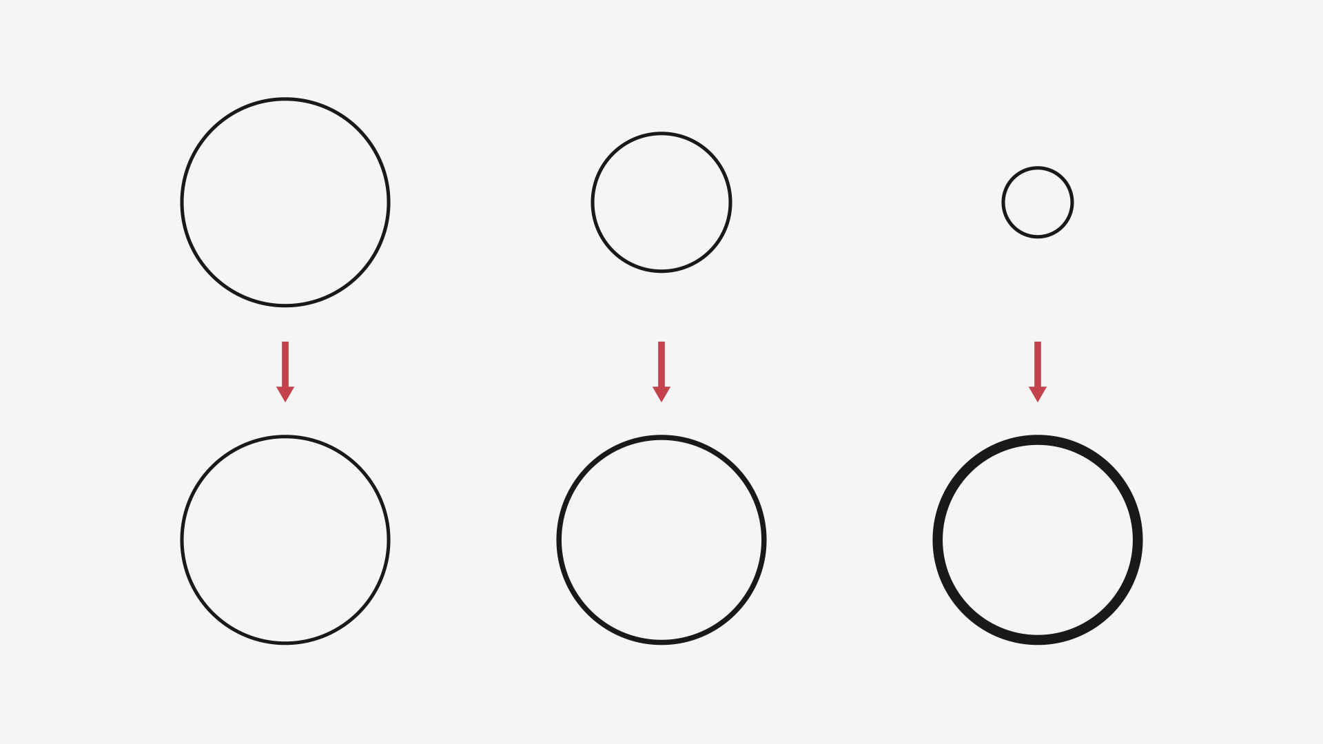
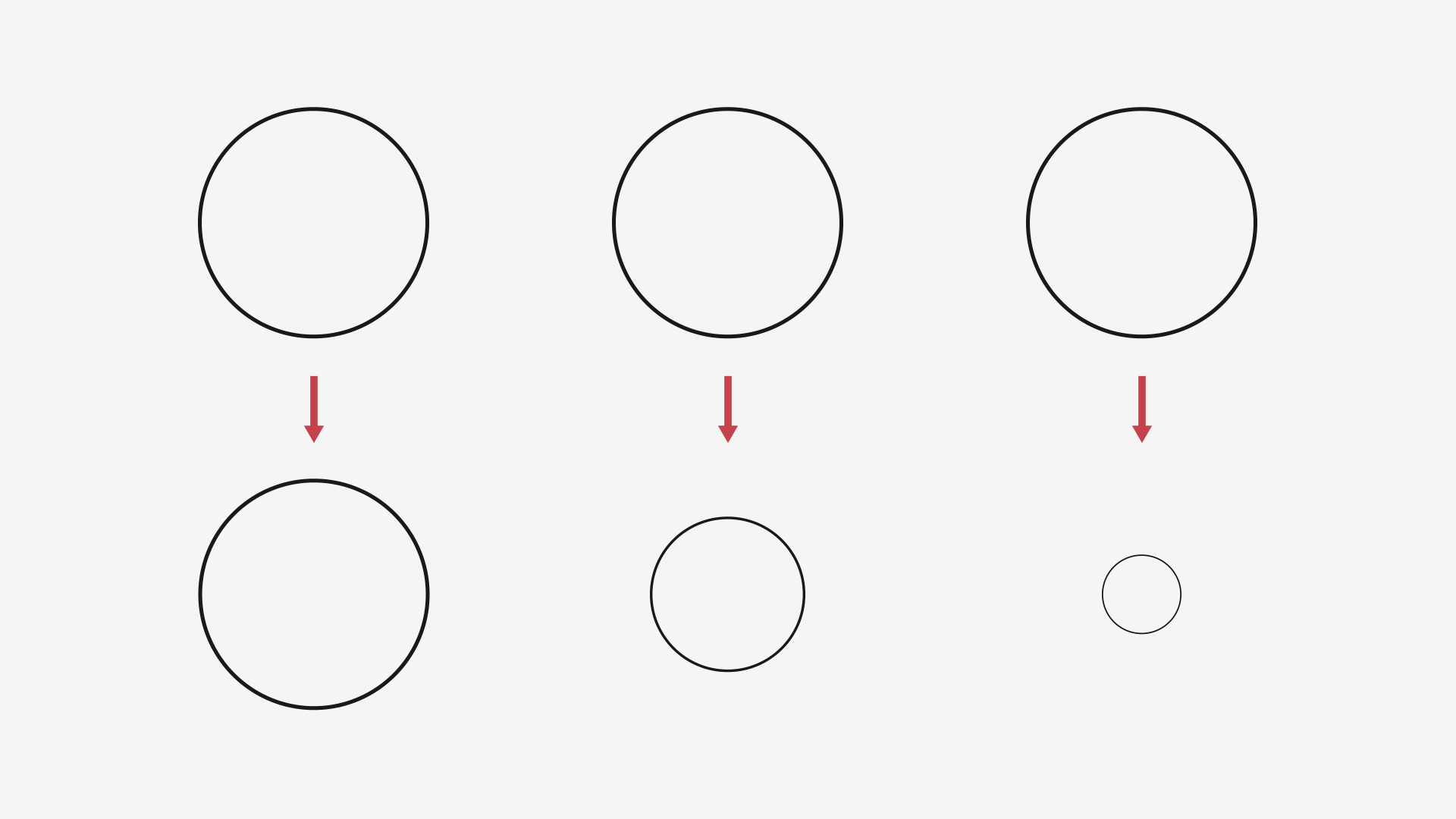
With a font, the exact opposite happens: if you have three circles with the same stroke width and scale them to different sizes, what happens?
If you think that I’m stating the obvious, man, I’m with you. But as simple as this might seem, it’s a good reminder of the kind of compensation necessary for different type sizes and a good starting point for size-specific designs.
In fact, I usually start a typeface by printing a bunch of circles and squares with different stroke widths at different point sizes, just to see how thin can it bear. And I do it again once I start adapting it to smaller and bigger sizes.
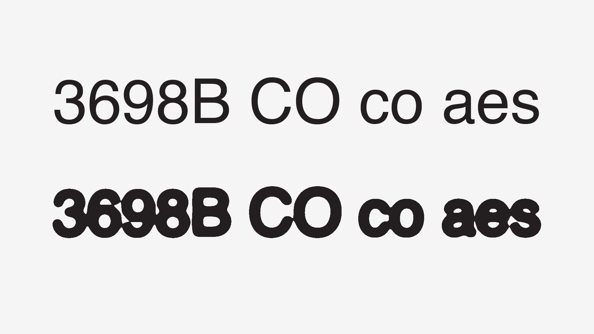
So, as a rule of thumb:
The smaller you get, the lesser should the contrast be.
But this doesn’t mean that you shouldn’t pay attention to the thicker parts of your strokes; in fact, you should thicken them even a bit further.
It’s like having a stroke around your design: comparing the thicks and thins, the thinner parts will thicken more in proportion than the thicks.
To illustrate this idea, remember the image that opened this section? Here’s how it looks if we scale the type to the same size:
9. Conclusion
I hope that you’ve enjoyed the article and the cabbages!
I’d like to thank Michał Jarociński, for the suggestion, Kevin Larson and Hrant Papazian for the helping hand and you, for your attention!
So, if you found this helpful, please be so kind share the article with your friends or go shopping for some fonts, so I can keep writing these!
And don’t forget to check the Further Reading and References section, below: there’s more awesome stuff there!
Cheers to you!
Further Reading and References
- The Aesthetics of Reading – Larson, Kevin & Picard, Rosalin (PDF)
- Size-specific Adjustments to Type Designs – Ahrens, Tim & Mugikura, Shoko
- The Science of Word Recognition – Larson, Kevin
- The Development of the Signage Typeface Wayfinding Sans Pro – Herrmann, Ralph