0. Introduction
If you ended up here, you probably heard about Optician Sans. I mean, it’s everywhere, from Fast Company to Gizmodo, introducing me to the experience of finding time to do e-mail and podcast interviews. I have even considered turning Behance notifications off, due to the constant phone buzzing (yes, I have now turned the vibration off for notifications – #smartFábio).
If this sounds snobberish, arrogant and ungrateful, it’s quite the contrary: I am flabbergast about how this came to be: all of this attention was completely unexpected to me.
Part storytelling, part making of, part as an outlet to process this phenomenon, I’m writing this so I can tell you what this typeface is and how it came to be in a degree of detail that I couldn’t do otherwise.
Alright, let’s do this!
1. The Backstory
1.1 Hello Reddit! Hello Simen!
After Optician Sans’ release into the wilderness that is the Internet, during a videocall to plan some stuff, I asked Simen Schikulski how he found me.
Simen is a gentle person, soft spoken and with dreamy eyes, that – once the conversation gets going – unveals his excitement and inner drive from his quiet demeanour. And he happens to work at ANTI Hamar, the Norwegian studio that commissioned me the production of Optician Sans – in fact, he was the person who started the typeface.
It was on Reddit: you offered me help to finish the typeface!, he told me. I had completely forgotten about it.
Simen’s post on /r/typography caught my eye for two reasons: first, I usually go around the subreddit to help people out; second, because it was about optotypes – at that time, I was researching about it myself to produce materials for my Masters’ students.
2. Optotypes
2.1 Optotypes?
Hold on, what’s an optotype? Right.
According to the Merriam-Webster entry on optotype, we have the following definition:
Optotype: figures or letters of different sizes used in testing the acuity of vision — usually used in plural.
Even if you are in no need of glasses — and unless you live in North Sentinel Island (how did you get an Internet connection over there, by the way?) — the chances are that you’ve had several close encounters with optotypes, most likely through a Snellen or LogMAR chart.
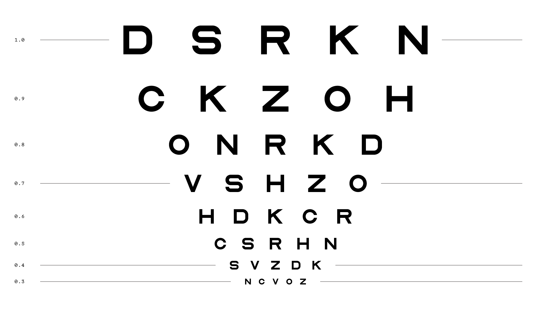
For a long time, looking at these at the optometrist and/or physician, I’d think something in the lines of oh, that’s horrible!, considering them poorly designed. This was, of course, a conclusion out of my own ignorance – but they still look ugly, though.
2.2 Visual Acuity, Not Legibility
In the midst of all these articles and interviews, I stumped into a widespread idea that was somewhat surprising to me – that optotypes are more legible. They’re not.
In fact, if optotypes were constructed to be highly legible, it would defeat its purpose: these are built to measure visual acuity, i.e., to test how capable your eyes are to distinguish between small details. As you can deduce, ambiguity is somewhat key and, as I stated before, ambiguity isn’t really legibility’s best friend.
But how is accuity measured? Why these charts?
Erik van Blokland has explained this way better than I could, but I’ll still try to summarize it:
If you have noticed at the optometrist, you look at the chart from a specific distance. And each optotype size corresponds to a different angle from your eyes’ lenses.
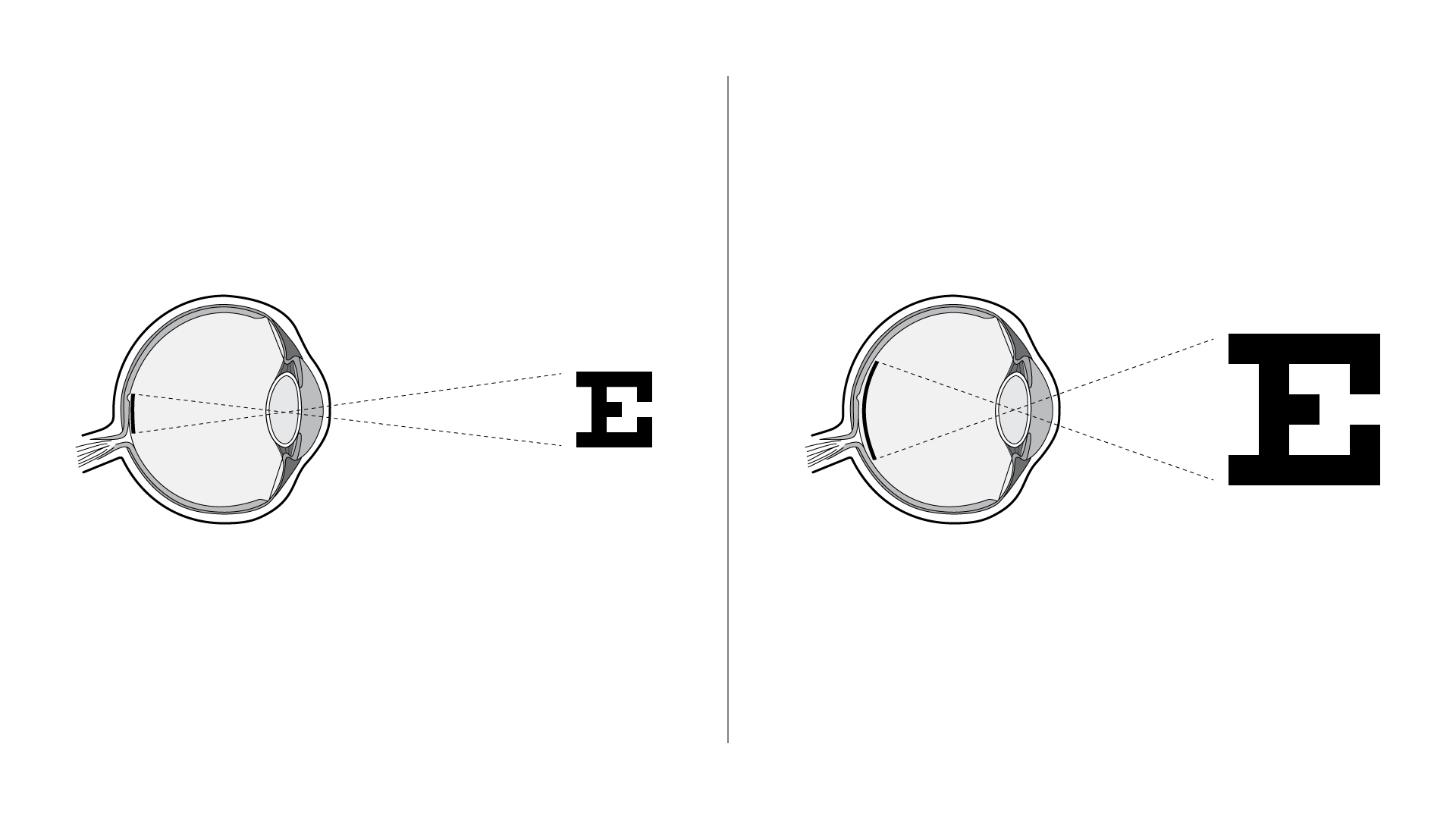
If that image projects itself onto your retina at different angles, the smaller the angle, the less photoreceptors are being used to see that figure.
For example, the 20/20 line corresponds to 5 arcminutes and we then know that around 10 photoreceptor cells are being used (in the fovea, where the highest concentration of cones is).
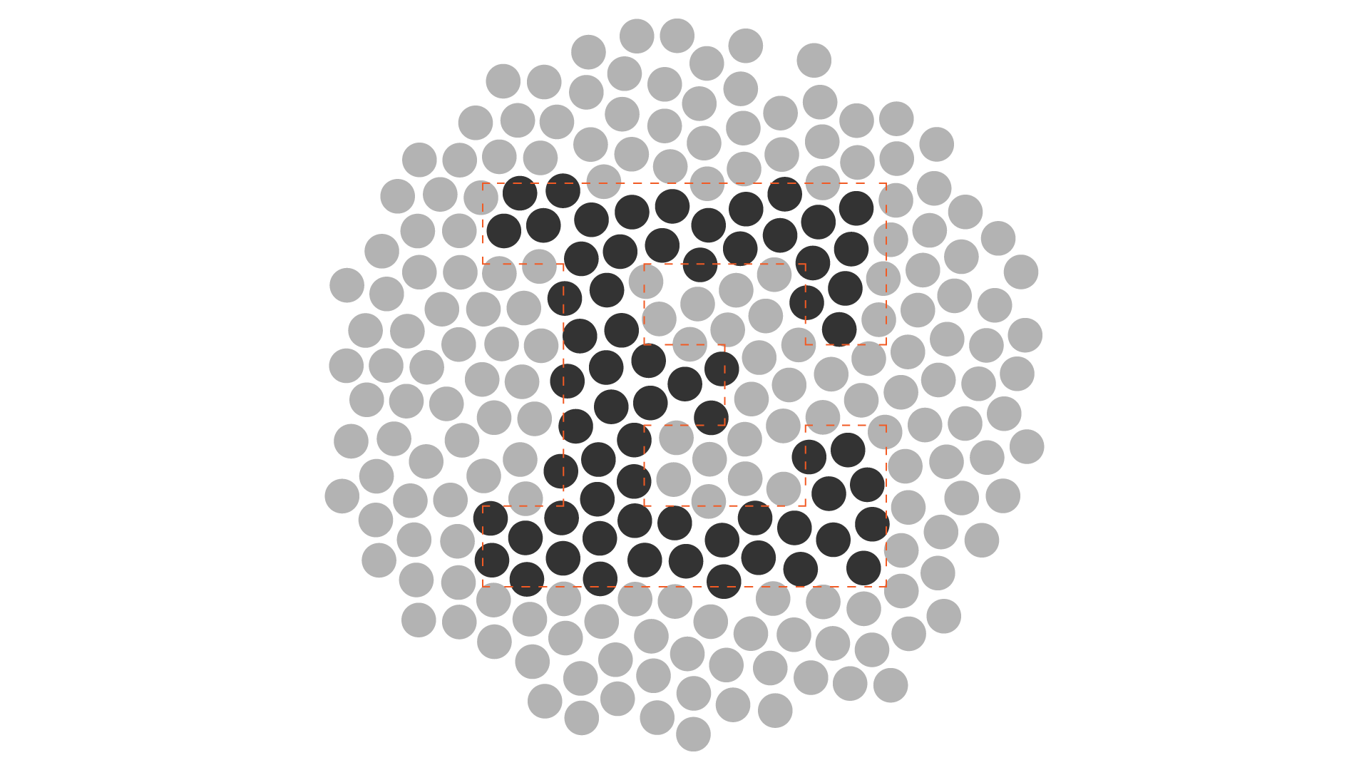
That is why optotypes (at least Schellen and Sloan) are designed in a 5×5 grid – each stroke corresponds roughly to 2 cells at 20/20.
3. Making Optician Sans
3.1 The Commission
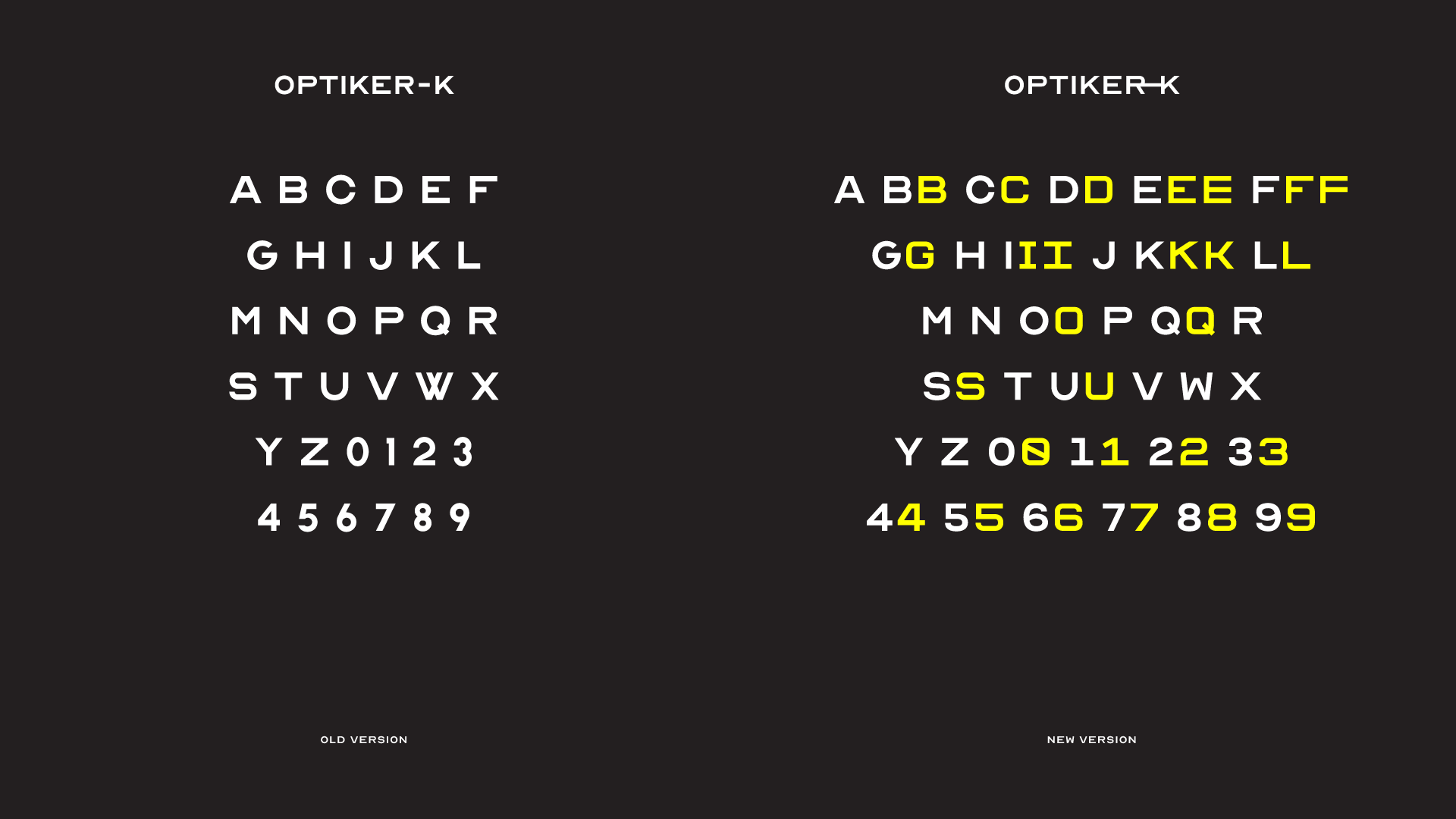
As stated in §1, ANTI Hamar hired me to produce a bespoke typeface for one of their clients. The client is Optiker-K, a family-held Norwegian small business, providing optician and optometrist services since 1877.
So, for Optiker-K’s rebranding, Simen designed a first draft of the typeface, but something wasn’t quite right: at this stage, we stumbled upon eachother and he ended up hiring me.
3.2 The Brief
Initially, this was a calibration commission: to balance strokes, proportions, to correct node placements, to space it and hint it, to compile the typeface in a distribution-ready package.
In spite of this, what I got from the conversation with Simen was some sort of hey, can you make this work? proposal, so I started to look for inconsistencies – and ending up detouring from the brief.
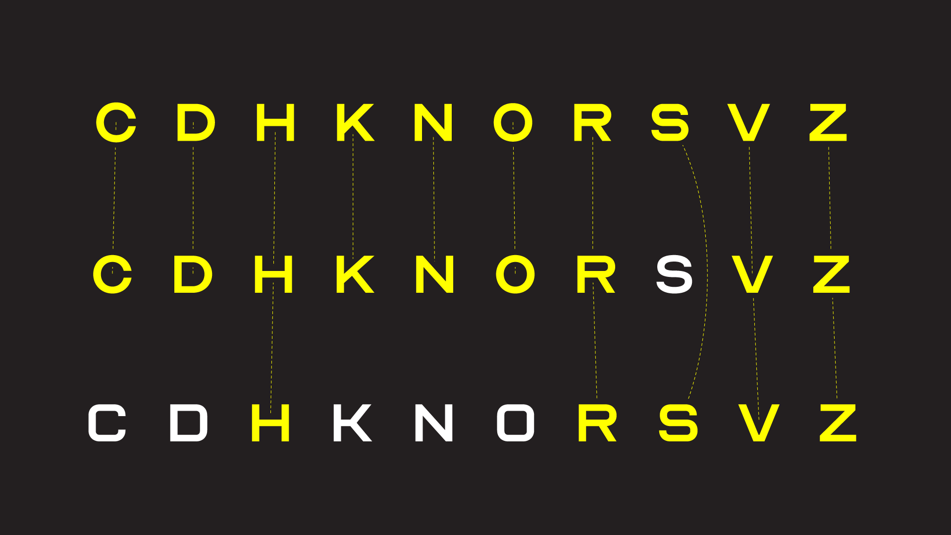
You see, the Sloan letters weren’t built to work as a typeface: if you compare, say, the S with the C or the O, they seem stylistically unrelated. At some point, it struck me that we were dealing with glyphs from two different typefaces, almost randomly picked and joined together.
But our goal was to have a consistent look for the brand. Secretly (read: without asking), I redrew from scratch what Simen provided (in FontLab VI, as usual, since you’ve been asking), in two character sets: a more rounded, friendlier one (inspired by the O and C shapes); and a more blocky one (looking at the S).
Then, with a hint of fear, I pitched them to Simen, who cheerfully agreed straight away. *phew*
3.3 Logo-in-a-font
Apart from the two alternate character sets, Optician Sans offers an Easter Egg: while looking for a fast way to deploy Optiker-K’s logotype, we decided to include it inside the font itself; so whenever you type O-K or Optiker-K, the logotype automagically appears!
4. Hello Internet!
Free. Yes, for free.
The client, Optiker-K, decided to release the typeface for free. So you can send e-mails to them and to ANTI Hamar, filled with heart emoticons and unicorn hugs.
Upon release, well, the web went crazy, way beyond what we expected, especially for a font made to work in English and Norwegian only.
So thanks for the love, everyone! It feels really good to have made something that everyone is enjoying so much!
4.1 The Future – Present, actually.
With all this attention and cheering crowd, we decided to take some small steps forward:
- The typeface is available on GitHub – if you want to keep track and fork it to your own servings, please do!
- The License changed to SIL OFL to make this possible;
- We’re slowly expanding the font to support more languages!
5. Wrapping Up
I hope enjoyed knowing a bit more about this typeface. If you wish to know a bit more on ANTI’s side, check Simen’s article on Medium.
And, if you haven’t already, subscribe below to keep in touch! Cheers!
References and Further Reading: