Part I: Introduction | Part II: Learning To See | Part III: Overshooting | Part IV: The Stroke (Optics)
0. Introduction
Welcome back!
I’ve been rewriting this article for ages now, so I’m glad to finally share this with you!
Today we’re going through a subject that it’s apparently simple, but the degree of complexity and abstraction can escalate pretty quickly, so I’ll be dividing this article in four sections: Introduction, Translation, Expansion and Scatter.
So this first part deals with the basic concepts that we need to understand this matter thoroughly; some structural, some a bit more abstract.
Scared? Great: it means that this will be easier than what you’re thinking. Let’s get this started!
1. Modulation
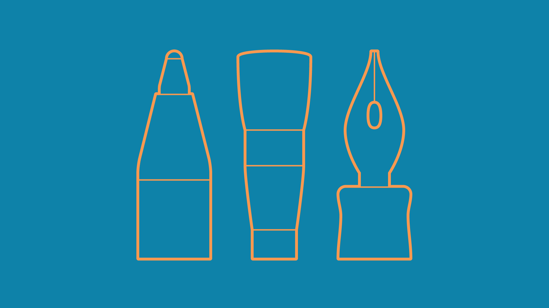
So, what the heck is modulation? Let me try to give one of my famously cryptic definitions:
In type, modulation is the register of a given tool on a given surface, through a given gesture, or the emulation of this.
Dude, you should write poetry. Yeah, I know.
In the human-friendly version, when you draw a letter with – let’s say – a ball-point pen, you make a certain gesture with your hand that, on a piece of paper, makes the pen release ink and produce a certain shape. Obvious stuff.
Now, let’s say you use a pointed brush instead of a pen. Depending on the pressure, angle and surface (imagine doing this on wood, for example), even if you make the exact same gesture, the shape produced will be different: there will be thicks and thins, rough edges and so on.
Or, if you’re drawing in a digital environment, you’ll be emulating this result.
So, modulation is the way a tool creates variation in a stroke, whether analogue (via calligraphy) or emulated (via lettering or type design). Or the variation of the stroke itself.
2. Gesture and Ductus
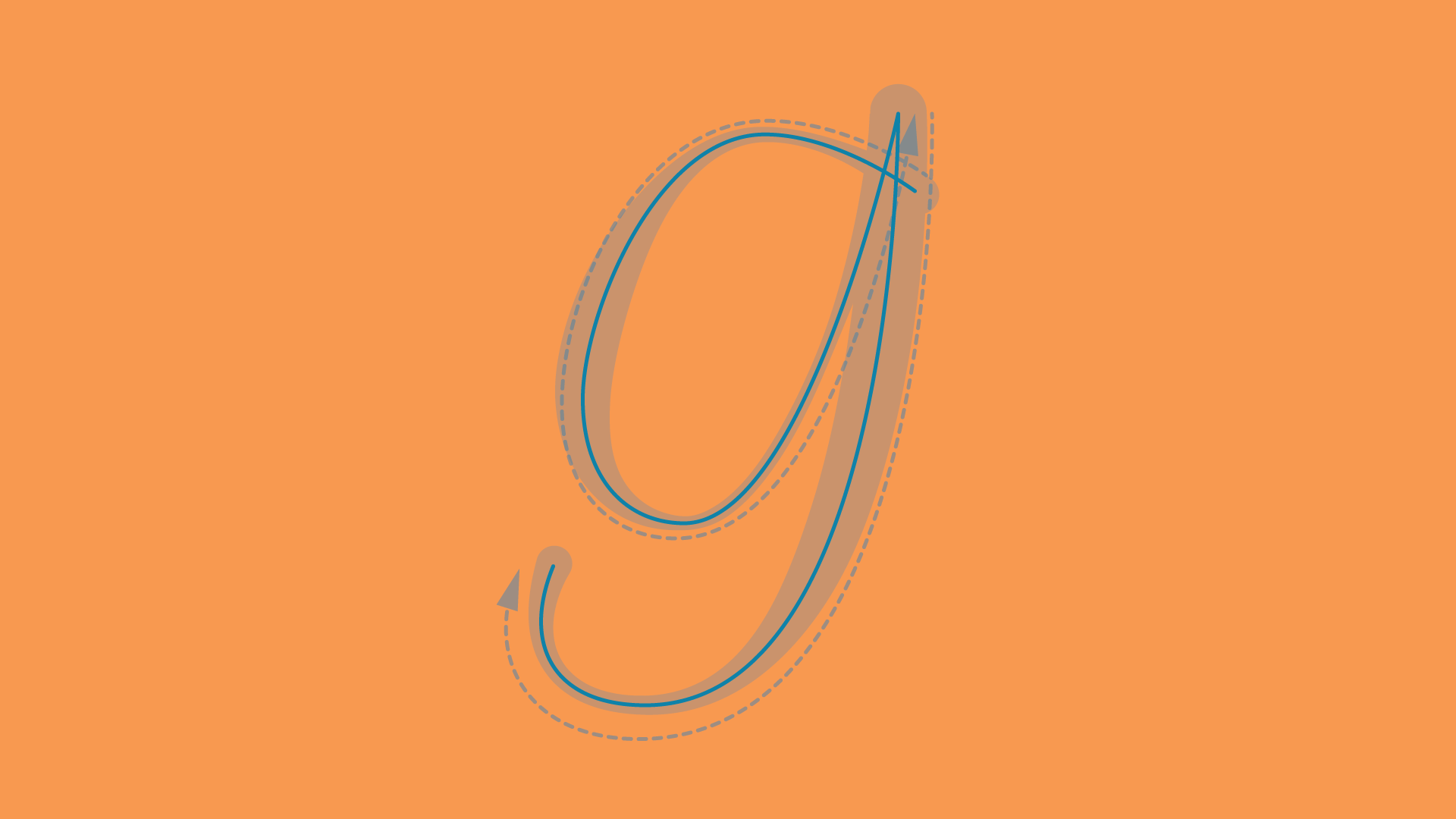
I guess I don’t have to explain what gesture is, since it’s not a matter of type-specific jargon. But when you do a gesture, it follows a path. To this path, we call it ductus.
The ductus is the skeleton of a letter. Although an abstraction, think of it as the path from where the stroke expands, or as the path of a writing tool.
Some definitions will tell you that you can get to the ductus by a reduction of the stroke towards the middle of the letter, but this is an imprecision: this might work in the case of translation (as you’ll see later on), but in most situations, especially when it comes to drawing glyphs by outlining them, the modulation around the ductus is assymetric.
3. Velocity, Pressure, Angle and Rotation
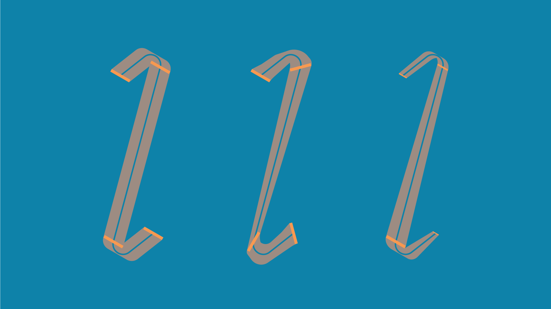
Especially in the translation model, angle is commonly treated as being fixed. This means that the writing tool (i.e. broad-nib pen) will be held at a certain angle and this won’t change while it propagates through the ductus. Still, every calligrapher knows that “rule” is just for comprehension sake; in fact, the angle can change a lot, even with a broad-nib pen.
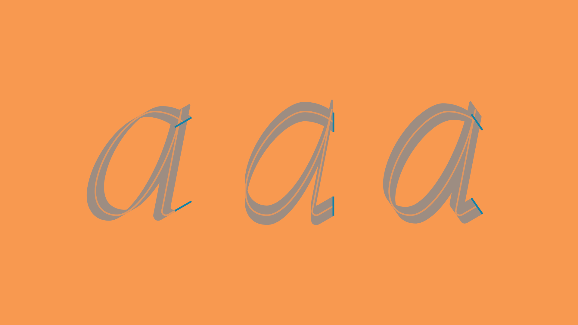
How the angle of the tool changes in the gesture is vital to understand velocity and rotation: rotation is the variation of the tool’s angle, while velocity is the speed of which this rotation happens.
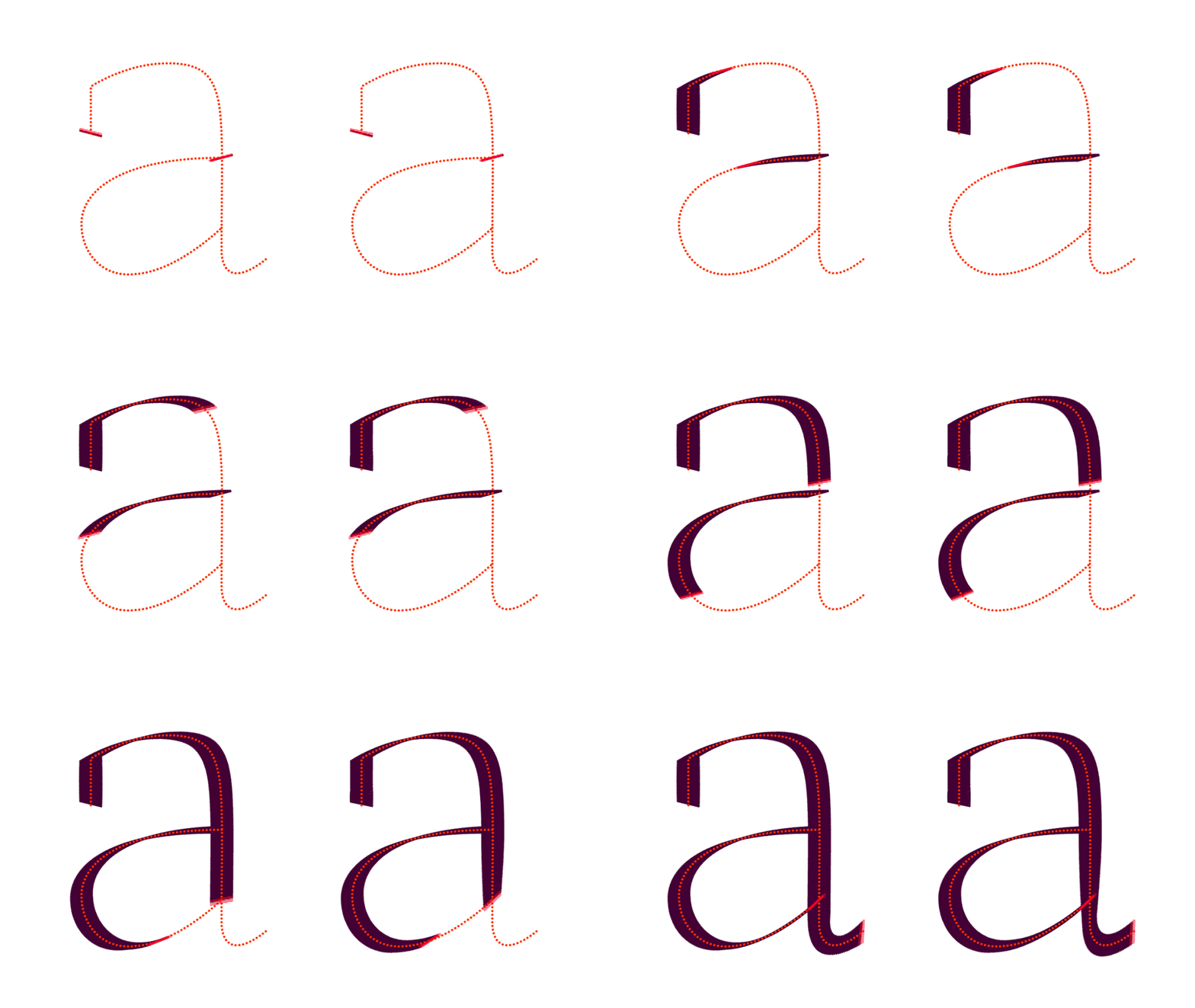
As you can see above, these factors have a huge impact on the shape of the stroke.
Finally, let’s consider pressure. Though we can almost ignore pressure in the case of translation and/or pushy people, it plays a big deal in the expansion and scatter models.
This item on our list will be explored further in the series (pretty much as any of the others), but here’s a simple explanation: the force exerted by the writing tool against the surface may influence the stroke. Take a pointed brush or nib, for example: as further pressure is applied, the stroke expands accordingly.
4. Some considerations
Before we move on, there’s a couple of things that I’d like you to keep in mind.
First of all, if you’re still a bit confused, things will become more obvious in the next articles, where you’ll see these concepts in action. So pat yourself on the back and plow through.
Second, you don’t have to become and expert calligrapher in order to produce good lettering or type designs. In fact, you don’t have to do calligraphy at all, although it wouldn’t hurt. The goal here is to understand where letterforms come from and to know how writing tools work, so you can analyse form in a more knowledgeable way, developing your sensibility.
Third, purely emulating these concepts and processes won’t produce satisfactory end results. There’s a lot more to do on top of this, such as optical corrections, curve quality, formal consistency and such. Still, knowing this will, for sure, aid you in achieving better end results.
Fourth, read Gerrit Noordzij‘s The Stroke. Really, get it and read it: it’s a fascinating read.
5. Wrapping up
I hope you’ve enjoyed this article, since you’re at the doorstep of some very interesting stuff: we’re going to put these concepts to work in the next few articles, so subscribe below to get notified and see you in the next chapters!