1. Concept
Grafista is (semi-)monospaced typeface that has two sets: a text typeface and a texture library.
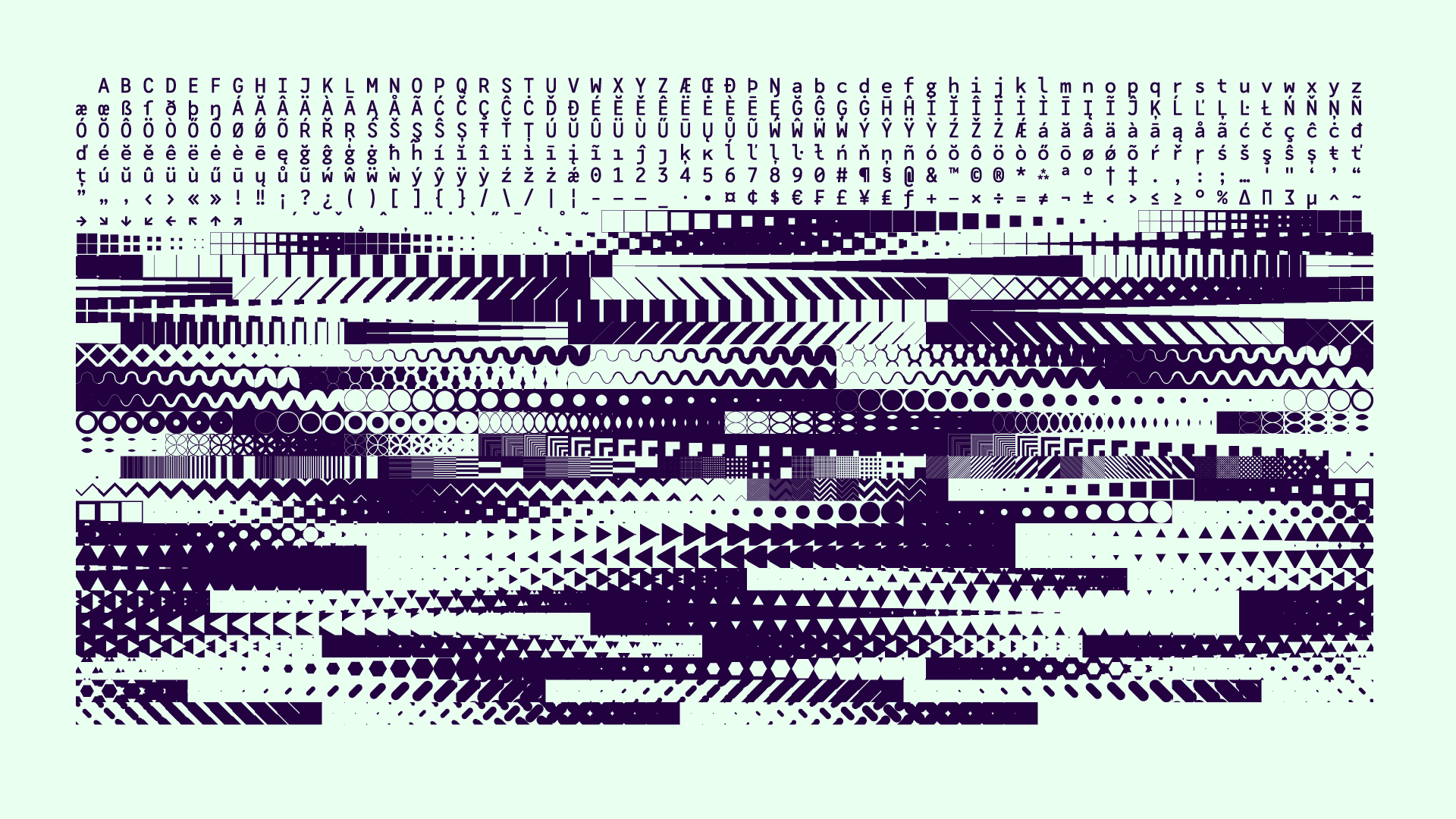
The reason why I called it semi-monospaced is because these two sets have different widths: the text set’s width is half of the textures’ one, making it possible to combine both in the same text box.
The idea behind Grafista was to “challenge” the standard notion of what a typeface is for: basically, a typeface is a collection of box and forms in those implicit boxes: not necessarily something to compose text with.
With this, I’m not claiming that this is something new: throughout history, numerous punchcutters and type designers have included texture or tile sets in their typefaces, whether for borders, pictograms, ornaments or any other non-letter elements.
At the same time, the format of a font makes a texture bank easily accessible through a glyphs panel or a OpenType feature, spanning through a wide variety of software or applications.
2. Genesis
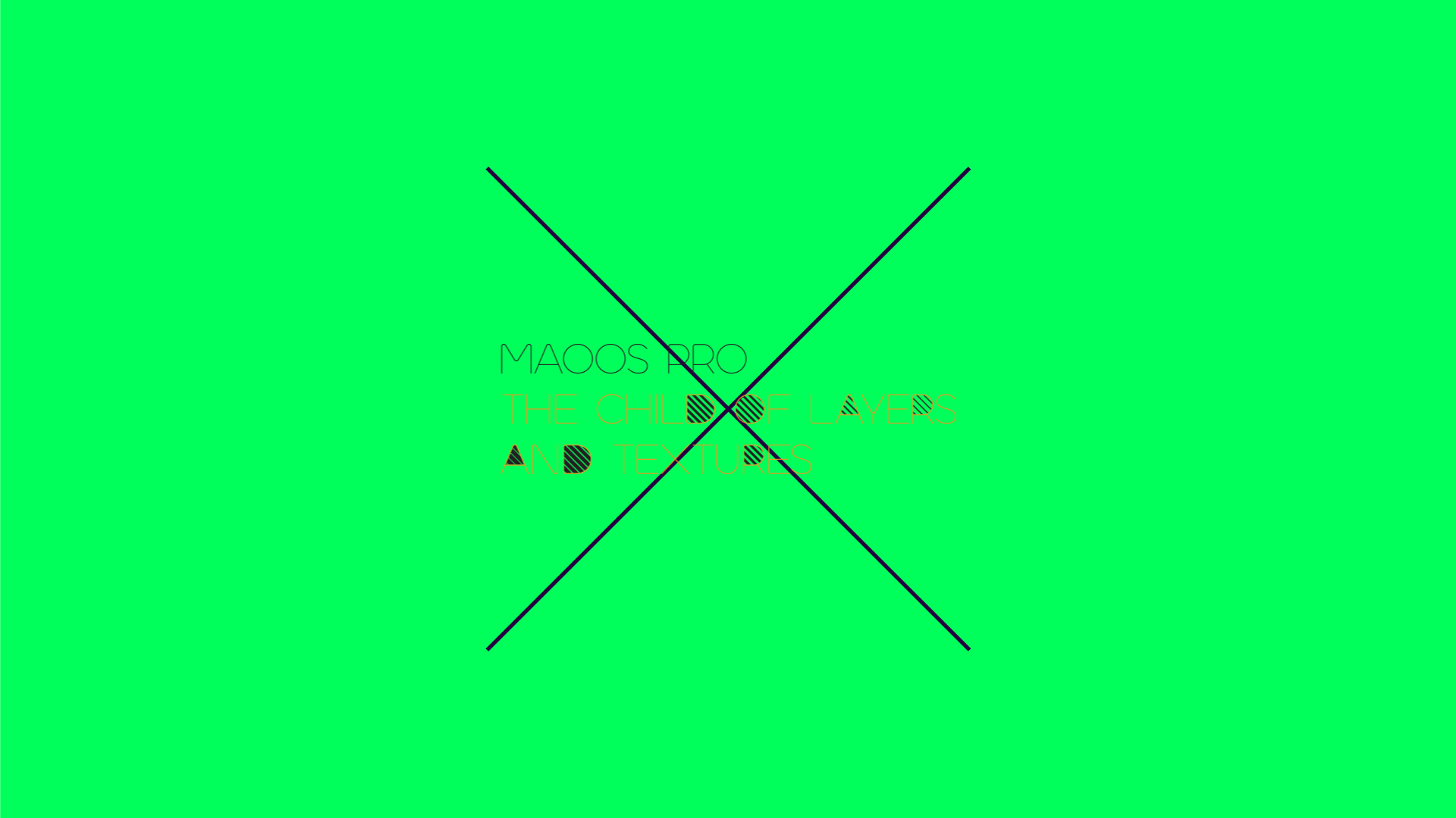
Grafista is a reincarnation of a failed incarnation called Maoos.
The idea behind Maoos was to create a typeface that had the primary focus of being a texture bank, a library of pre-made graphic tiles that one could use to create images, not necessarily text.
But the reason why Maoos never got to see the light of day was that something was wrong. Sure, the tile part was working: the idea behind it was tested and it was working. The text part didn’t.
The letterforms were nice-ish; I mean, they were congruent as a whole, but these two parts (textures and text) were two separate things, with no connection what so ever.
So, I’ve tried several approaches to Maoos, trying to blend the letterforms with the textures: several line width, multi-layering sets where textures only lived in the counters, alternative glyphs; it was always a mess and adding layers of complexity to it wasn’t helping – it soon became one of those typefaces in the drawer (or in a backup disk, to go with the times).
Some years passed (I started tinkering with Maoos in 2013), Maoos had many problems: the letterforms weren’t neutral, comparing with the textures, so both sets would live in different realms; proportional forms would make side-by-side use with the tiles dodgy and to be avoidable at all costs; multi-layering sets is a production headache for the end user, among other small bits.
So, I ended up trying to cram way too many things in a single typeface, without realizing that beef and deodorant in the same package wasn’t a sensible deal.
A couple of months ago, while working in a monospaced typeface (news on that to be announced), it hit me: if I could do something fairly neutral, sturdy and monospaced, it might work with the textures. And it did: Grafista was born.
3. A typeface with letters
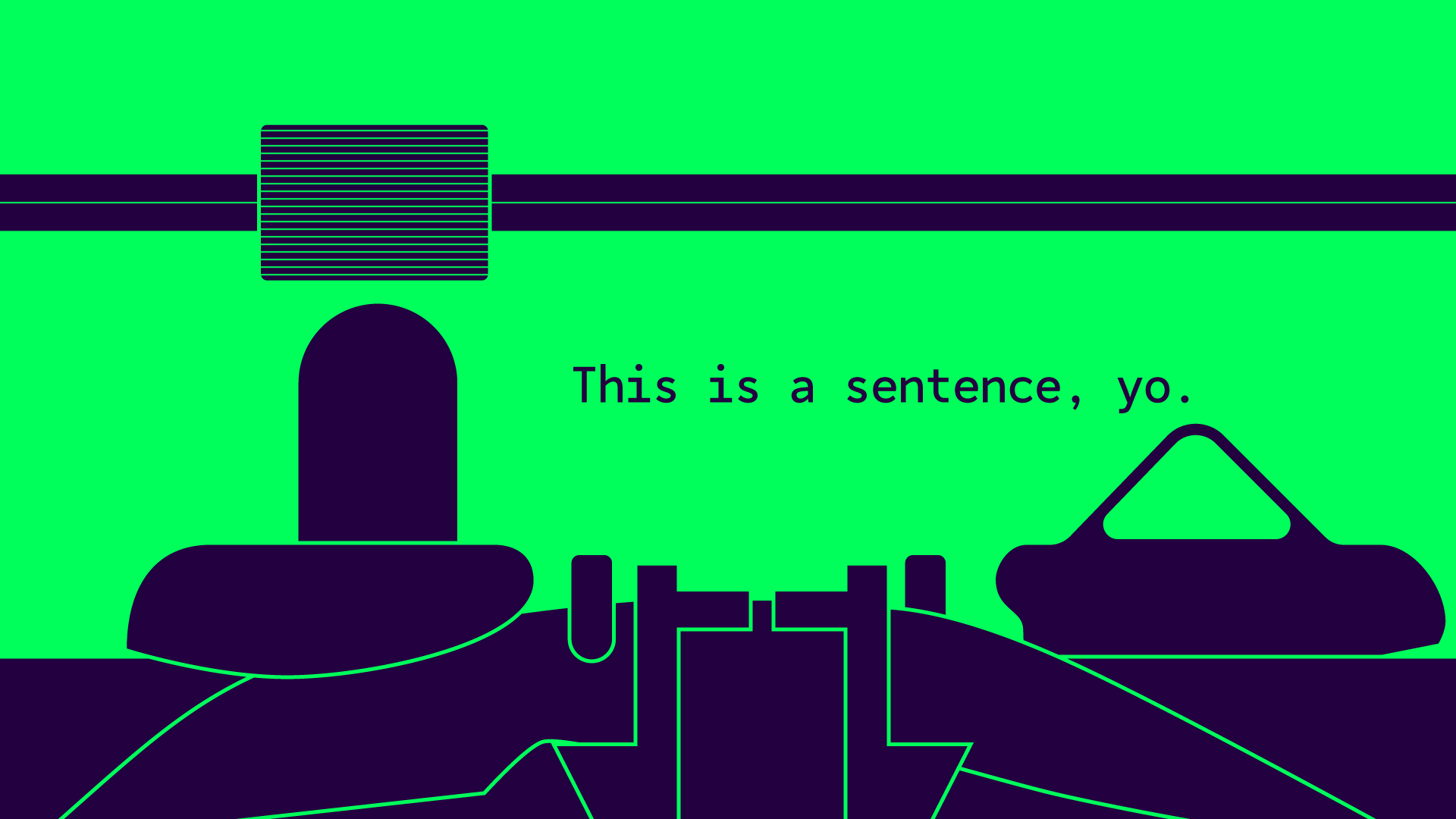
Monospaced typefaces have a mechanical vibe to them. Even the typewriter ones, with all their nostalgia, still feel technical, due to the fixed width. They have an implicit and very obvious system that implies a mechanism, while most proportional typefaces try to fight the technical nature of the composing system in order to achieve reading comfort.
Sure, readability and legibility were considerations while drawing the roman, but they weren’t the main goal: the however you do it, it works motto was the main focus while developing Grafista; I wanted you to have the freedom of using it without the concerns of micro-adjusting your compositions.
On the formal side, the choice of borrowing traits from grotesque and coding typefaces were due to the simplicity of the tile elements: in Grafista, complexity comes from the add-up com combinations, not the tiles themselves. So, considering how simple the tiles are, as a single element, the letterforms should follow the same logic.
I wasn’t looking for a fit-for-everything text typeface, I wasn’t looking for solving a technical problem and I certainly wasn’t looking for nostalgia. However, I was certainly looking at the text part as something heavily graphic, where text and textures could be used at the same time, whether in single or multi-line compositions.
“A typeface is a beautiful collection of letters, not a collection of beautiful letters.” – Matthew Carter
Or, in this case, a beautiful collection of letters and forms.
4. Making tiles
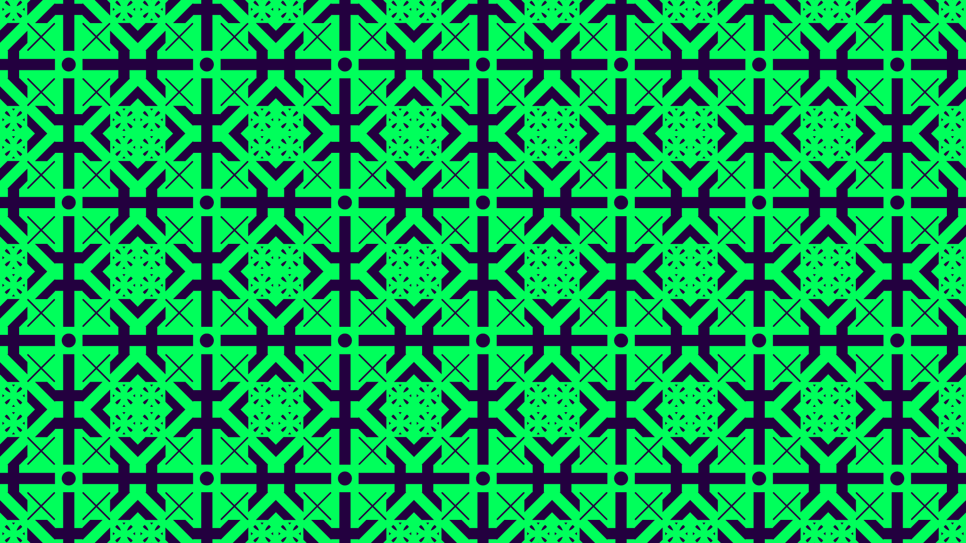
Tiles should be, huh… tilable.
Maybe I’m biased in this: I’m Portuguese, a culture with a centuries-old obsession with tiles. Tiles are everywhere, in an impressive array of shapes, colors and applications. We’re probably as obsessed with tiles as we are with food: and our food is awesome.
In Grafista, every texture glyph is treated as a tile: you can seamlessly repeat each block vertically or horizontally. Or use it as some sort of pixel. Or pre-made graphic elements to play with. Or as a way to reach enlightenment, if that’s your sort of thing (e-mail me if it happens).
Still (and it sort of comes without saying), you can cannibalize the textures to your liking and treat them as pure graphical elements.
5. Wrapping Up
Grafista is now out! Grab your copy and contact me to show me what you’ve done with it!
I hope you’ve enjoyed knowing a bit more on how Grafista came to be! See you in the next article!