It’s been some time!
To take some time off the oh-so-many huge projects in the making and craft something for you that’s worth your while, today we’ll be talking about some typography tricks that I find helpful and that I haven’t seen anywhere or that I’ve found the information available unsatisfying.
Another plus for you, some of these came out of designing type, i.e., out of looking constantly at type at a micro level.
So, while I’m satisfying my inner megalomaniac, here’s a small post of some things I’ve learned along the way.
1. Contrast Too High?

This one has a story.
While I was waiting for a meeting at We Came From Space, my curiosity won me over and I had a peek at what Joana Sobral, from one of the studios there, Non-Verbal Club, was doing. She was designing a newspaper and was having trouble with the body typeface.
The typeface was Hercules, set in a very small point. The copy was gigantic, the line-spacing as tight as it could be and the thinner parts of the typeface would simply disappear under 8 points (the point size was 7.5 points).
A bit after I told her “that cut clearly wasn’t designed for such a small size”, it hit me: if a really thin stroke was added around the letterform (in that case, it was something like a 0.05 point stroke), it might do the trick. And it did, along with a slight increase in the tracking to compensate the x-axis growth.
You see, typefaces are designed for a specific size (or, at least, they should). When drawing for small sizes, one of the good practises is to decrease contrast. Other things should be also done, but we were looking for a quick and dirty solution on the spot.
The addition of such a thin outline wouldn’t compromise counters, it would just steal some white space (solvable with the loosening of tracking) and rescue those vanished thin lines.
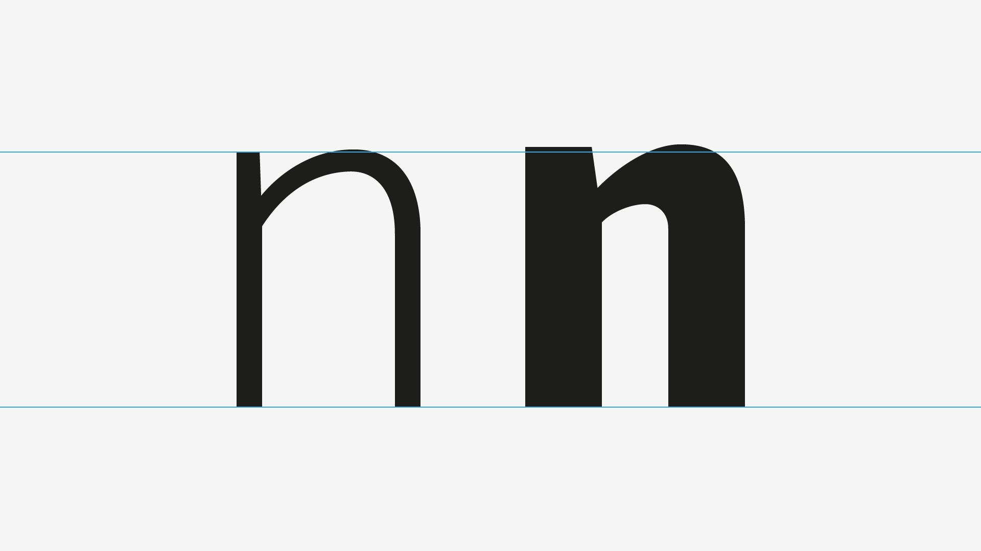
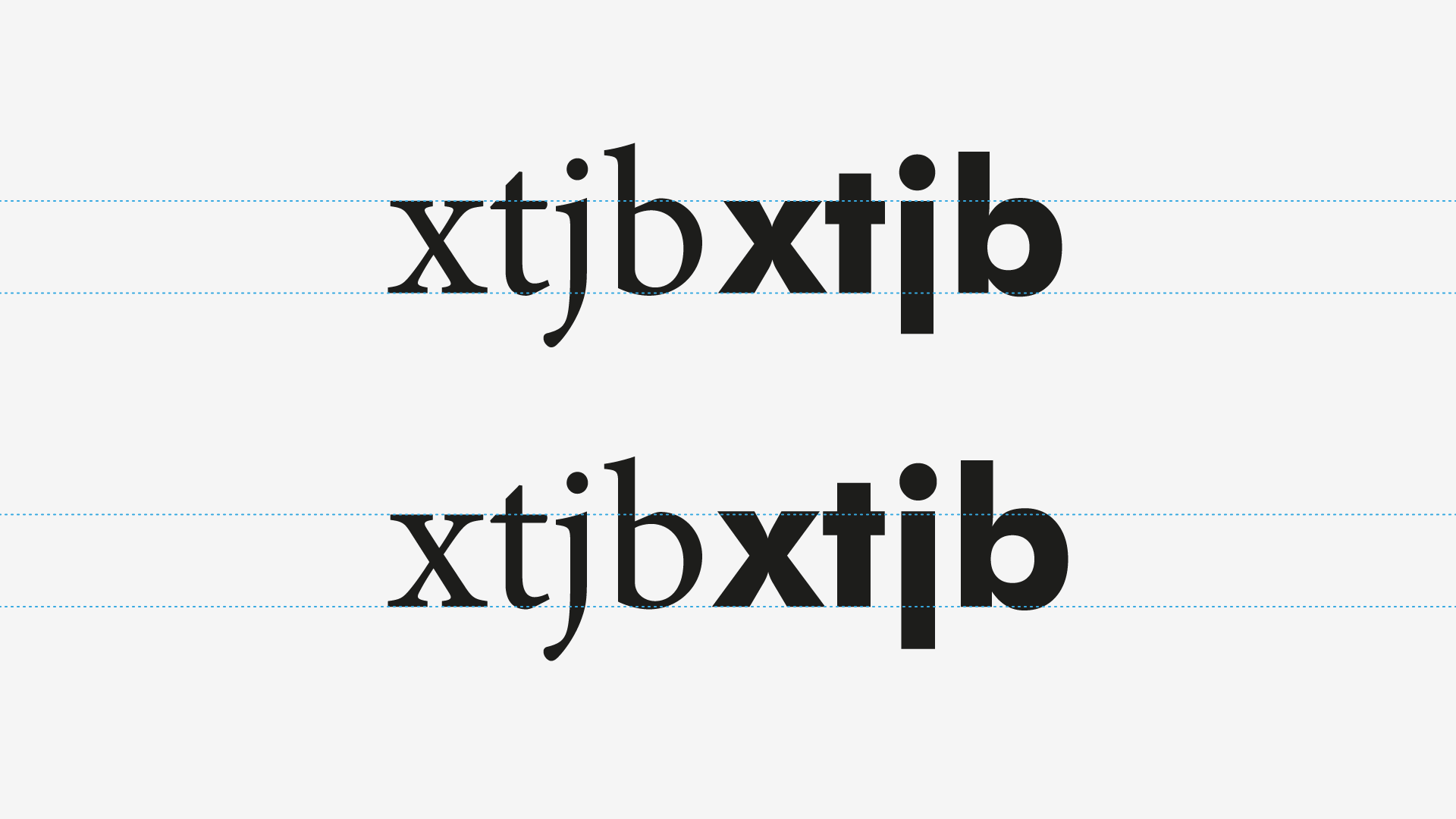
2. x-Height and Weight (Pairing)
“When pairing typefaces, adjust the size to match the x-heights”.
This is a good advice, but incomplete: it does not consider weight. But let me explain this from another perspective:
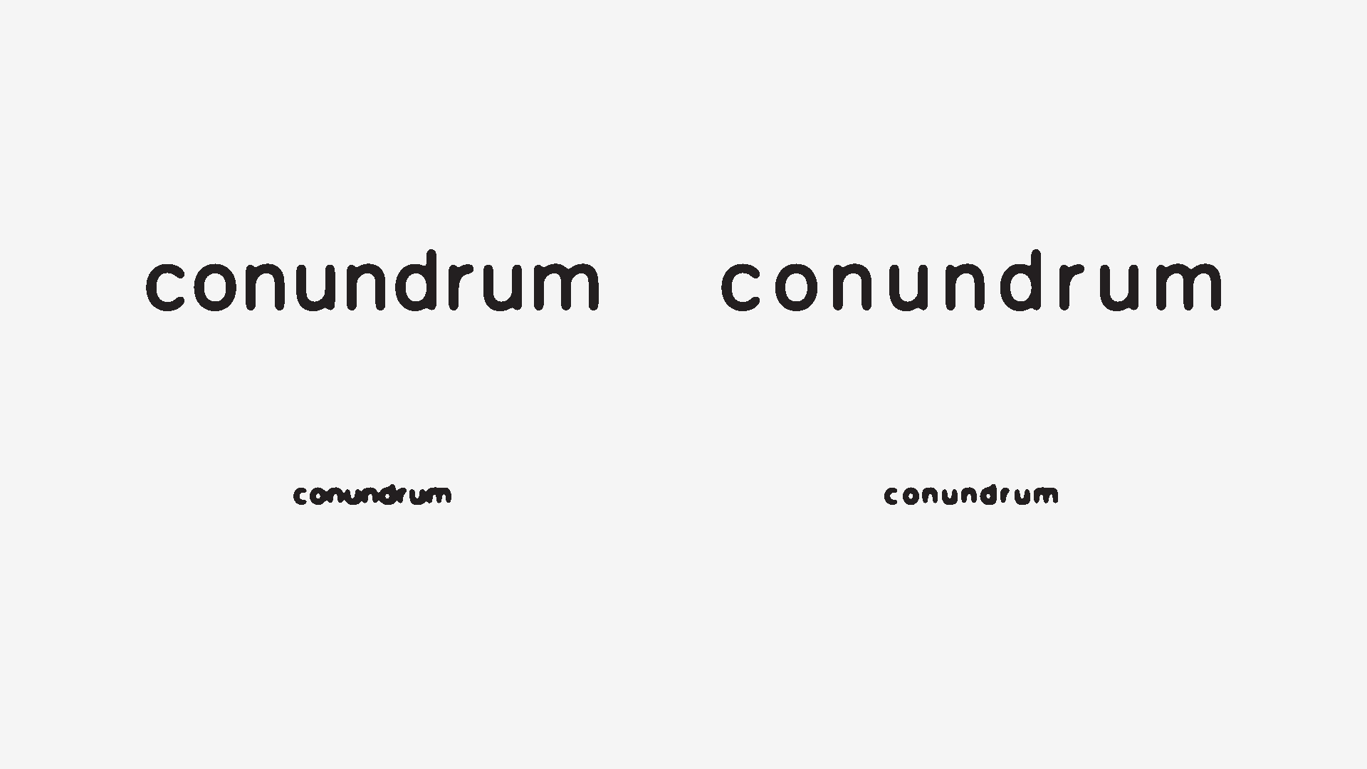
The lighter the type, the taller it seems; so, bold cuts are designed a bit larger than their lighter counterparts, to compensate for that optical illusion. Have a look:
So, when pairing typefaces, we should do the same as above. As an example, here’s Minion Pro Regular paired with Futura Bold, first with the same exact x-height, and second with the correction:
3. When Possible, Tint Your Black
When I was starting out as a graphic designer, I had the privilege of working with a printing house composed of a handful of old guys. It was a very small print shop with a lot of old-school machines.
But the better part was the people. They had years and years of manual printing, lots of metal type blocks, a letterpress in the corner, a rusty inoperative Linotype in the backyard and a kind and patient heart to deal with my curiosity.
I’ve learned a big deal with them: they gave me free reign to test everything, while suggesting me small alterations to improve the works in hand.
One of the most precious teachings I got from them was to compensate the text colour with the paper colour, which one can easily extrapolate to other mediums.
3.1 Printing
The principle is simple: if you have a coldish background (paper colour), add a bit of a warm colour to your black. If the background is warmer, add a cold colour. Simple.
What it does is that it improves the silhouette of the letters, sharpening the text, by colour contrast.
Be aware that this only works with direct colour; do not use it by mixing multiple colours, use a dedicated spot color for this instead. So, if you’re printing in offset, only use one composite layer for this, or the overprint will make your text blurry.
3.2 The Screens
The same principal can be applied to screens. I never use pure white or pure black on a screen, and it has its perks:
- No White Burning, No Black Staining: I find the pure white/black combo quite aggressive on screens. When I worked in television, I had the opportunity to colour test a lot of television sets (from plasmas to CRTs, LEDs and the state-of-the-art OLEDs, back then), and one of the first things I did was to test how much they could handle the whites without burning, as well as how much black could you go before shutting the pixels completely.
- Better colour harmony: Using a bit of colour to something apparently monotone gives a more tactile, natural-like feel to the design.
- Sharpening of letters: Like in print, it improves the silhouette, adding clarity to the texture.
- Increased viewing angle: Specially in LED and OLED monitors, not burning the whites and keeping the blacks from staining increases the monitors viewing angle, when it comes to text.
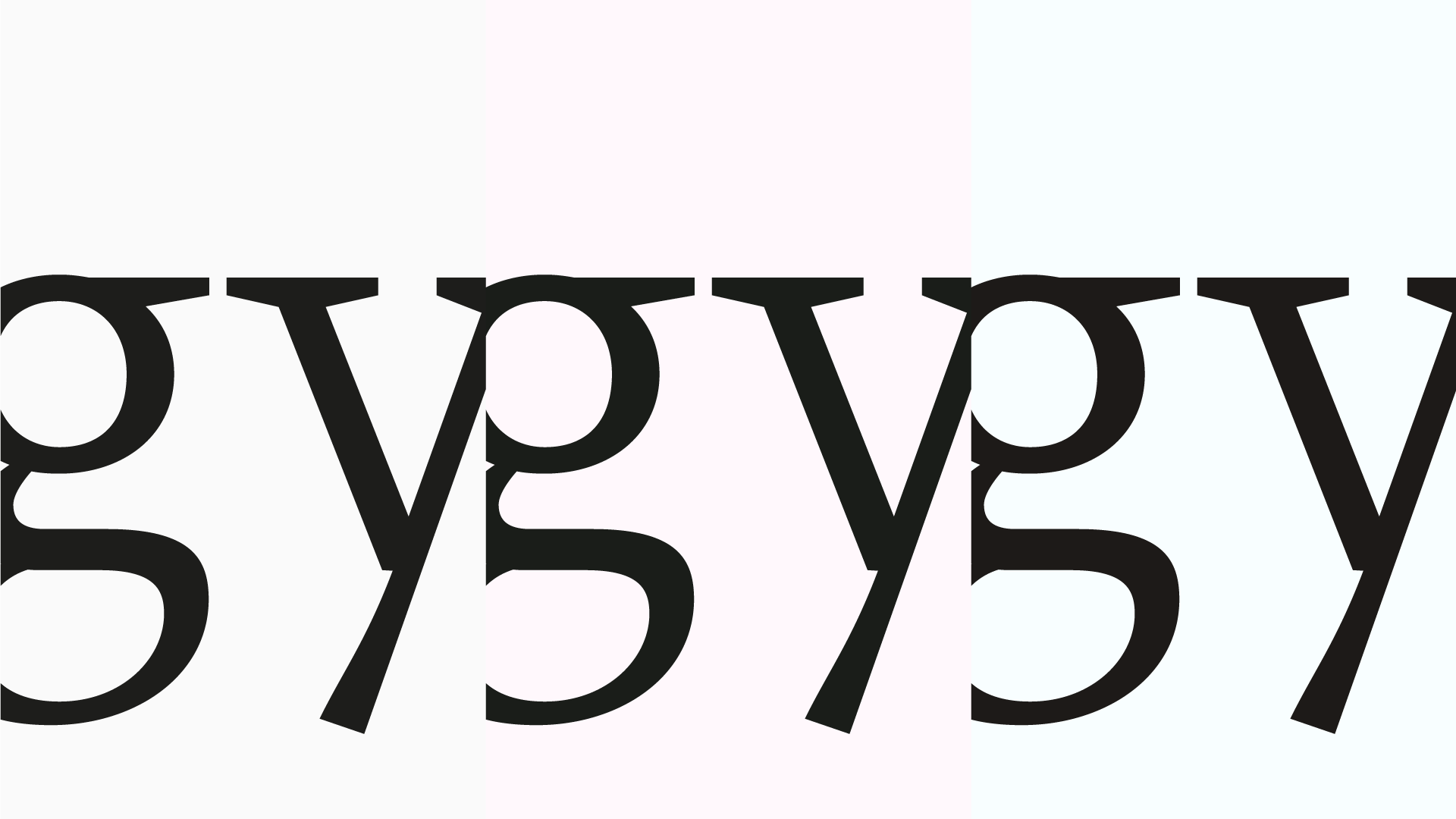
4. Tracking and Size
Default values are not sacred.
I’ve read so many times do not use optical kerning! that is pointless to think that you use it. But the truth is: sometimes you have to (to get closer to a desirable result, you should not take it for face value).
Sure, type designers spend a lot of time around metrics and kerning, to the point of being the most usual complaint in our métier. But expecting to fire up a DTP software, pasting a text and choosing a typeface with no further adjustment is naïve.
Back on track: as we discussed in §1, typefaces are designed for a specific size. And apart from other formal considerations and adjustments, tracking and kerning is also size-specific.
If you’ve already read On Legibility – In Typography And Type Design, this isn’t new to you: if we consider a “medium” point size as our size reference, the bigger the size, the tighter the tracking. And as type size shrinks, tracking should grow.
There are two reasons for this: one perceptual, another one technical:
- Perceptual: The actual physical amount of white space varies according to size. It’s easier to recognize a silhouette when it’s big than when it’s small, so adding white space between glyphs when they’re tiny improves that silhouette-reading process. When it’s big, as long as you retain some white space around the letterform, it will still be recognizable without much deciphering.
- Technical: Not everyone has 20/20 vision (ah, those times!), printers aren’t perfect, screens aren’t perfect. These factors, among others, make the tracking issue, specially at small sizes, paramount. Someone who deals with typography, has to think and deal with deterioration and bad reading conditions, whether is low resolution, ink spreading or a bad rasterizer.
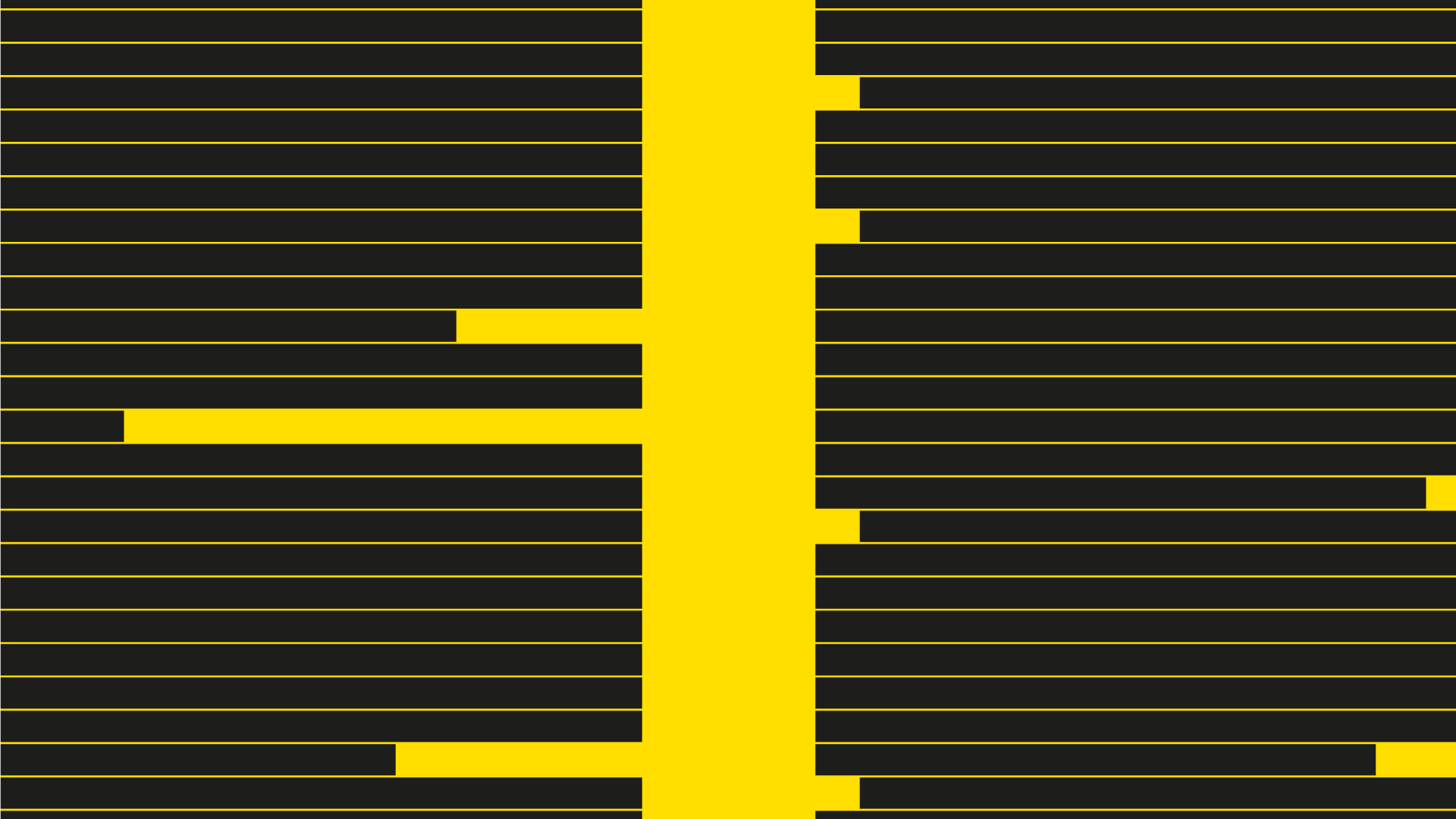
As I’ve mentioned in the readability and legibility article, a good test for deterioration is the Gaussian Blur / Threshold one. Have a look:
5. Justification, Hyphenation and Other Fairy Tales
Composing a block of text isn’t a straightforward nor simple task. There are a lot of factors to consider (mediums, resolution, letter size, leading, paragraph navigation, microtypography, rags, widows and more) as well as technical limitations.
Every solution is, therefore, object(piece)-specific.
With that said, you can imagine my expression when I read/hear people say to never justify text, because font metrics are sacred. Or when I bump into a website with justified paragraph text.
Don’t get me wrong: these scenarios are possible to pull off in an impeccable way; I just find disrespectful to the craft of typography and centuries of test-and-try knowledge.
Let’s get to the point: justification is a matter of navigation, more than a matter of style.
5.1 Justified Text
This is a book style classic, because it’s the most versatile and economic way to compose text. And also the hardest.
The beauty of justified text is that, regarding composition, is a very stable form that relates to the page format and, in a glance, it tells you when a paragraph starts and when a paragraph ends.
The problem is (and I believe this is the reason why some people bluntly tell others not to do this) that it takes time, effort and knowledge.
In order to achieve a good texture with justified text you need to pay attention to hyphenation, rivers, line-breaks, optical margin balance, widows and orphans, line number and text flow: all of this means you’ll find yourself doing letter-by-letter micro adjustments very often.
Note: The reason why I strongly discourage justified text on the web is due to the lack of control you have, specially regarding hyphenation. Sure, there’s manual hyphenation in CSS (and the auto feature is a no-go), you never know if the text block width will remain the same, with responsive sites. So, better safe than sorry.
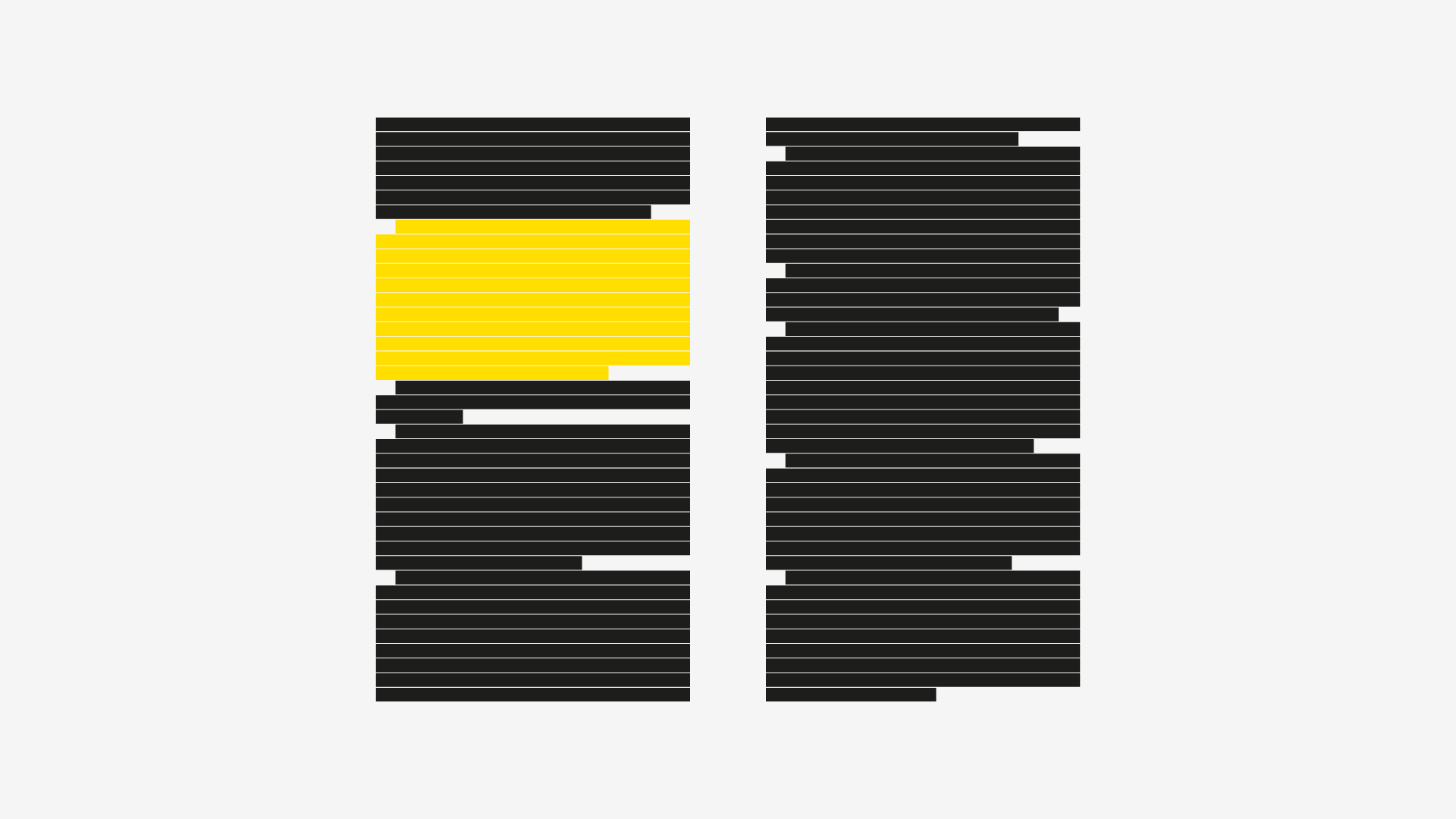
5.2 Side Aligned Text And Rags
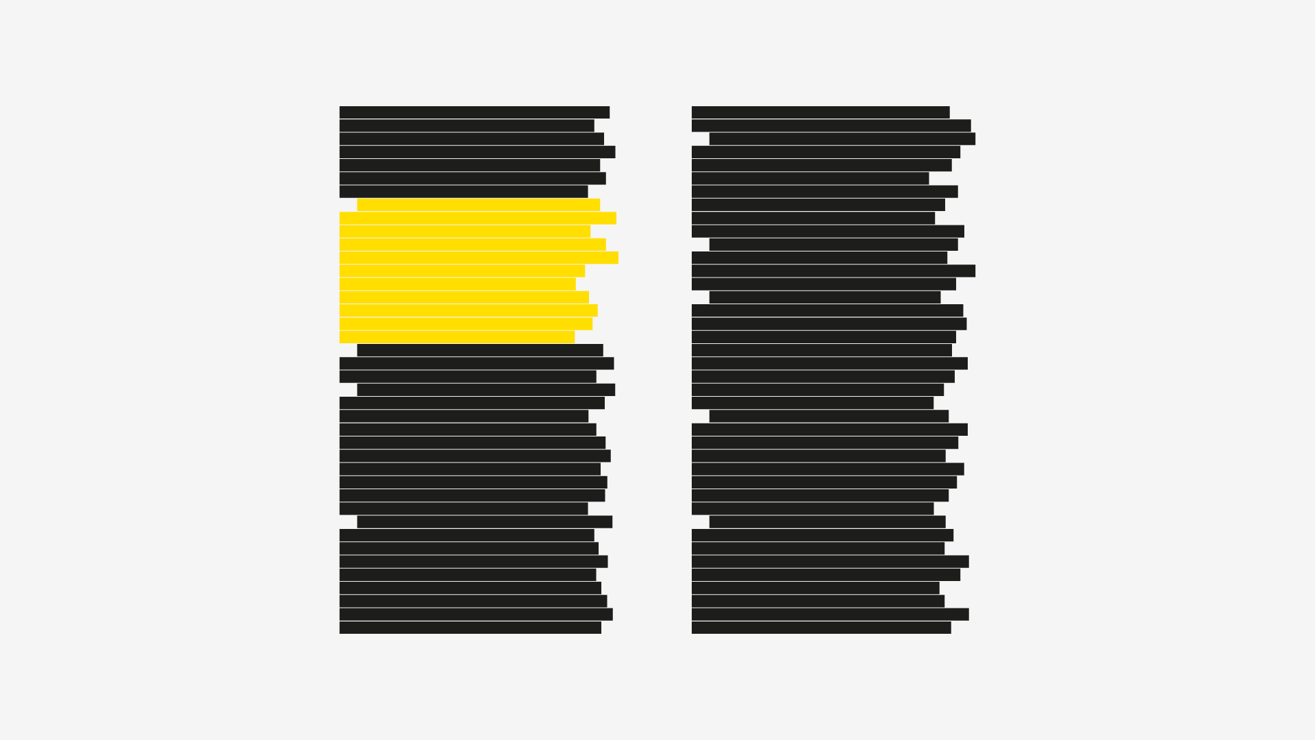
The nice thing about left aligned text is that the only thing that you have to control in the texture is your right rag, so the micro editing consists in line breaks. It also makes the text block a bit more dynamic.
But, as you can see in the image above, when scanning through the right margin, you don’t have any clue on where the paragraph ends (and the next one starts), specially if the last line of the paragraph is a longer one. One actually has to find a period and check the identation of the next line to now if one is dealing with a paragraph or not.
A solution for this is to separate each paragraph with a margin, as you can see below:
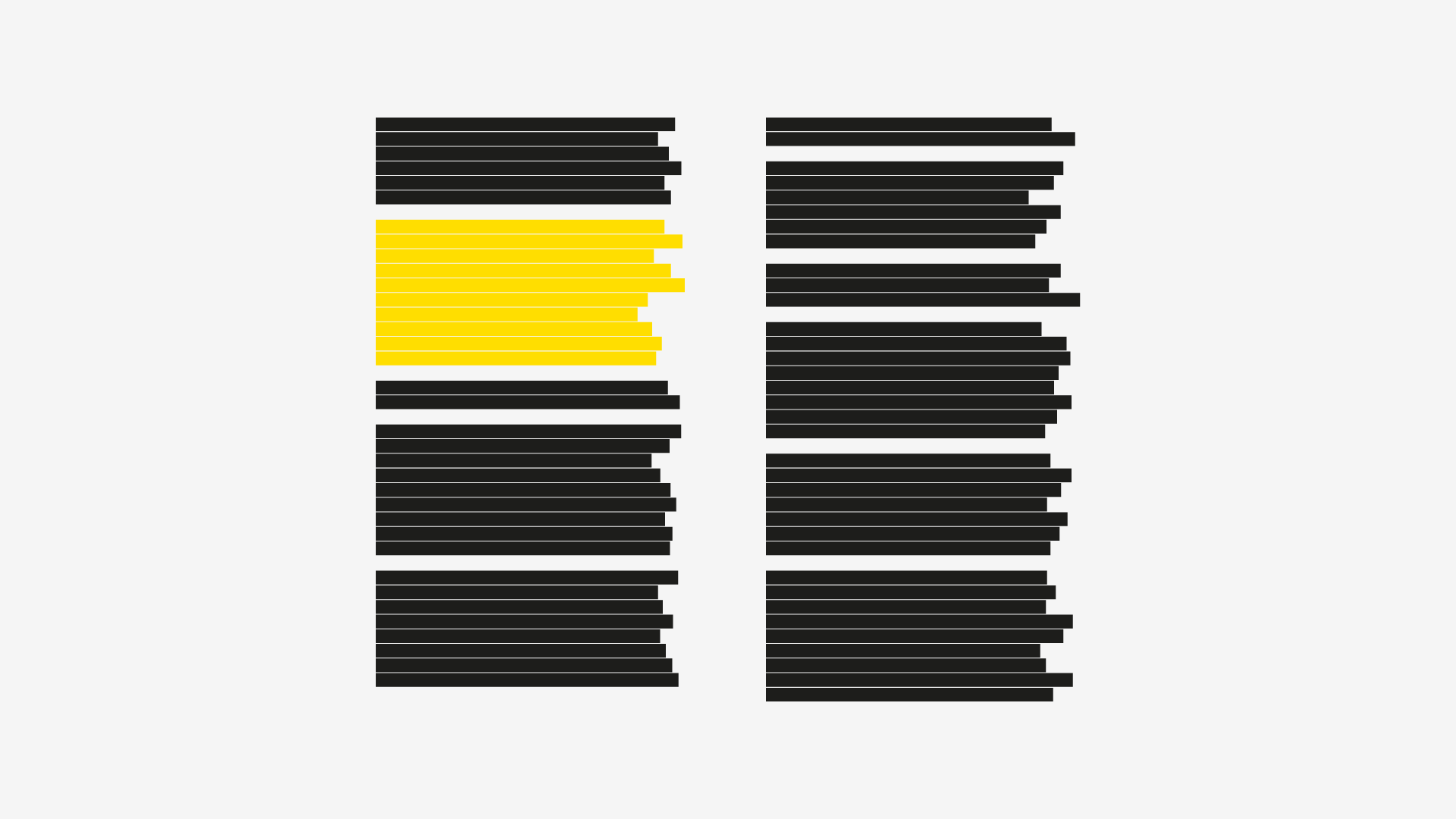
This has become the de facto standard for the web, but by doing this you loose a third level of hierarchy in the text, where you could divide the paragraphs by groups, for some reason. Sure, you can add marks – and in the web is a good solution, since there’s no constraint about how much vertical space you can use -, but when you have physical constraints, such as in a book (page count, line count), this can become a problem.
In the image above, you can see an example of when a paragraph ends a line above of where it should, if line count is desired to be respected.
6. Conclusion
I hope you found these tips as valuable as I do!
If you did, please be so kind to share it among those you think that will enjoy this too!
For more goodness, subscribe in the form below!
Cheers from Portugal!