With the implementation of the em unit in CSS and it’s handy use in responsive webdesign, all of a sudden it got famous outside the typographic realm.
1. The Simple Answer
An em is the same size as the font’s point size. There, as simple as that.
But if we already have the point unit, why would we need the em?
Well, the em unit is a relative unit, while the point is a fixed one. This means that a point will always be 1/72 of an inch, so a 12pt font will have (in height) 1/6 of an inch (or one pica, but that’s another story); on the other hand, 1em in a 12pt font is equal to 12pt and 2em will be 24pt (1/3 of an inch) – but in a 72pt font, 1em corresponds to 72pt (1 inch) and 2em to 144pt (2 inches).
Back to why, a good example of the use of the em (and probably where it’s mostly used) is on setting the line height (leading): imagine that you want to use a font in 24pt and you want the leading (font height + spacing) to be 1 and 1/4 of the font size; doing some calculations, you’ll find that it’s 30pt. Now imagine that you have a title, a subtitle and a quote deck to go along with your text body, and you want to keep the same relative space between the lines of text.
Instead of having to calculate every leading measure in points, wouldn’t it be more simple just to say “125% of the font height, please“? Well, the good news is, you can, specially in CSS:
body, html { line-height: 1.25em; }
Done.
2. History
First of all, why the name, em?
If you thought that the em has anything to do with the letter m, you got it wrong. But if you thought that it has something to do with the letter M, you got it right. *smile*
Smartassery aside, the em got its name from the width of the letter M. As you may guess, this would easily escalate to a major headache, since the unit would vary with the typeface being used at the moment and, as we already saw above, with the point size as well.
But why the width of the letter M? How did it go from width to height?
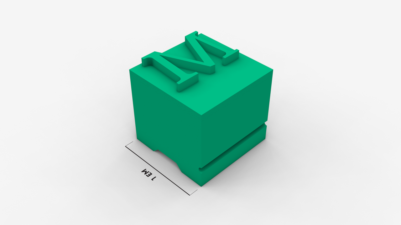
The answer to these two questions is the same: traditionally, in metal type, the letter M was cast in a square block (a.k.a. em-square and/or em-quad), so the height and width were the same measure.

3. Em = Distance From Ascender to Descender? Not Really.
In digital type development, there’s a thing called UPM: Units Per Em. As you might have figured out from it’s name, the UPM sets the amount of subdivisions of the body size, i.e., its em.
The rest of the font’s metrics are set in relation to this matrix. Take the following case:

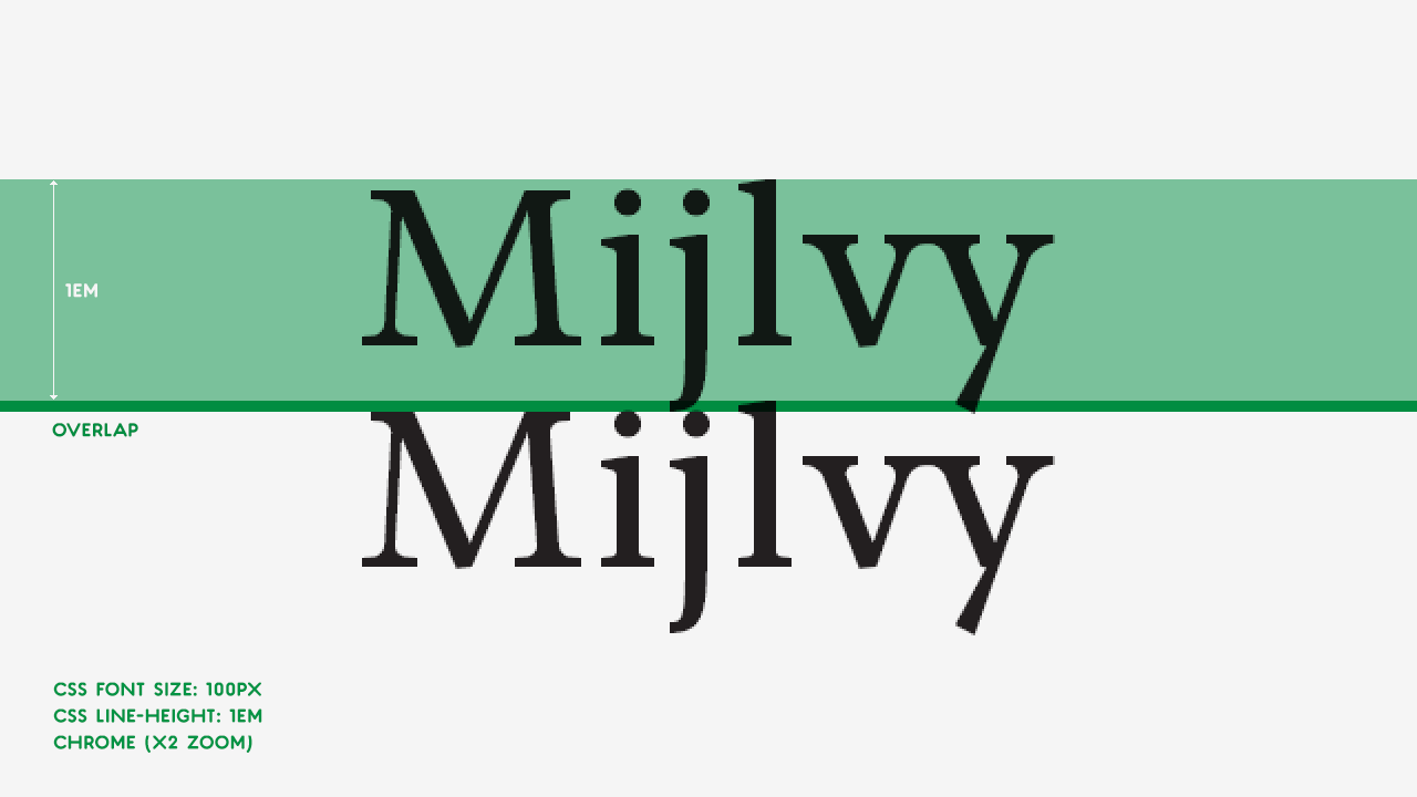
As you can see on the right, the UPM is set to 1000 units and if we add up the distance between the ascender and the descender, the value is 1050 units, hanging below the em height. So, if we set the line-height or leading to 1em, the ascender and descender will overlap. Take a look:

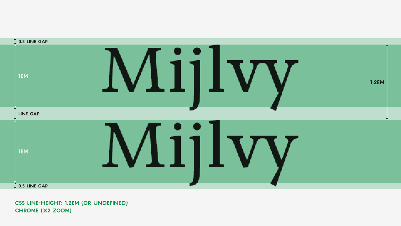
But pay attention to the line gap, in first image of this section. From the ascender to the line gap bottom, its 1200/1000 units, the same as 1.2em.
Since the line gap acts as a default leading parameter, leaving the leading untouched or setting it to 120% (or 1.2em) produces the same result (in this case, of course):

One thing that is worth mentioning is how the line gap is handled. In most DTP software and browsers, the line gap is divided in half and distributed on top and bottom of the em square, as you can see above. This is why you usually have to nudge your text box a bit down in order to make your baseline hit the grid.
4. Wrapping up
So, now you know what an em is, how the font’s body height is calculated and how leading works.
Hope you enjoyed the article!
References & Further Reading: