Index
Introduction | Learning To See | Overshooting | The Stroke: Optics
This is the first article of three, in our series, to talk about the stroke.
We briefly introduced the idea (in the previous article) that the stroke width has an effect on perception and, for this reason, should be adjusted. So, this article is just about that: optical adjustments to stroke.
May I state it right now: this is not rocket science and the more elaborated considerations about stroke (such as modulation, for example) will be covered in the next articles. For now, we want to approach a very simple case – a monoline construction – and try to achieve balance.
And without further ado (and because I’m starting to feel way to serious while writing this), let’s skip to the good part.
1. Horizontal vs. Vertical

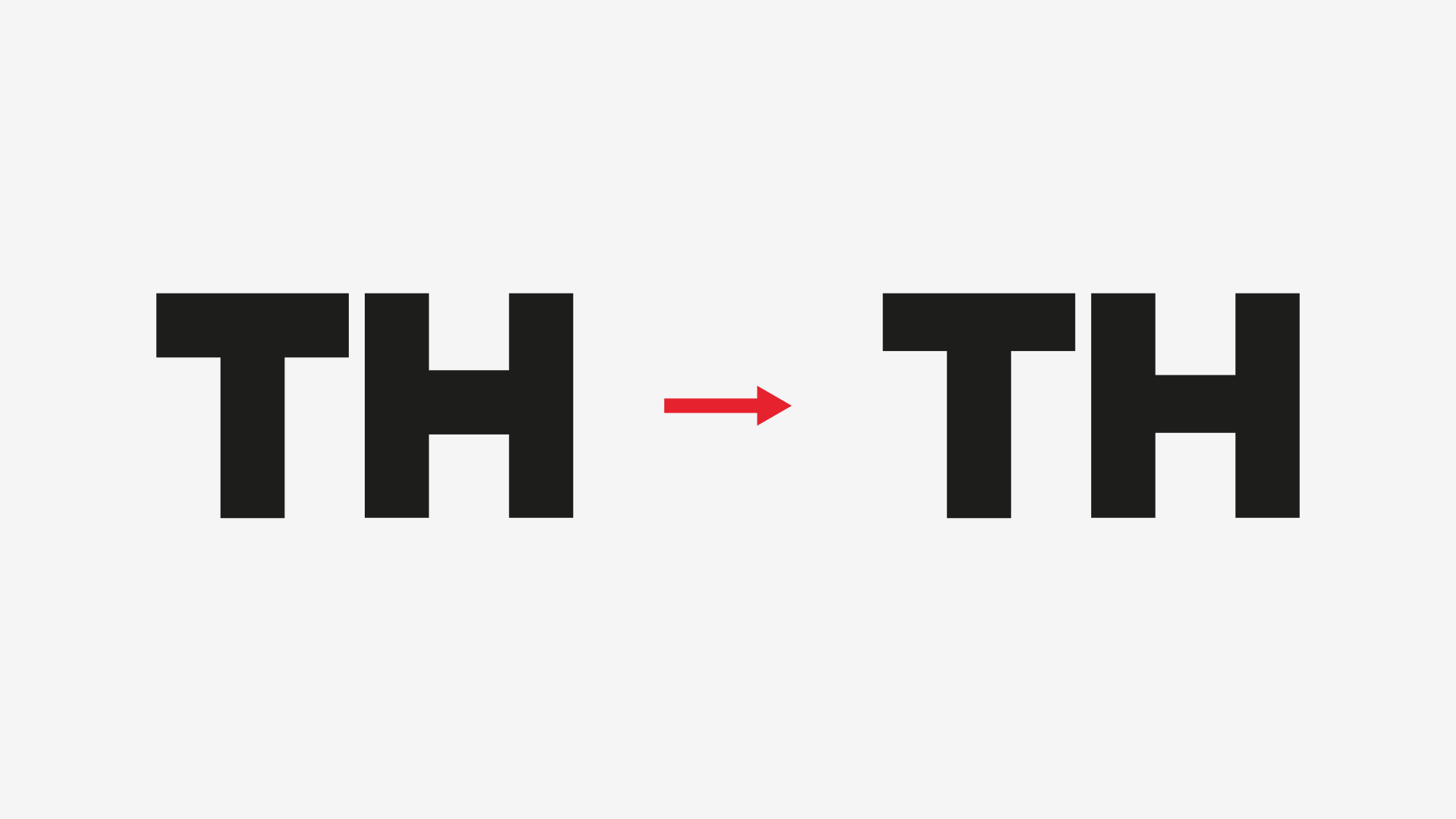
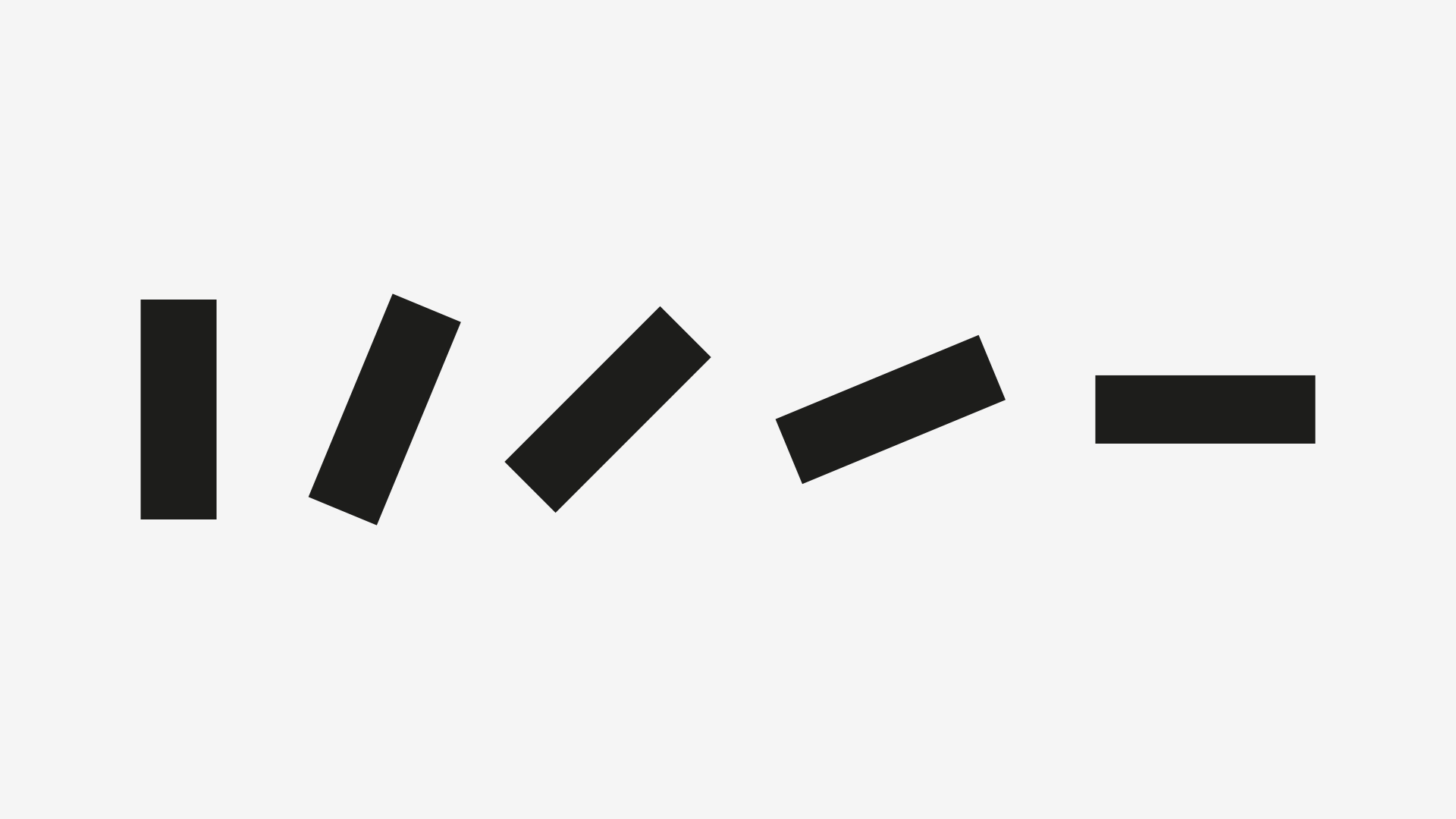
Let’s get right to it: in the image above, which are the thickest strokes? Vertical or horizontal? Take your time. Horizontal, right?
If you thought “they’re equal”, you’re right. But do they seem equal? To me, they don’t. And to most people, they also don’t.
But for many years, I simply trusted the computer. And, as always, the computer was right, so who was I to judge mathematical perfection? Well, this is about perceptual balance, not the first. Again, trust your eyes.
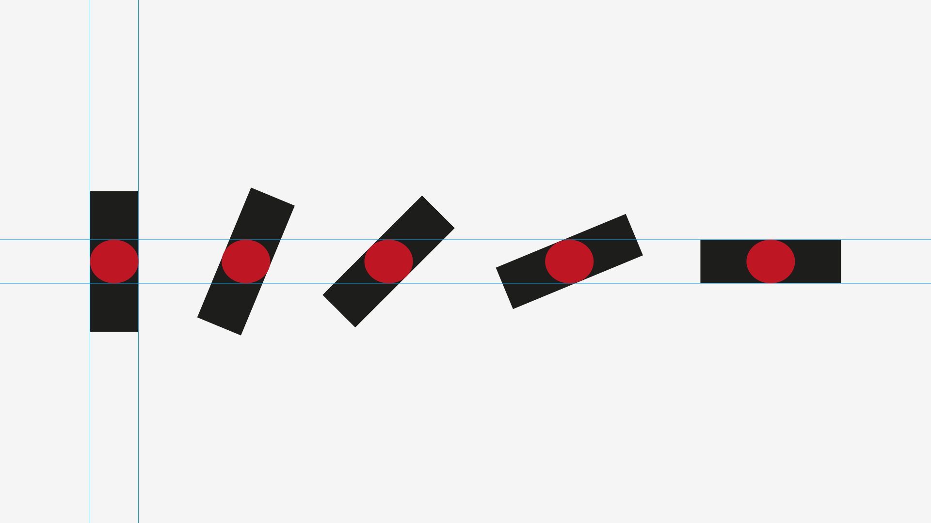
And here’s a correction (with horizontal strokes being about 1% thinner than the vertical ones):

But why does this happen? In honesty, I don’t really know, although I have some theories about it:
- We have two eyes, distributed horizontally, making our area of eyesight wider than taller; and this might add relevance to vertically distributed elements;
- In type, we have millennia of broadnib and flat brush writing, usually with 30 to 40º angle from an horizontal position, making horizontal strokes wider than vertical ones. But again, this could be due to a perception/optical/neurological phenomena.
If you’re wondering about how this works in typefaces, have a look here:
2. Orthogonal vs. Diagonal
Consider the following example:

Again, all the 3 lines have exactly the same stroke width. We already talked about how to compensate the horizontal line, so let’s just do that:
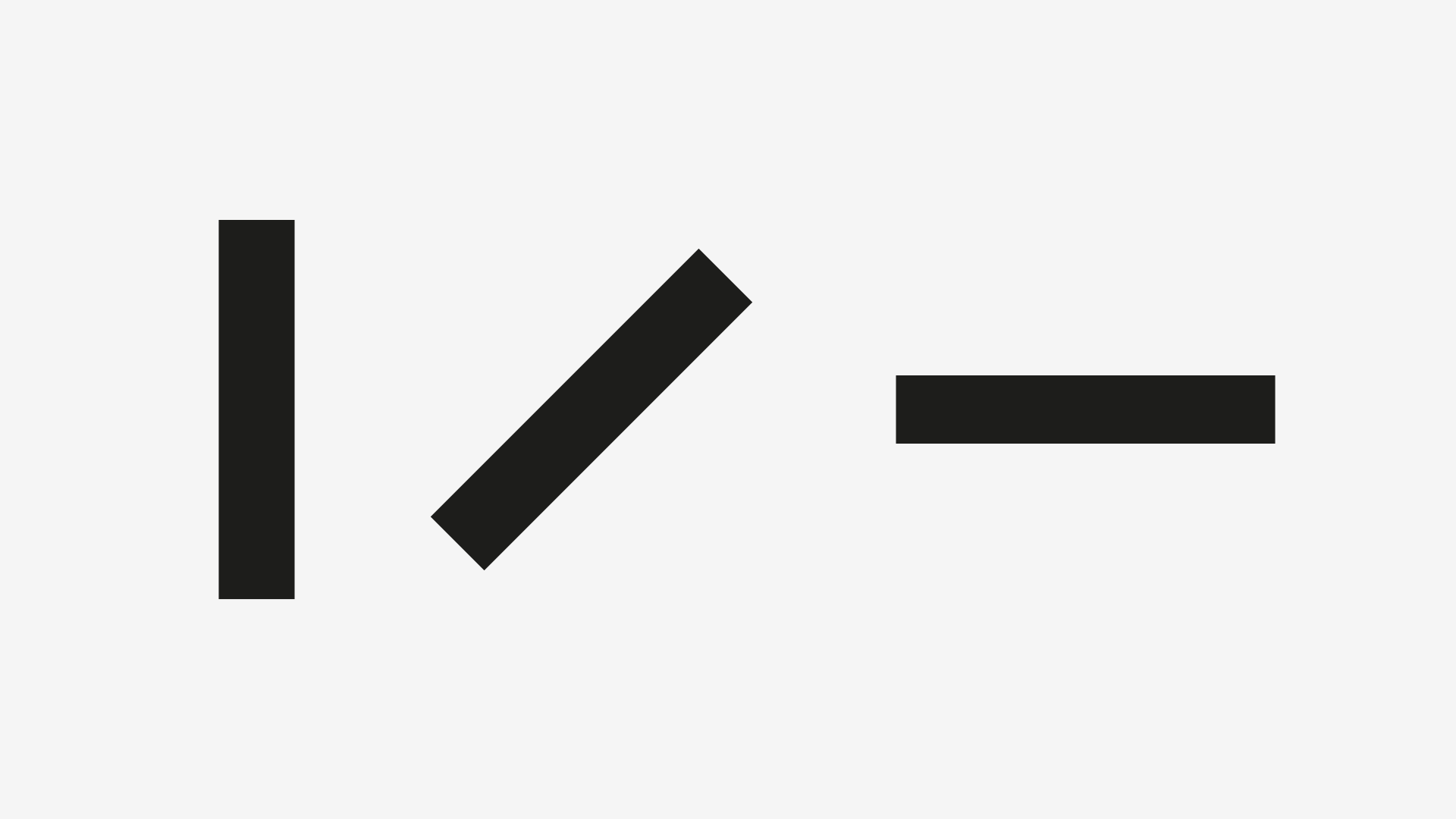
If it wasn’t obvious in the first image, now it is: the diagonal line also looks heavier than the orthogonal ones.
So, for comprehension’s sake, let’s give the diagonal line the same stroke width has the (already compensated) horizontal line:
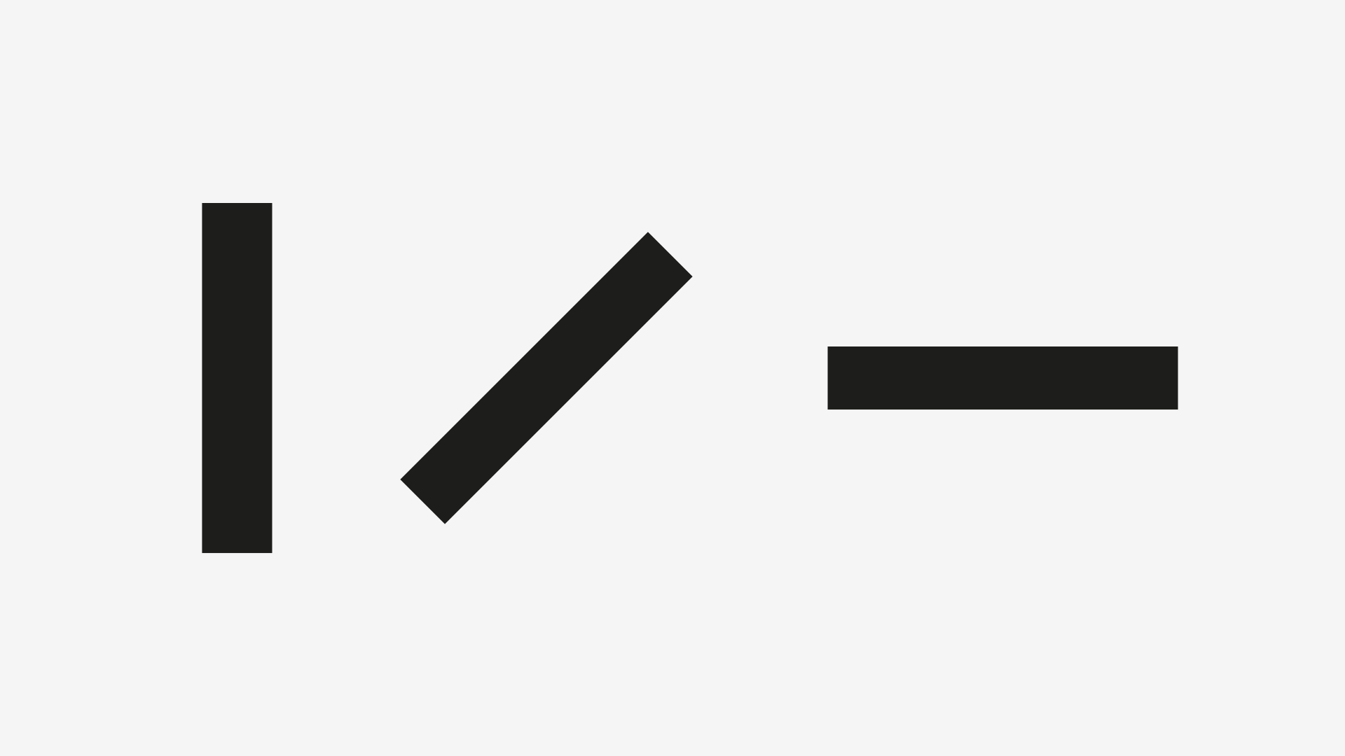
… which makes the diagonal line too thin.
Before we get into the solution, I’d like you to consider a couple of things:
- This example is not random, i.e., I’ve picked a 45º angle to the diagonal line for a reason that you’re about to find out;
- We can only apply this to monoline fonts, although this is just a starting point (the next articles will cover more cases and correspondent corrections).
So, if neither of the horizontal nor the vertical strokes’ width is applicable to the 45º diagonal (which, again, is half-way rotated between the orthogonal axis), what happens if we pick the exact in-between stroke width? Here you go:

Does it look alright? *wink*
And now, you might be asking about other angles. If we apply the same width stroke to any diagonal, we get this:
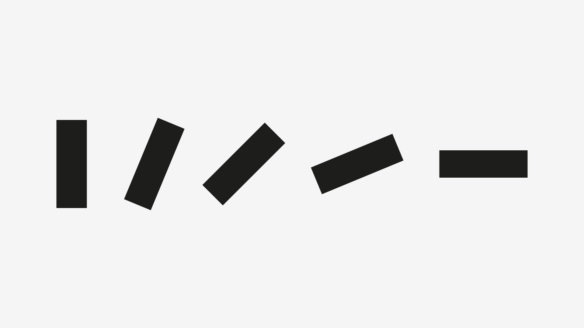
If you compare the first two lines, the second looks too thin; and if you compare the last two, the former looks too thick.
So here we can start to acknowledge that the thickness of a diagonal line should vary according to it’s angle, and that it’s a progression between the horizontal and vertical widths.
Here’s a linear progression of angles and widths:
2.1 Tackling Slants and Widths
If you’re anything like me, by now you’re doing some stressful mental schemes on how to calculate the exact width of a diagonal, depending on the horizontal and vertical strokes’ widths.
So, in order to save you some stressful times, here’s a quick and dirty way to do it:
- Draw an ellipse that has the same width as the vertical stroke and the same height as the horizontal stroke;
- Adjust the strokes to be tangents to this ellipse.
Two steps method. This is what I call workflow optimization! Here’s a visual representation of the method:
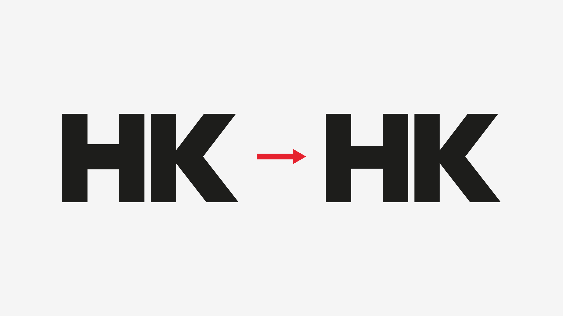
And, to implement a tradition, here are these principles applied to type:
3. Straight vs. Curve
And we’re coming closer to an end.
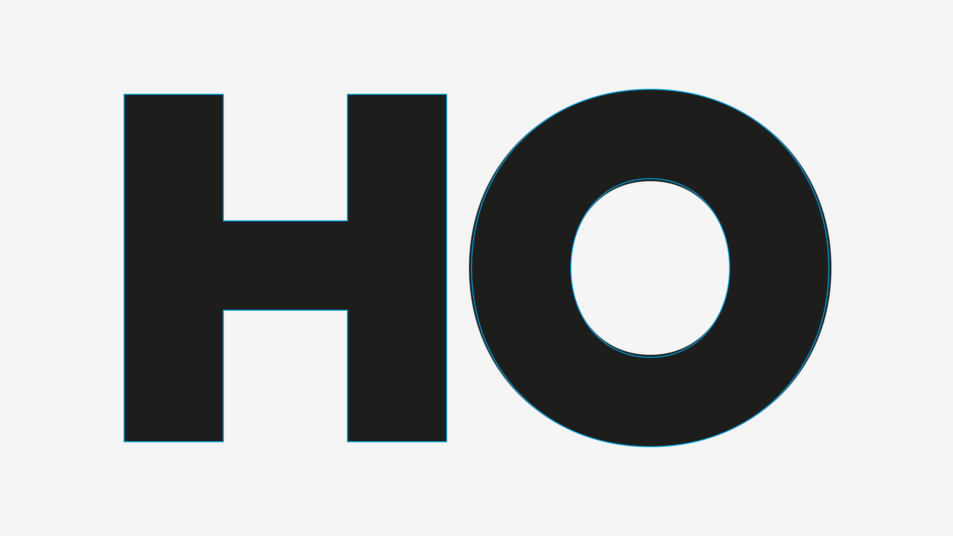
Let’s start with the following image, where all the strokes are exactly the same (and the O is already overshot):
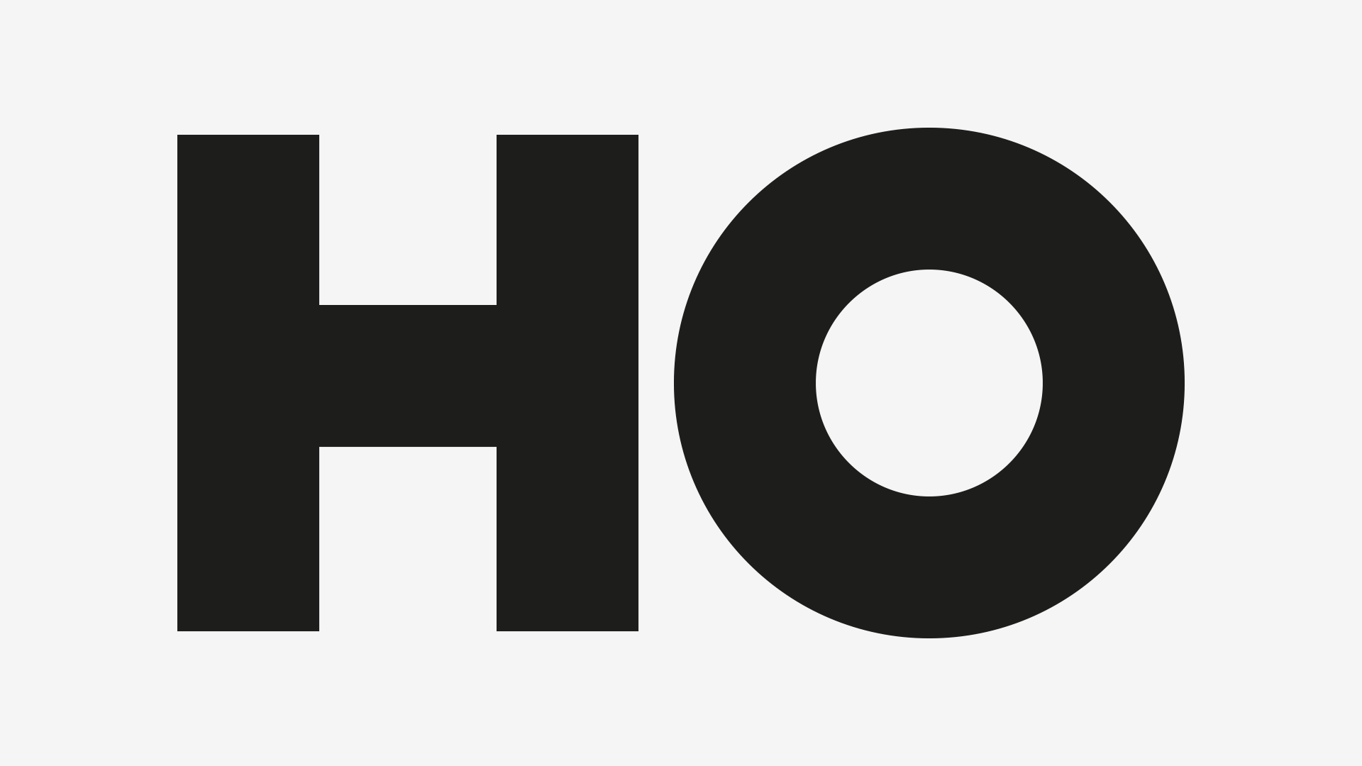
And now, let’s make the corrections that we already know about (horizontal and vertical, in this case):

Same kind of question: do the straight and curved strokes feel equal? You might want to take a step back it see the images from afar.
The H seems to pop out more that the O. And, as I mentioned, the O is already overshot, so it’s not a case of overshooting. Or is it?
Well, curves seem thinner that straight lines for the same reason we have to overshoot them: a lot of white space is created and positive mass is decreased, so we have to compensate for that.
But the thing to retain here is that curves seem thinner than straight lines and the amount of compensation needed isn’t as extreme as the one we do in the verticle / horizontal cases, so it’s closer to an overshooting compensation.
Let’s correct our example:
4. How Much?
If you’ve noticed, I wasn’t blunt about how much to compensate; in fact, I only gave one example in §1.
I could provide rules-of-thumb that would be percentage ranges of compensation, but I feel that this is a trap.
First (and again), I advise you not to make calculations; providing you such rules (on how much to compensate) would oblige you to make these calculations and I want you to design as freely as you can.
So take what you’ve learned today and trust you’re eye. If it looks awkward, well, it’s awkward. Teach yourself to pay attention to the forms, counterforms and whitespace. Inspect the curve/line segments on by one and compare them to the whole form. And to the whole group of forms.
Even if we dabble in maths and geometry, here, keep in mind that these are means to an end, not the end itself.
I hope you’ve enjoyed this article, see you in the next one! Cheers!