Index
Introduction | Learning To See | Overshooting | The Stroke: Optics
You probably heard about overshooting, specially if you came from a visual arts background. If you haven’t, welcome! And if you have, well, it doesn’t hurt to refresh our knowledge and explore what we know in a more in-depth way.
1. Definition
So, what’s overshooting?
If you search the web for a definition (as I just did), you’ll end up reading about economics theory or mechanical engineering jargon. Is this somehow related or interesting to this topic? Not really, but amusing, nonetheless.
Overshooting, in visual arts, is the optical correction of forms in relation to other graphic elements, more specifically to their construction rectangle, in order to achieve perceptual balance. Still amusing, right?
Let’s check the About.com definition of overshooting:
The main parts of letters generally fall between the baseline and x-height or cap height. The overshoot is where rounded portions of a letter (such as O or n) extend slightly above or below those lines. This slight overshoot creates an optical illusion that the letters are the same relative size as non-rounded (flat) letters like L or H.
Apart from the casual humor, I wrote that almost unintelligible definition because this second one is incomplete:
- It doesn’t contemplate shapes with straight lines that need optical compensation (A and V, for example);
- Has no consideration for horizontal overshooting.
1.1 A Matter Of Perceptual Mass
So, what is this all about?
Well, as we discussed on chapter 2, the way we perceive things around us isn’t accurate (for biological and cultural reasons), let alone mathematically perfect.
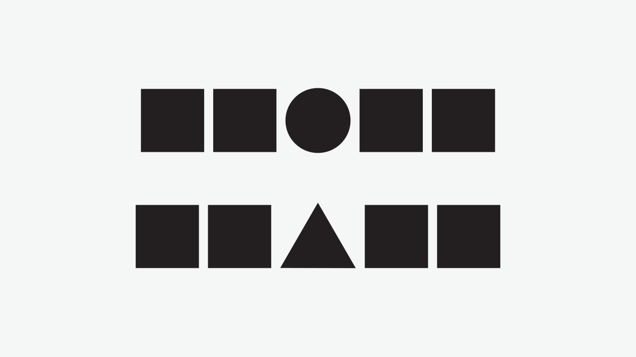
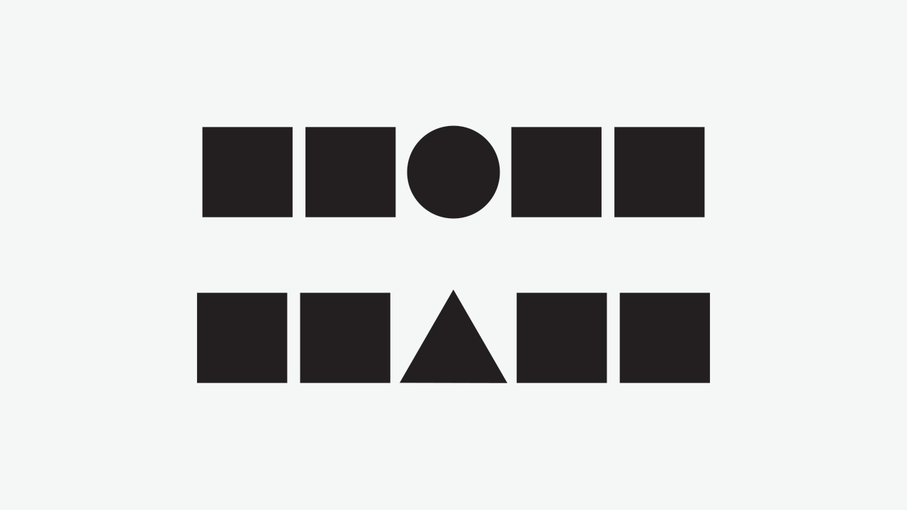
Using the classical example, consider this image:
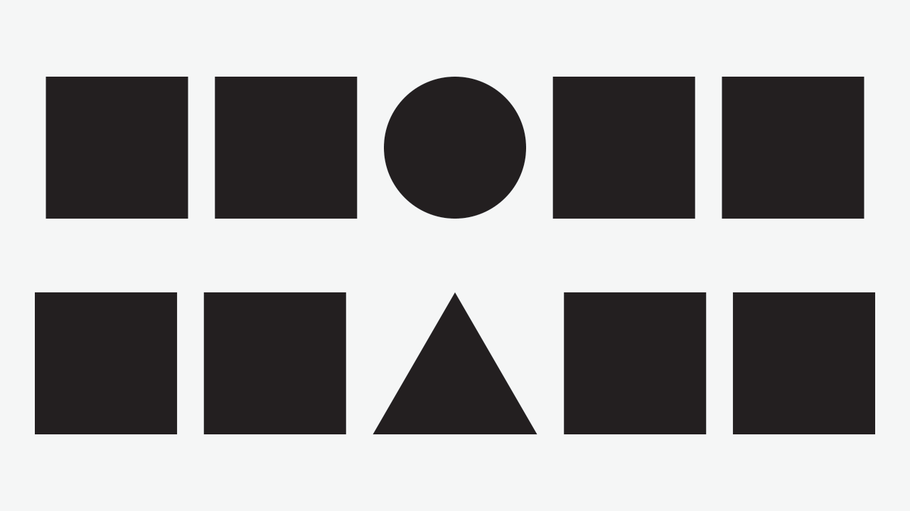
Now, do the circle and triangle feel to you that they have the same weight has the squares? Truth is, they’re all the same height, they just have a different area, or more precisely, a different visual mass.
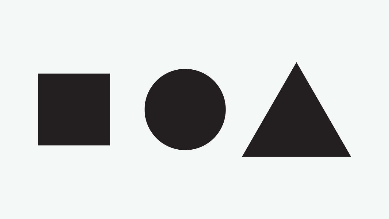
But then again, area and visual mass are not the same thing. If they had the same area, they would look like this:
2. Perception versus Geometry
Of course, there’s more to this. As we could see above (and discussed in the previous chapter), being mathematically precise doesn’t provide visual or perceptual balance.
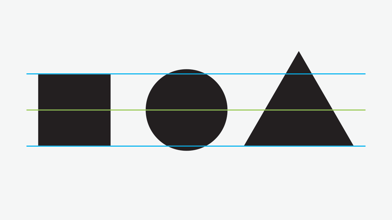
So, lets approach the problems of the previous image and correct them.
2.1 Alignment
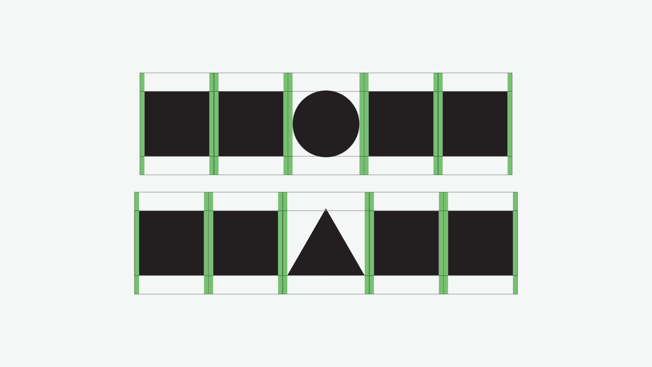
As you can guess, all the elements are aligned to their center. But if we try to come um to a base and top line, we would get something like this:
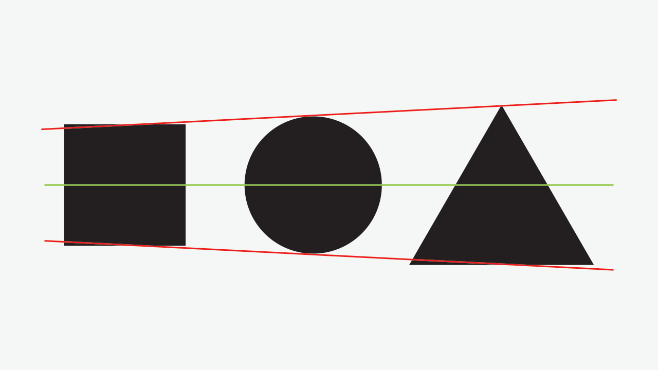
And, if we’re trying to achieve a stable composition, this doesn’t seem to be working out very well, right?
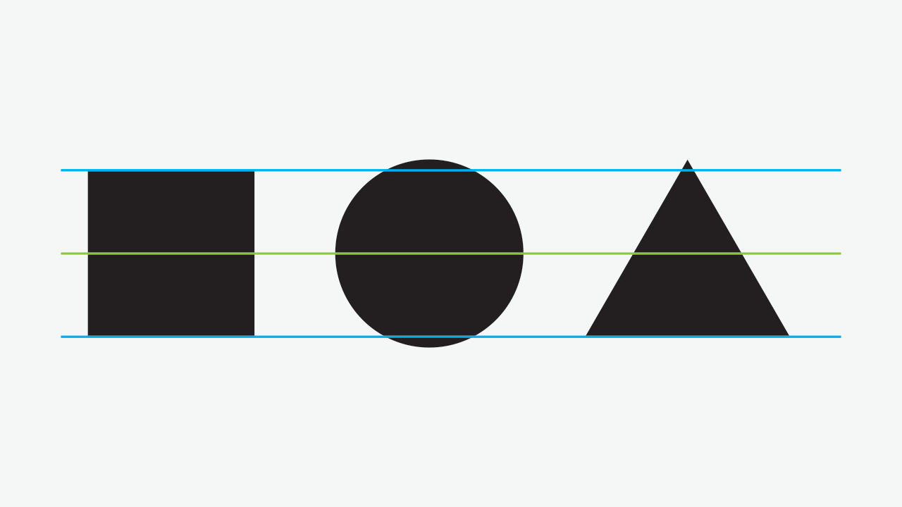
Lets then take the square as our standard element and extend the lines from it. We’ll get something like this:
The most evident problem here is the triangle’s bottom. Oh, sorry, the bottom-most part. *blushes*
So, apart from the platonic discussion about the sexyness of triangles, our seems to be falling down from the baseline, for two reasons:
- It creates a huge amount of mass below the baseline;
- Since the triangle’s base (or bottom, now I can’t get this off my head!) is perfectly horizontal, it’s pretty much stable, as a form; hence, the need for compensation below it’s baseline is nonexistent.
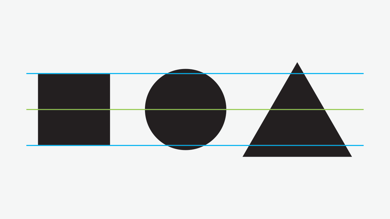
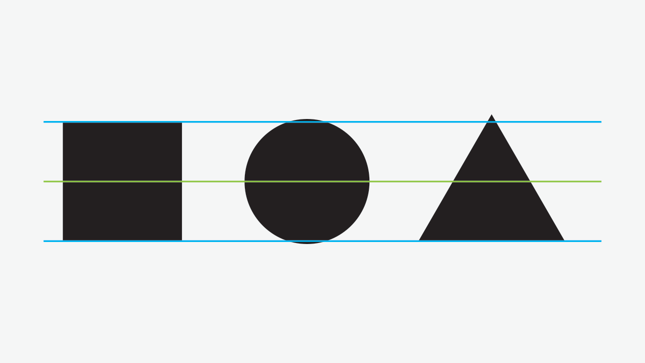
OK, now lets align the triangle to the baseline:
The base (I’m avoiding the word bottom, now. Or maybe not.) just got better. But what about the top? Too much stuff protruding there, right? As we saw in the first image, reducing the square to align the square just doesn’t work. And neither aligning it just to the baseline.
Lets try to scale it down a bit, while keeping the bottom (there we go again) aligned to the square:
Ah!, relief!
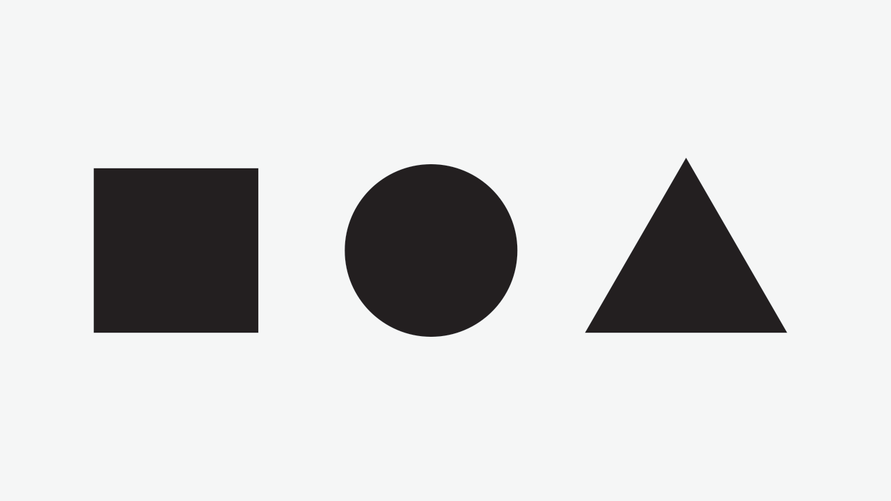
Still, the circle seems odd. The reason for this is the same: too much mass protruding above and below. Scaling it a bit down, aligned to the square’s center, we’ll get this as result:
Success! And here’s the composition without the guidelines:
2.2 Whitespace
Apart from being a really cool (or incredibly lame) name for a classic rock type designer’s band, every time you affect a form, you affect the white space around it: there is a constant play between positive and negative form and achieving balance of form requires attention to both, as New Age as this can sound. Or Confucian.
So, if we consider the vertical extremes of a form for optical compensation, we should do the same the horizontal ones.
Usually, horizontal compensation is neglected when we talk about overshooting, because it’s a matter of metrics. But since we are talking about perceptual (or optic, although the latter is not a very precise term, as we could see in chapter 2) compensation and this is not exclusive to type design, but rather generalistic, visually speaking, we should talk about this.
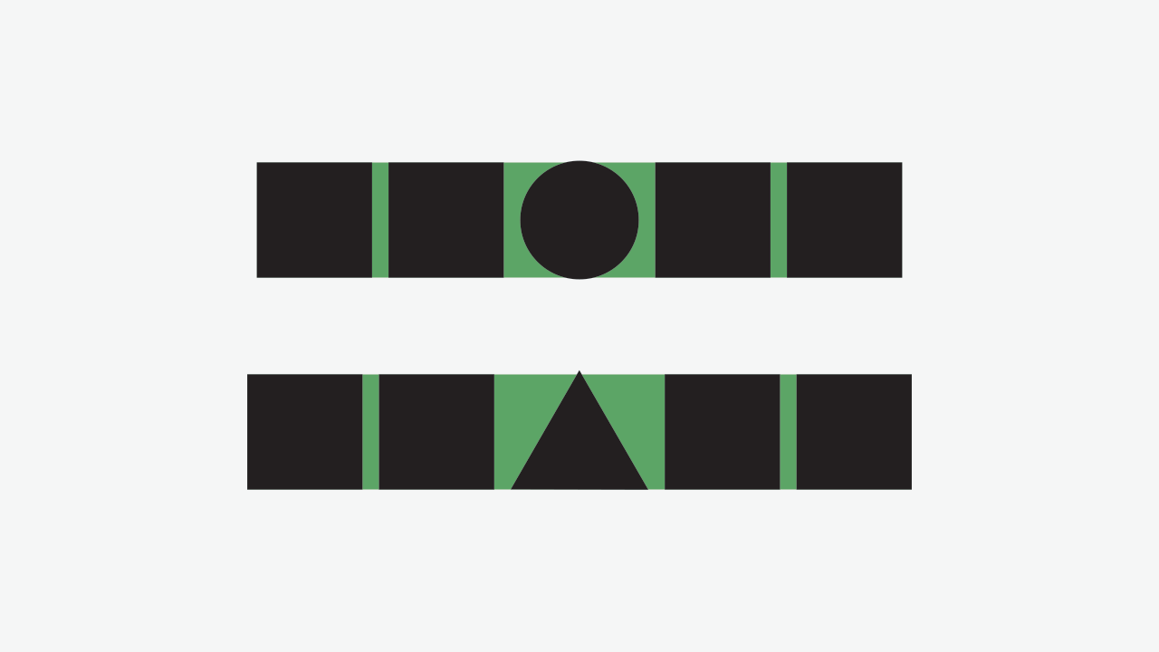
Consider the following image:
The circle and the triangle are compensated according to §2.1 and equal space is maintained between each element. The reason why squares are paired is to have a reference of spacing, since we saw that the square has no need for optical compensation. Here’s an image with the spacing margins:
Due to the triangle and circle’s irregular form (or better, non-square form), a big amount of white space is created, making these seem separated further apart from the squares, in comparison to the space between a pair of squares.
Again, we’re not aiming for mathematical calculations of space, but visual balance. With this said, if we were to calculate the white space area and make it equal, the circle and the triangle would overlap its neighbour square.
Instead, we’ll reduce the side spacing in the same proportions as we did vertically:
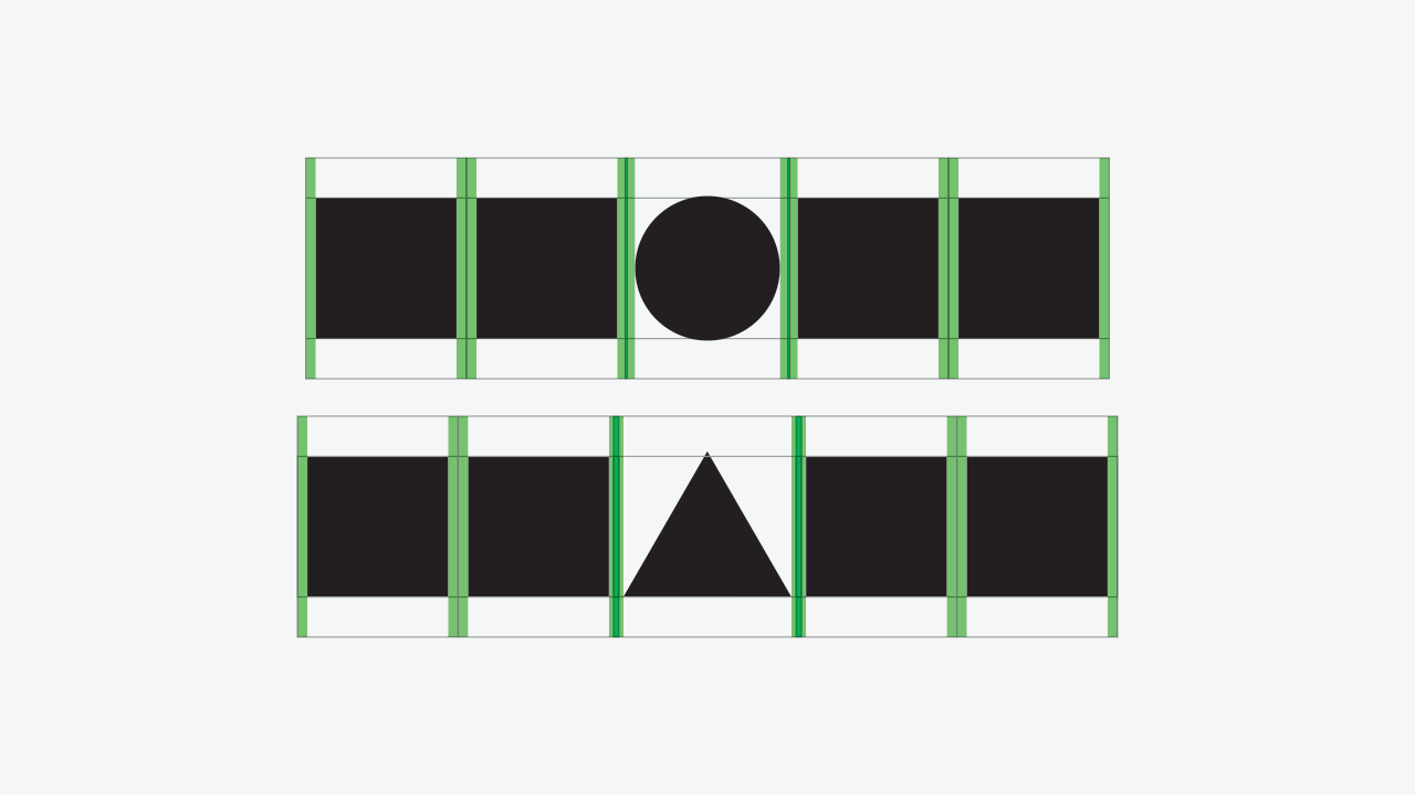
And here’s the same composition, without the guides and spacing blocks:
2.3 Some considerations
- I haven’t told you how much you should compensate, with the exception of the previous example. I did so because there isn’t an exact answer: we could talk about ranges, but these are form-dependent;
- If we’re designing free-form elements, as most glyphs are, the notion of exact calculations seems like a complete waste of time. It’s easier to test and decide than to write a complex software just to make that kind of decision for you and, most likely, with an unappealing result;
- The reason why I was able to tell you to compensate the same horizontally that was made vertically is because these forms are symmetrical horizontally, and, in the case of the circle, symmetrical in both axis. And to tell you the truth, the compensation in the triangle’s horizontal spacing is slightly bigger than vertically (meaning the spacing was further reduced), to keep a nice flowing rhythm.
4. Counter-forms
As stated in § 2.2, there’s an ever-going dialogue between positive and negative forms; and I say form instead of outline because we should also consider negative forms inside positive ones, because this also has an effect in optical compensation.
Here’s an example:
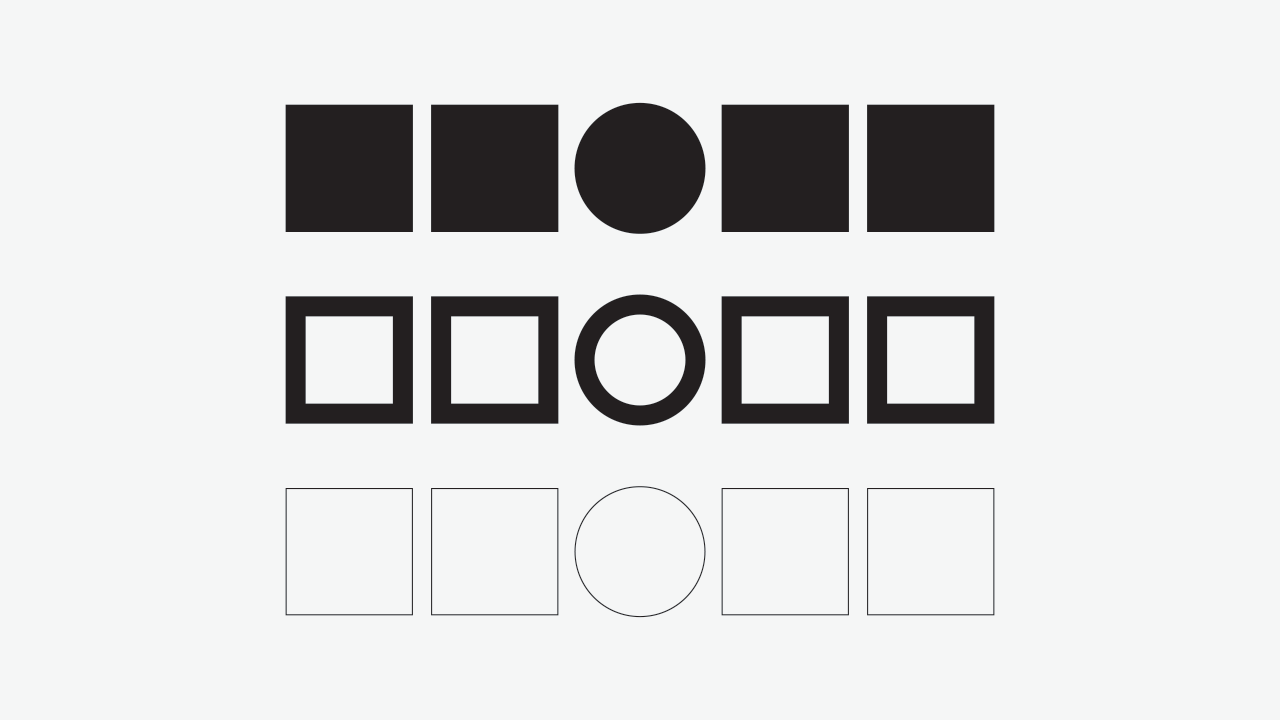
Here are some observations regarding the previous image:
- Proportionally, when we apply a stroke inside our forms, the amount of white space reduction, proportionally, is bigger in the circle than in the square;
- A thick stroke makes the circle look smaller than the square, for the reason above;
- A thin stroke goes above the top alignment, making the circle look bigger than before;
- The stroke has also an effect on horizontal spacing and should be compensated accordingly.
The conclusion here is that we should increase the amount of compensation as we increase the stroke, paying attention to balancing the counters. In fact, when we have counter forms, they overpower the form’s outline and their equilibrium becomes more significant than the solid form itself.
5. Conclusion
So here we covered the basics of overshooting, opening a door to the world of optical calibration.
Thanks for reading the article and I hope you’ve enjoyed it. If you believe that it can be useful to others, please share it!
See you in the next article!
References & Further Reading:
- Type Mechanics: 001 – Frere-Jones, Tobias